Royal-Tea
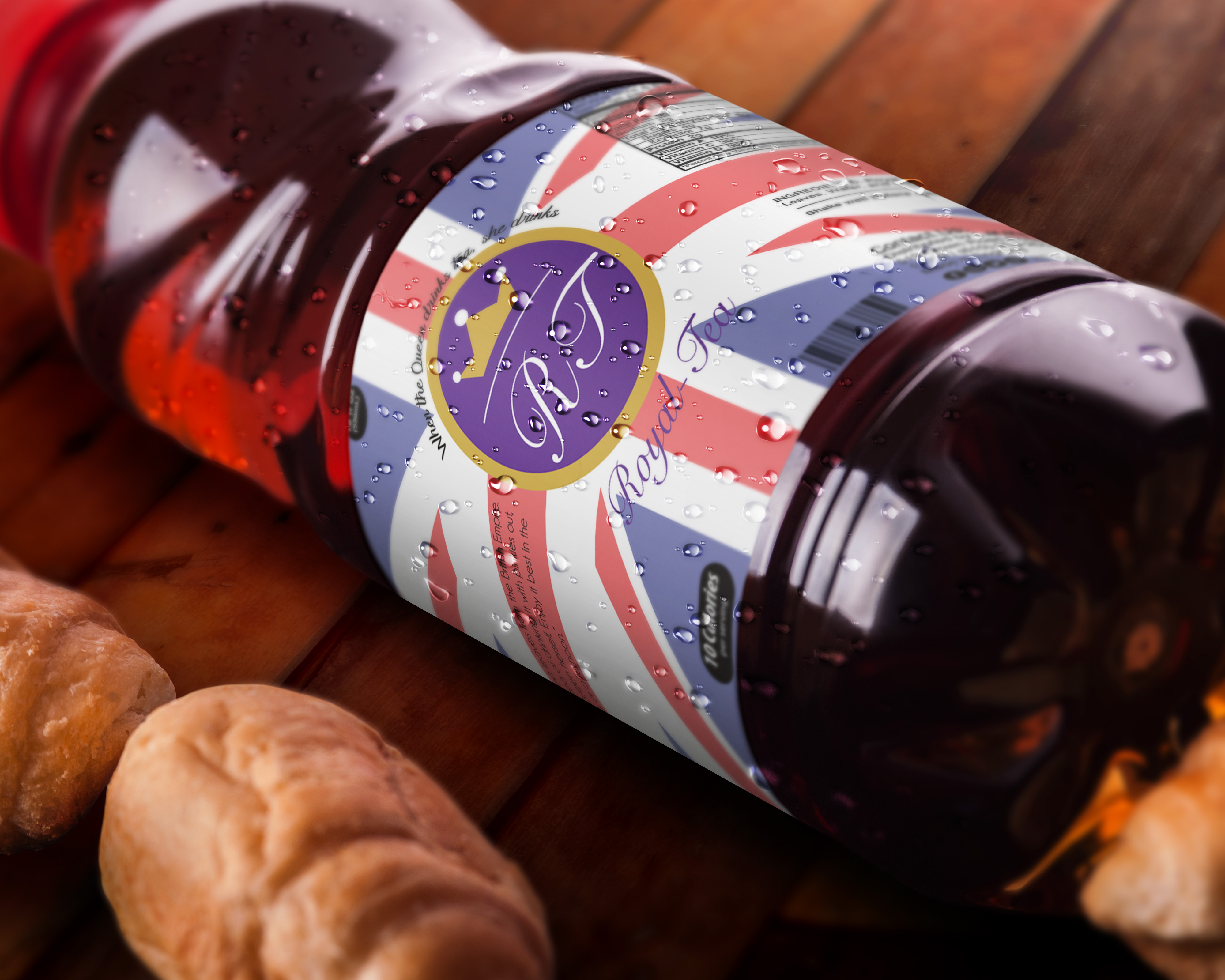
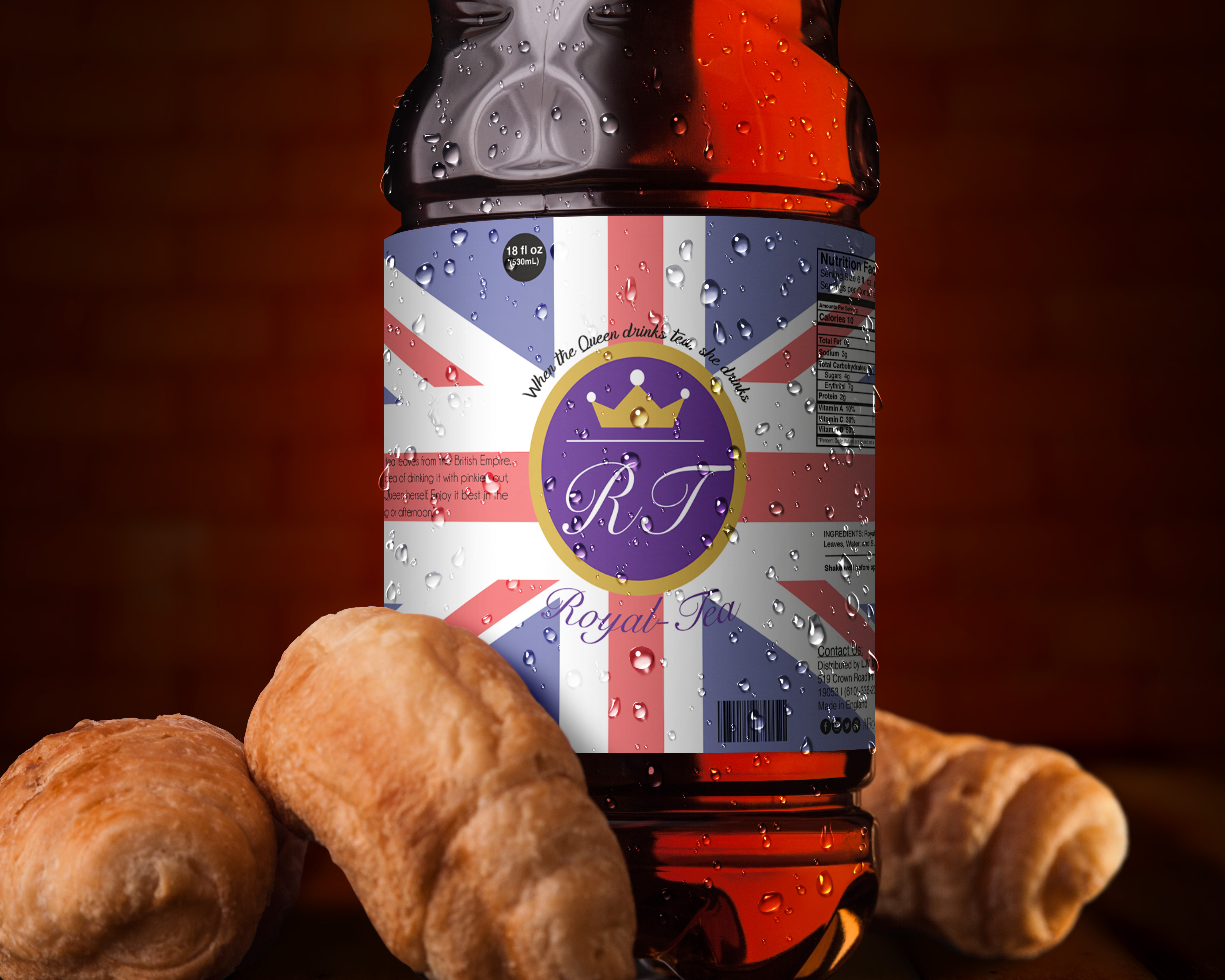
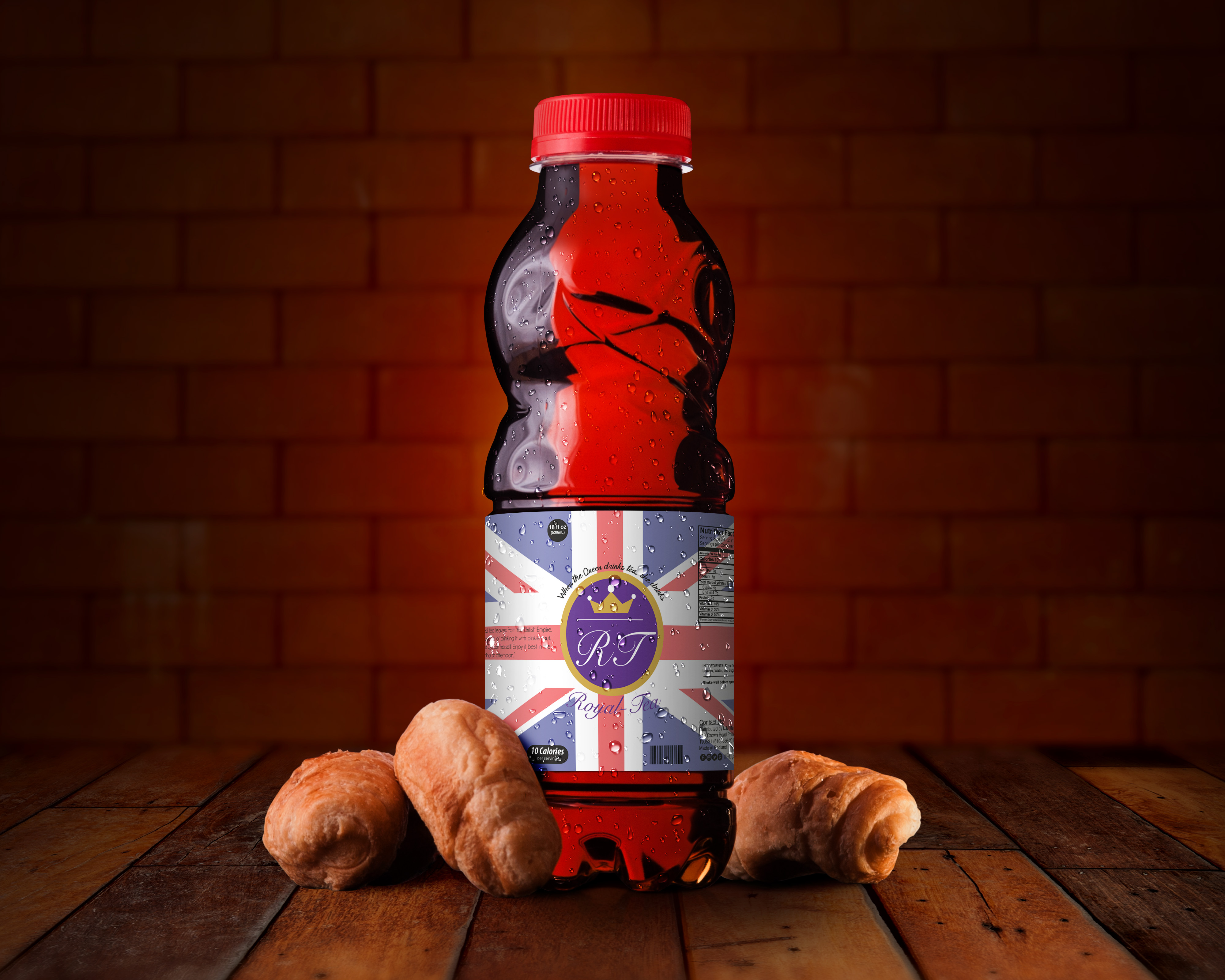
Royal Tea is a fictional iced tea company made in England and reflects the British Royal Family and English culture with their love of the beverage. Design pieces include a logo and a wrap-around drink label. The target audience would be anyone that enjoys drinking iced tea or likes English culture. The software used was Adobe Illustrator because it was needed for the logo and designing the drink label since it is a digital illustration. The design intent was to create aspects that represent the British Royal Family and English culture in the logo and drink label.
Process Work - Sketches
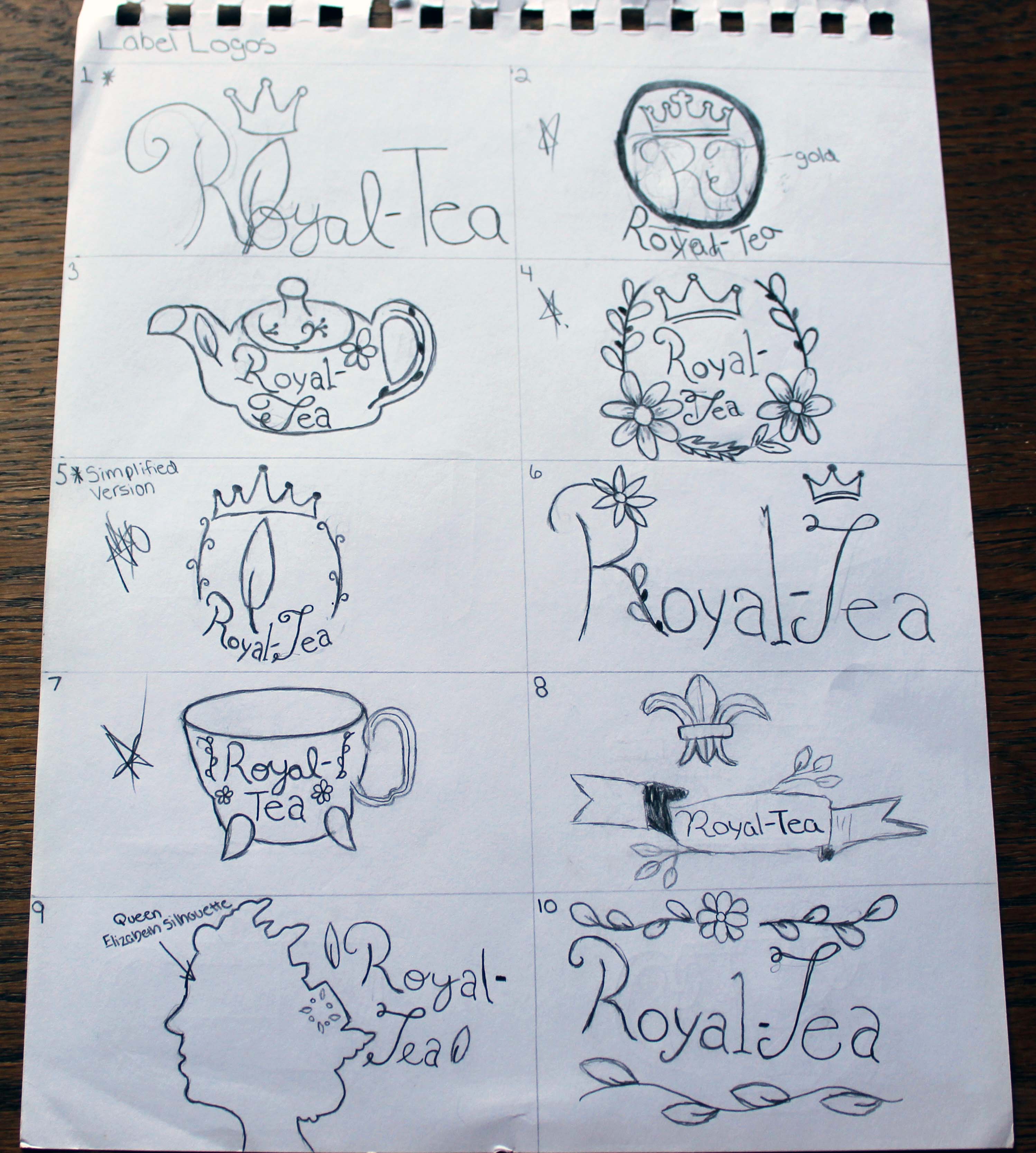
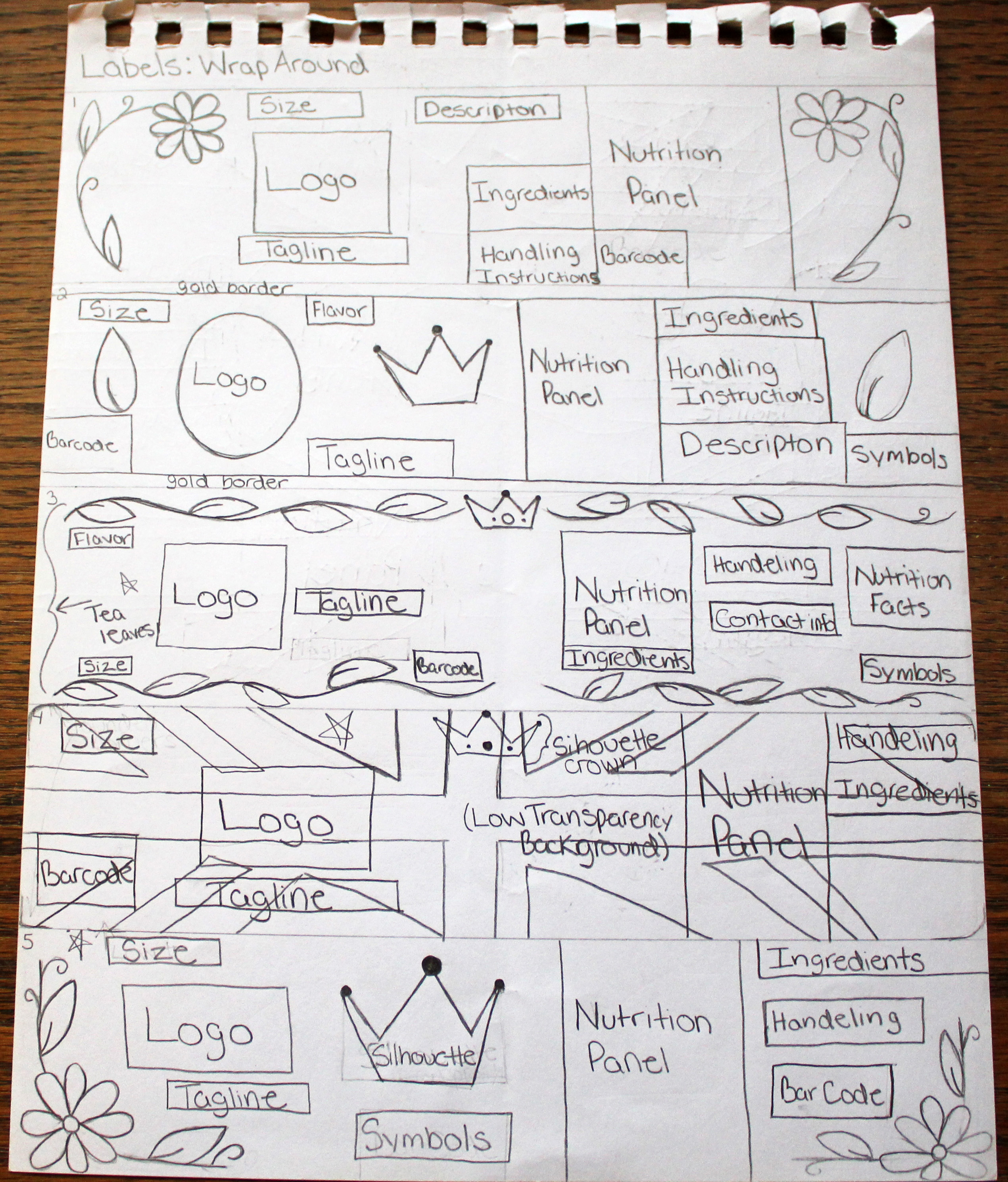
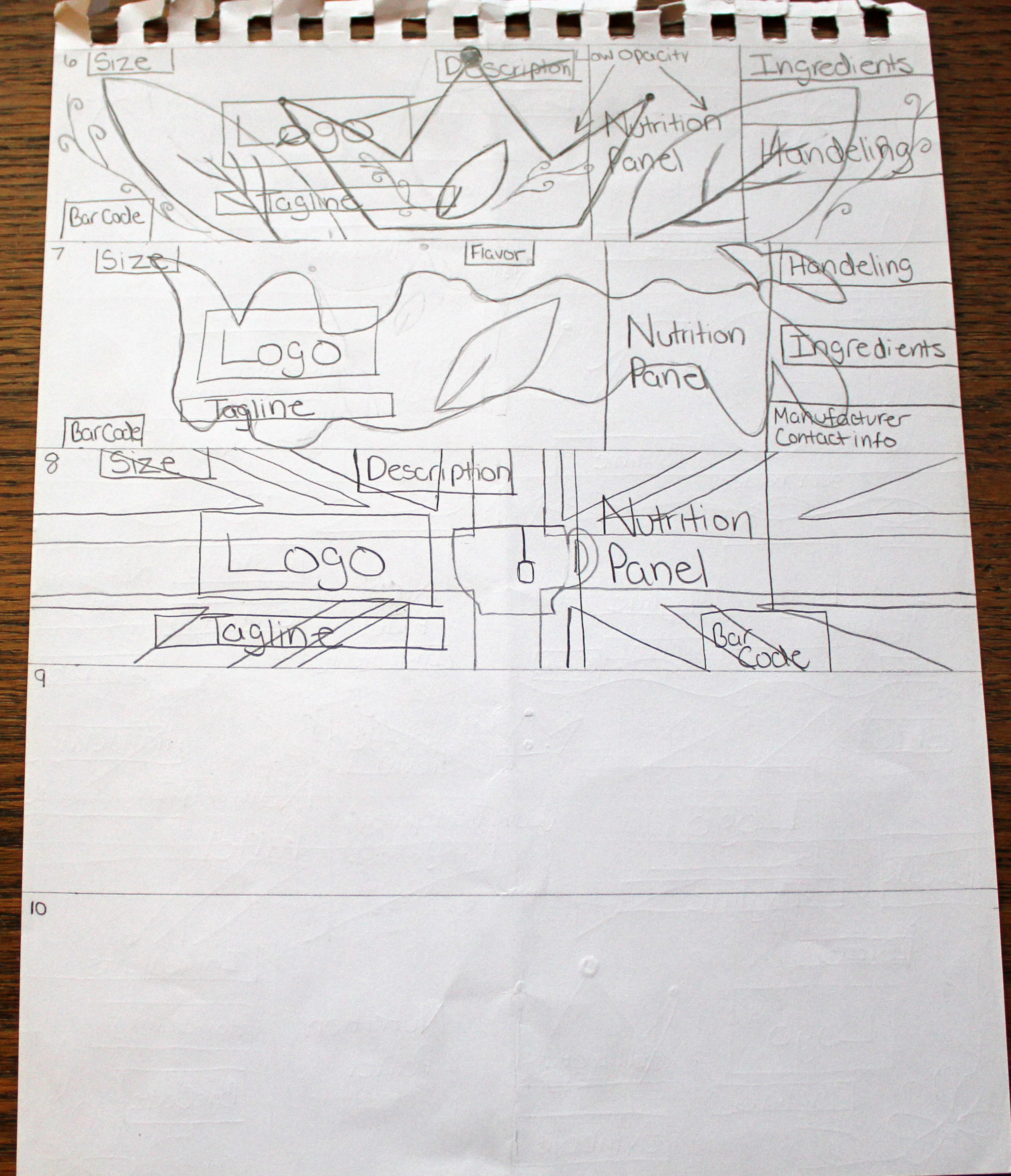
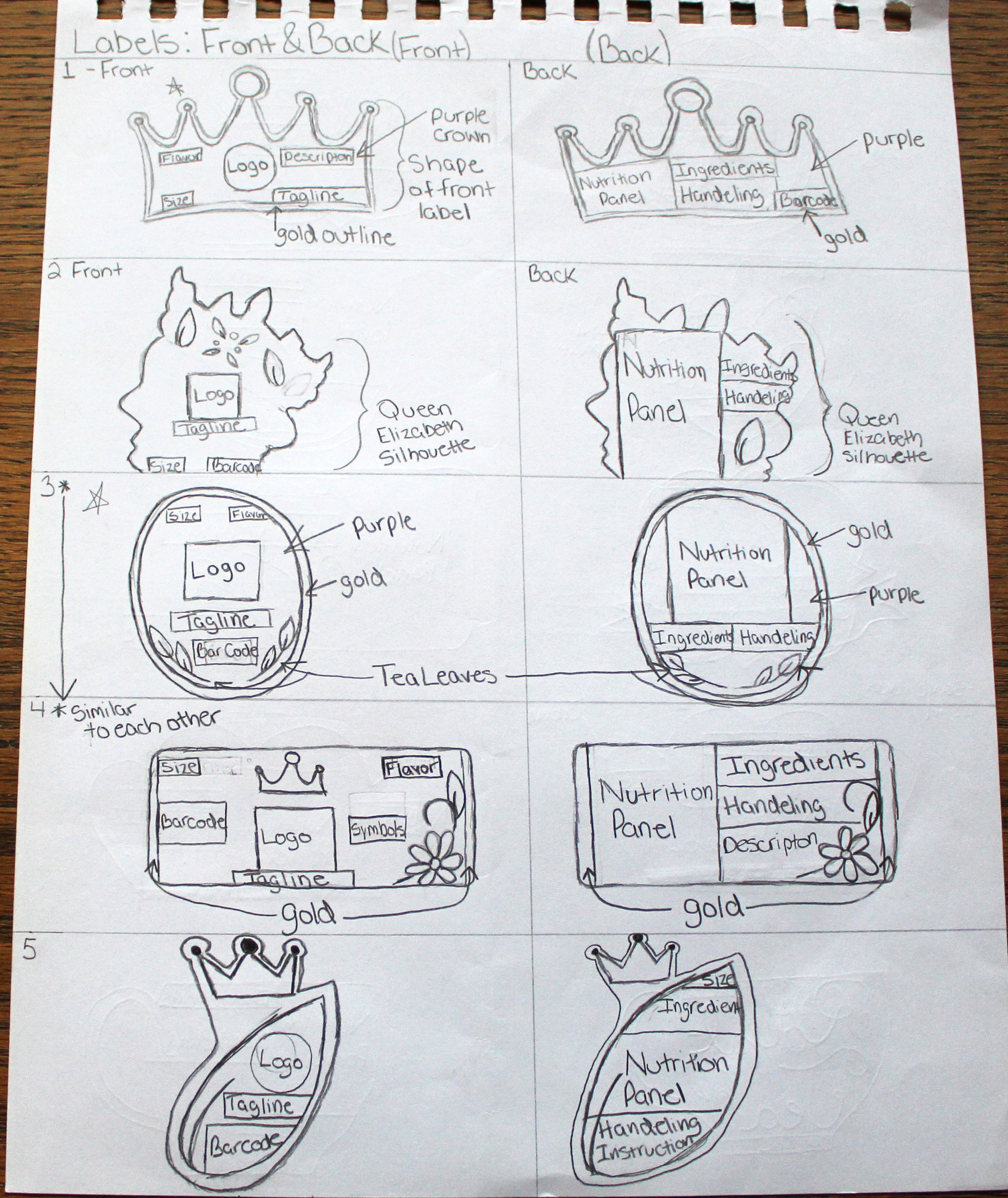
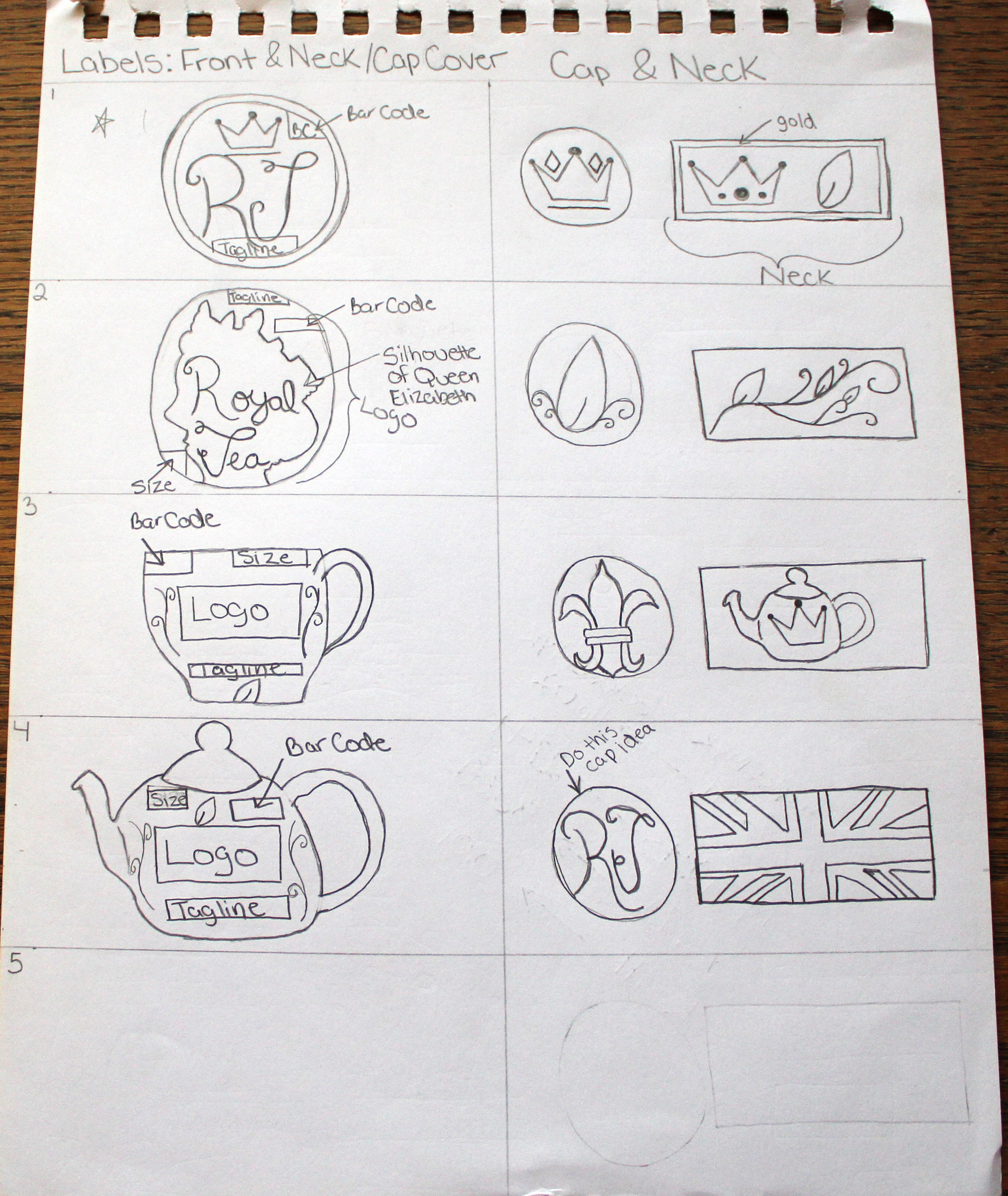
The thumbnail sketches for the Royal Tea brand show the first ideas for the brand logo, different label styles, and front/neck/cap covers for the tea bottle. All the concepts show the theme of English culture's love of tea. Also, due to the name, I wanted to use symbols of the British monarchy by using a silhouette of Queen Elizabeth, royalty in general by using a crown, or English culture showing a Union Jack flag. Adding greenery into some of the designs fits with the theme that it helps create the feel of enjoying tea outside in a garden in England.
Process Work - Type Study
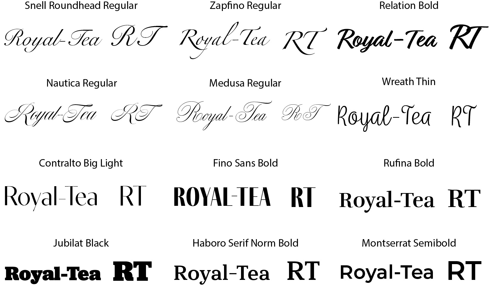
When brainstorming and researching for typefaces to represent the brand, I knew a script style was one of them because it is a fancier type to connect the British Royal Family aspect. I wanted it to be fancy but not illegible to the target audience so that they wouldn't know what it said. However, I also wanted to be diverse in choosing and including fancy versions of serif and sans-serif style typefaces. The final selection became Snell Roundhead Regular because it was fancy without being too over the top, and it fit the branding exactly how I imagined it. The other options still work with the theme, but some were too fancy, marginally illegible, or too simple for the logo.
Process Work - Color Study
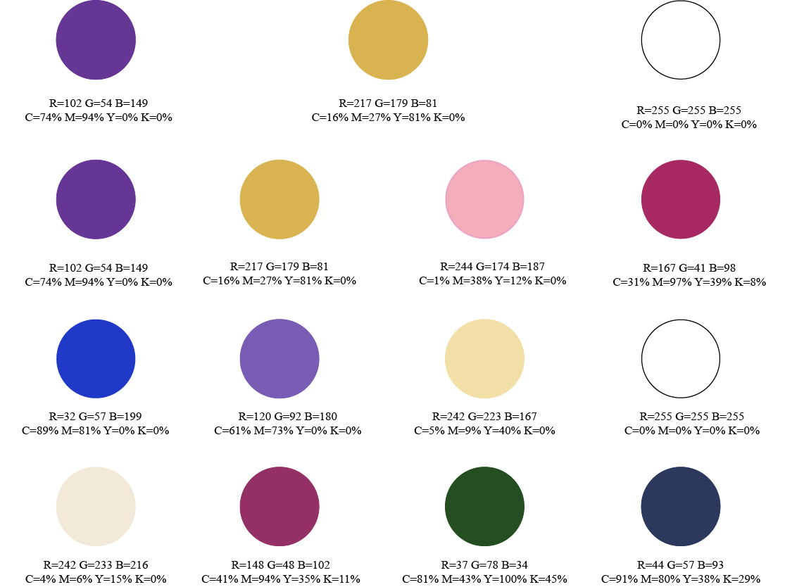
For color choice, I wanted to pick colors that reflect the British Royal Family or royalty in general; since it connects with the brand. I knew purple meant royalty, but I needed to select the right shade that appeared with the second color. The second color I wanted to represent wealth because that usually accompanies royalty. I researched varying golden hues and found the perfect gold hue that went with the purple hue I selected. Settling on two darker hues, I wanted to add a lighter one to balance out both colors, so I thought white would add that balance. I chose the first color palette because I liked all of these together and the symbolism behind all of them used. The other color choices did well in showing wealth, but it ultimately wasn't the color that I wanted to represent that part. I also researched alternative colors associated with the British Royal Family; however, they didn't look or feel like the right ones for the brand.
Process Work - Digital Logo Rough
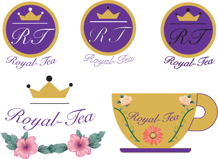
Since it resembles the royal seal used by the Royal Family, the chosen logo design ultimately became the top choice. For the seal, I also liked that it used basic shapes, and adding the color choices made it look more like something representative of the British Royal Family attached to the brand name Royal Tea. The other ideas created had the royalty sense to them but didn't execute the way I wanted by either color difference or layout/idea concept.
Mockups
