Green Thumb Emporium

Green Thumb Emporium is a fictional greenhouse that sells plants and offers services to plant lovers at any level. The branding pieces that went into this business were a logo, business card, brochure, newspaper ad, and t-shirt. The target audience is plant lovers that prefer house plants or people wanting to try plant care as a new hobby. The software used was Adobe Illustrator and InDesign. Both programs provided a different purpose, like Illustrator to create the logo and rough preliminary layouts for the business card and brochure. InDesign helped assemble the page layout for the finals made for the brand. The design intent was to create the necessary branding work for Green Thumb Emporium to promote and communicate its name and brand to its target audience and customers.
Process Work - Sketches
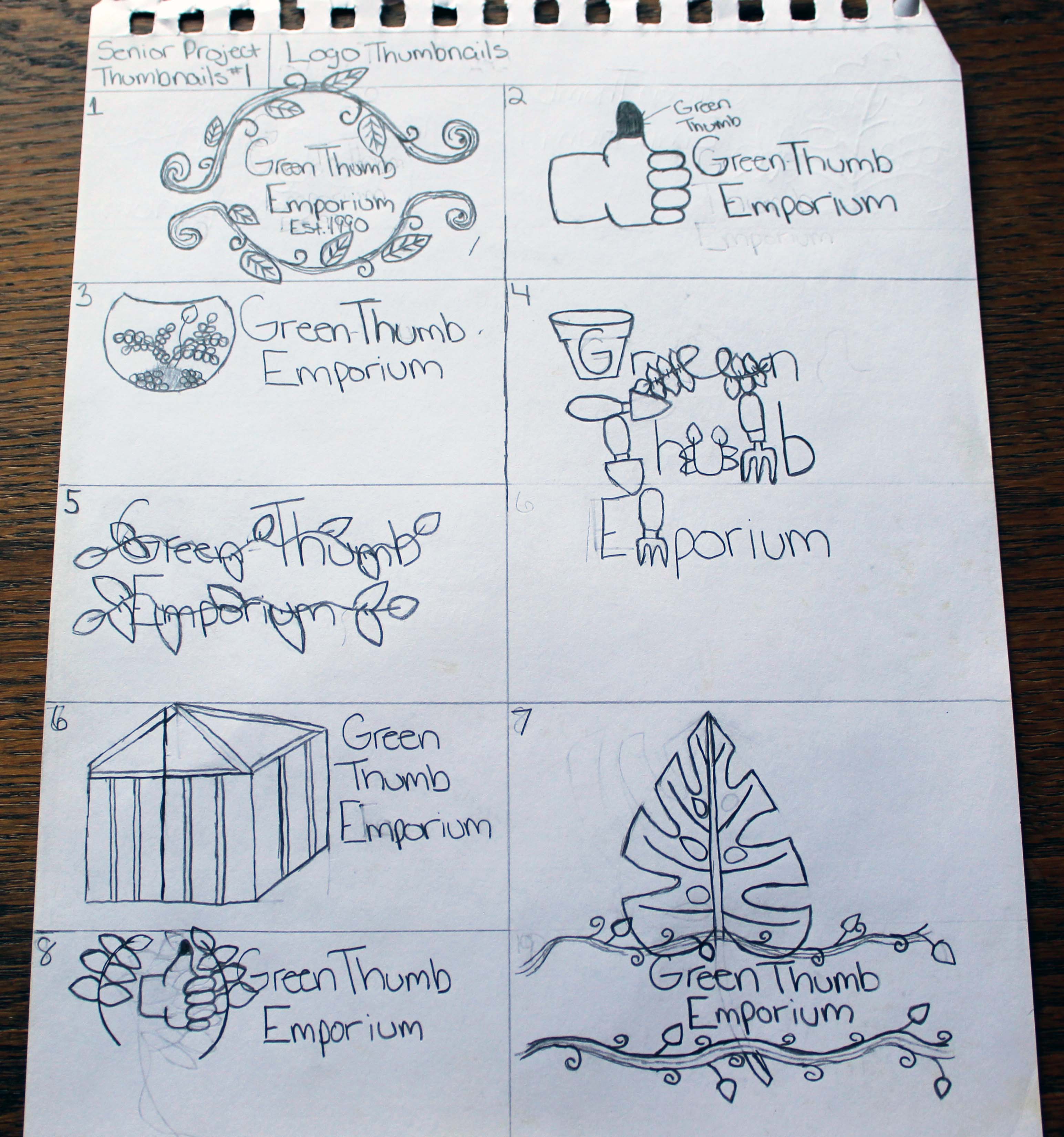
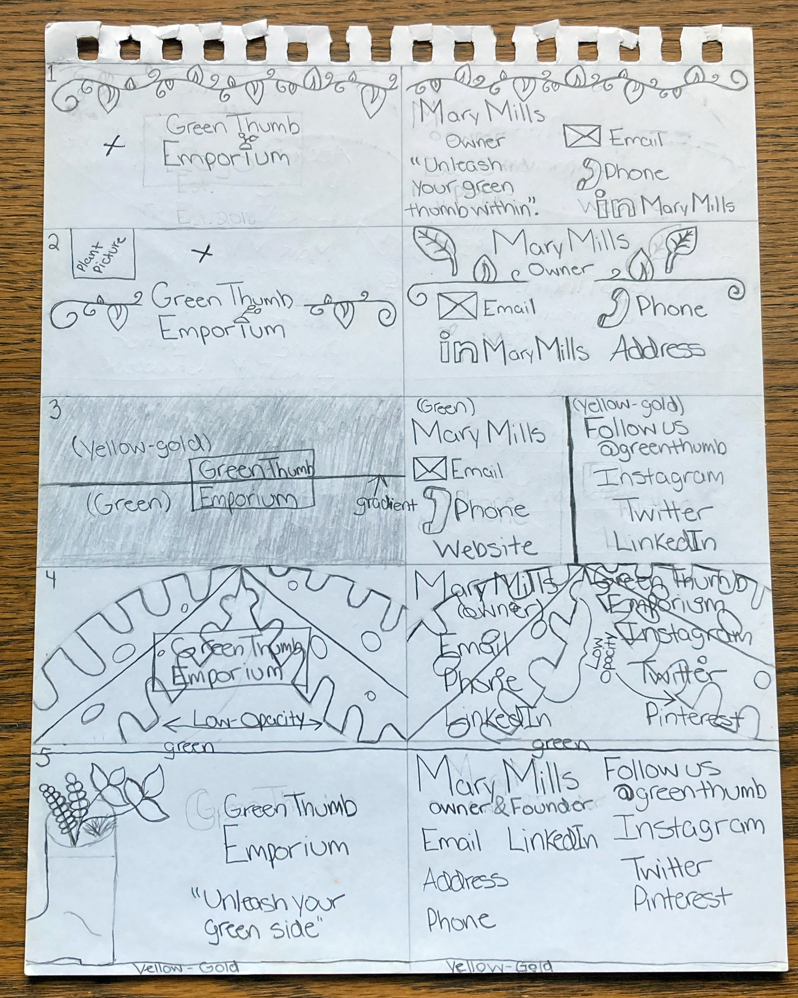
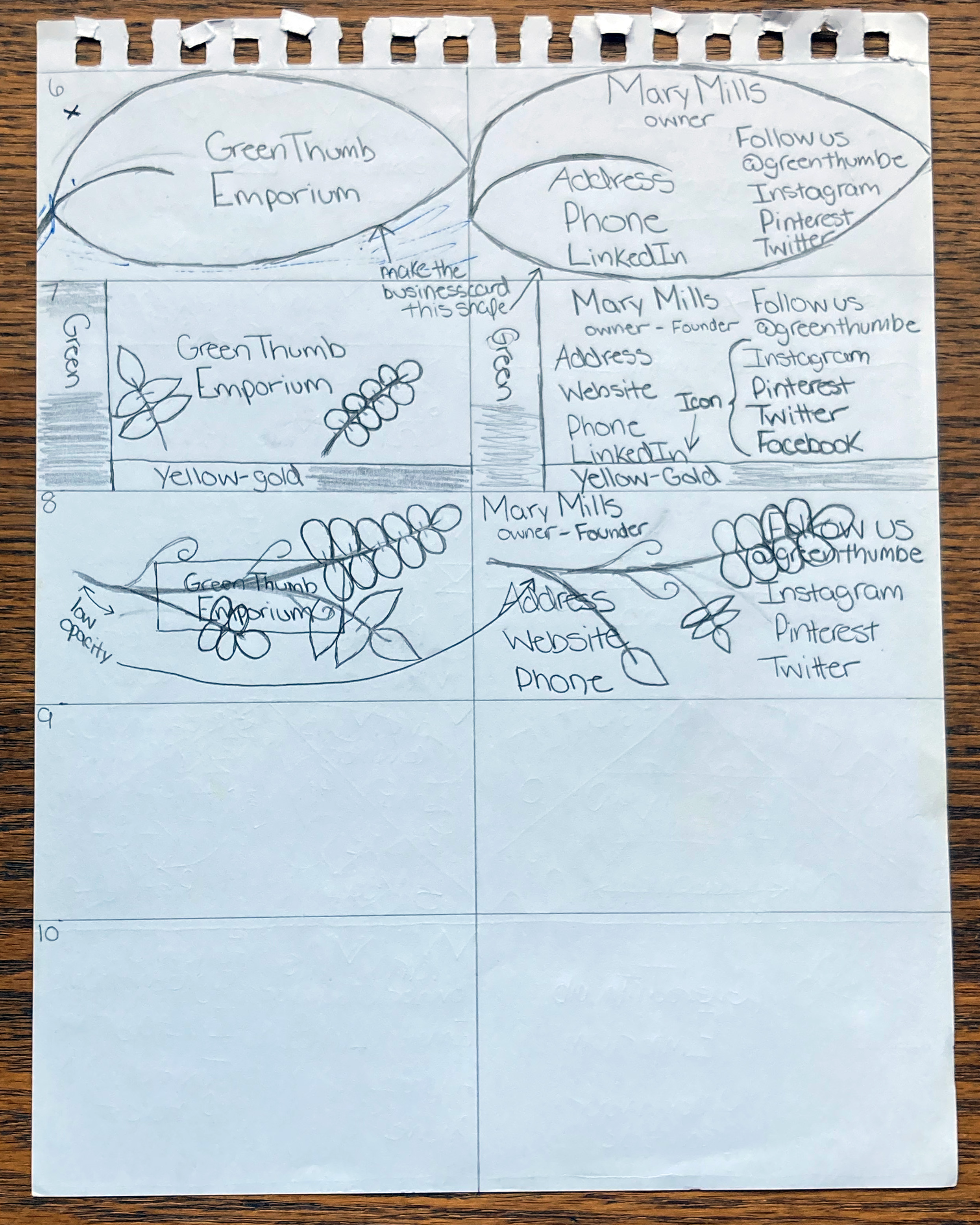
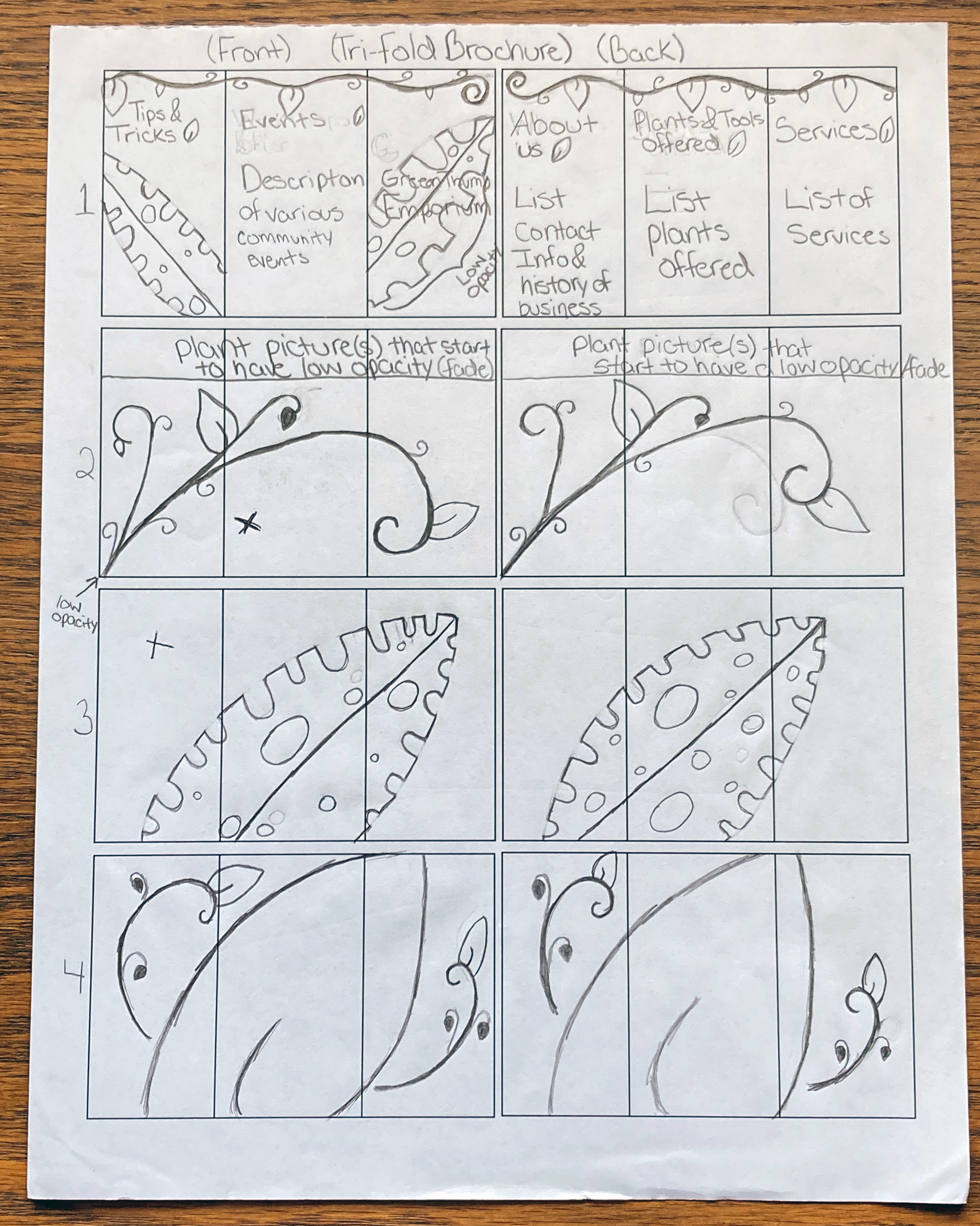
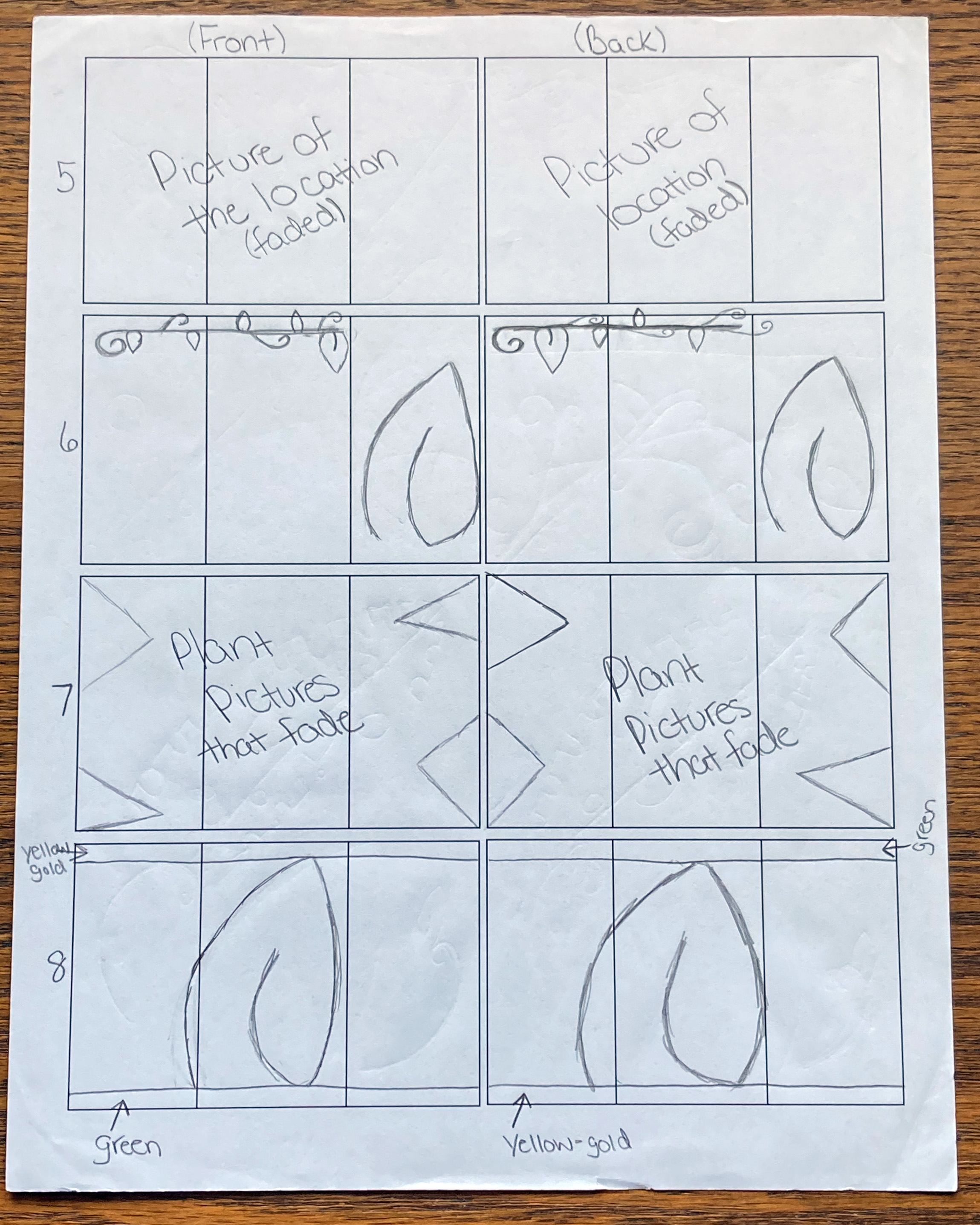
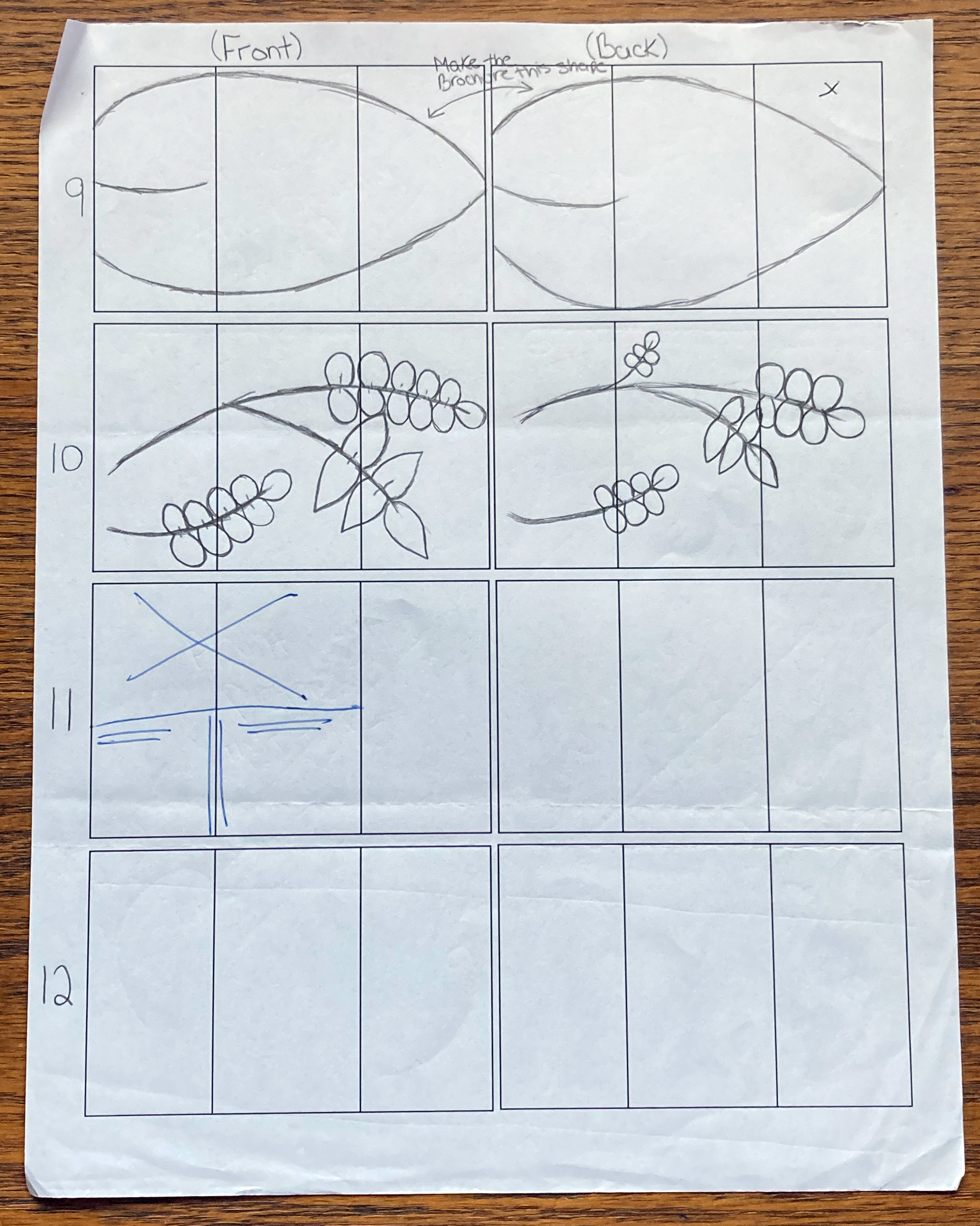
These are the initial sketches of the Green Thumb Emporium logo, business card, and brochure. Since this is branding for a gardening store specifically for house plants, I wanted to focus on plants, leaves, vines, and anything related to a greenhouse and plants in general. The business card sketches show the design, preliminary layout ideas, and what to include for business card information. The brochure sketches are a tri-fold brochure because it is a simple layout and is straightforward in presenting the information. I tentatively showed the headings for each panel along with a small synopsis of what information would be present under that heading. I also showed different plant graphics that I could use.
Process Work - Type and Color Studies
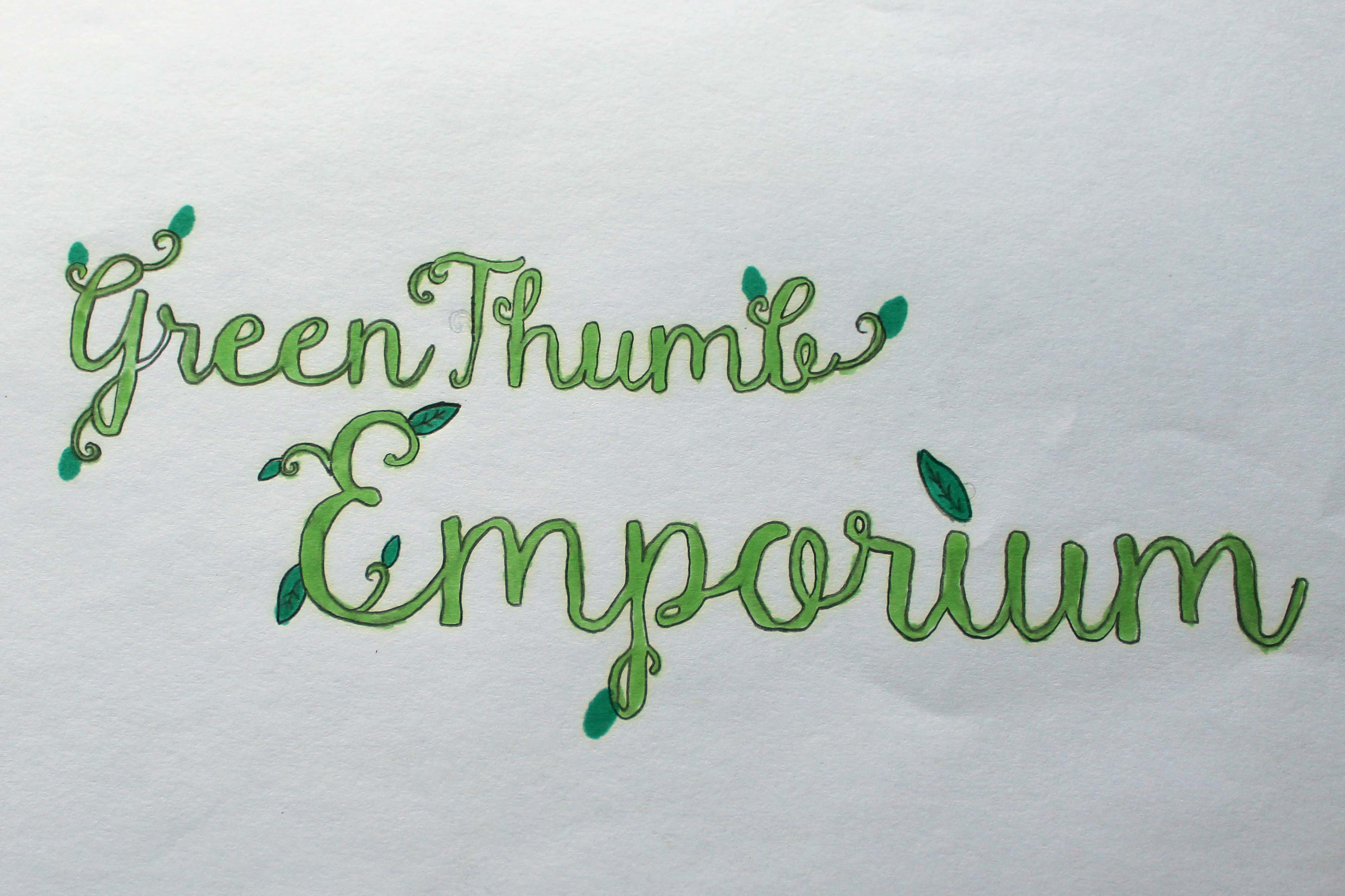
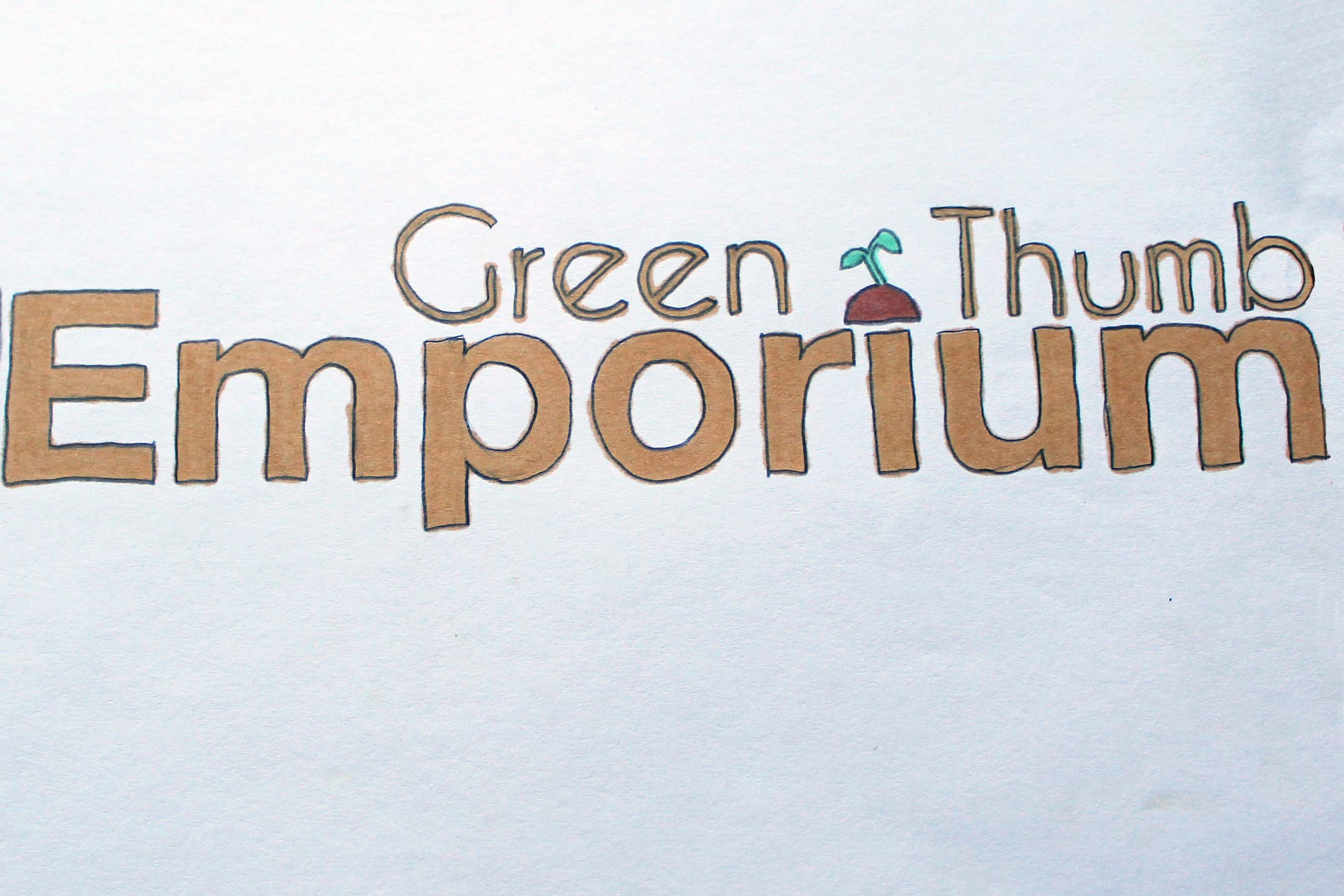
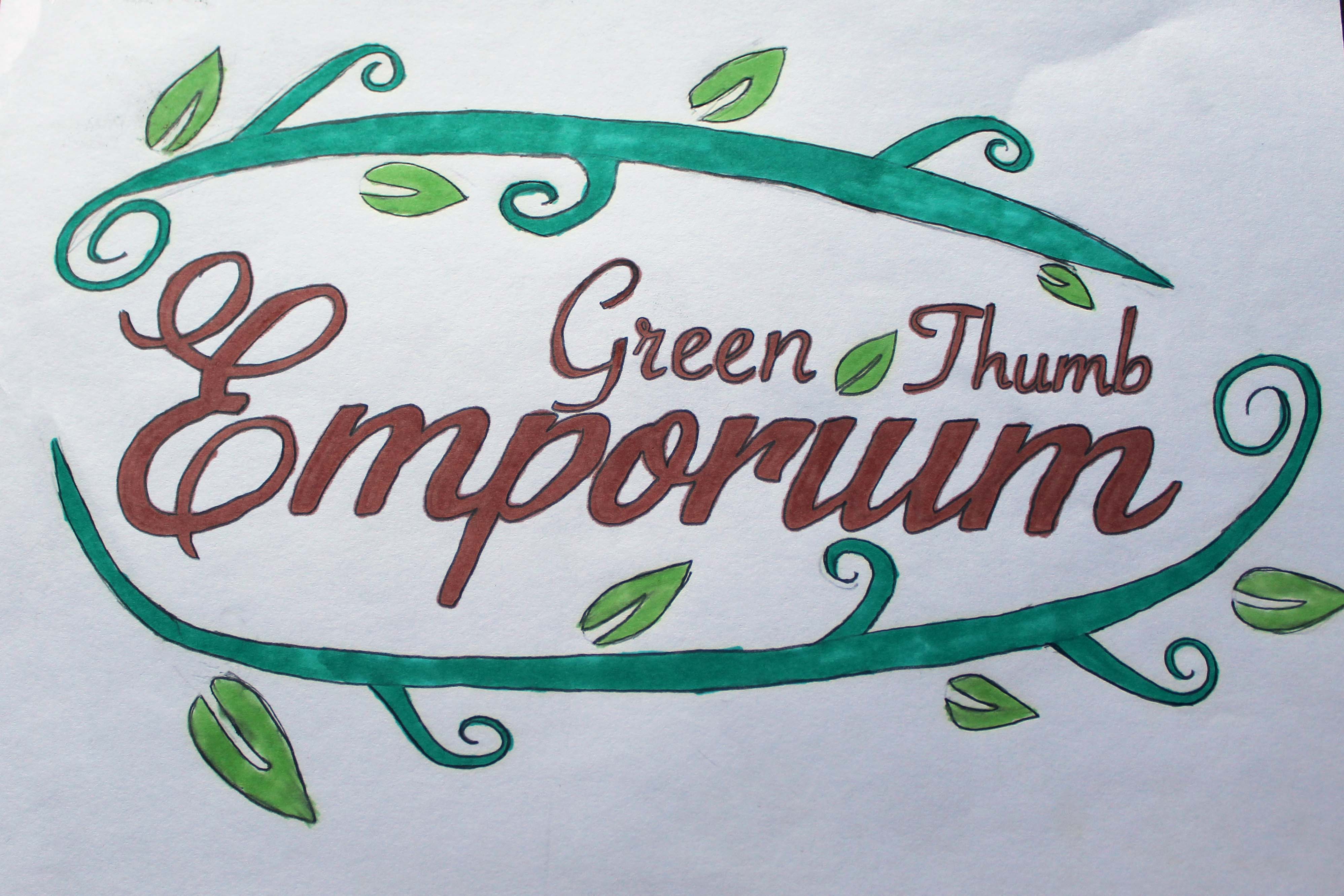
These logo roughs were after completing sketches of the logo. All three options are different typefaces and color options because I wanted a range of what would fit the Green Thumb Emporium brand. The first option focused on a script-style typeface with tint and shade of greens, the second was a sans-serif style with earth tones, and another script style with a mix of greens and earth tones. I chose to use the second option because it is straightforward while still showing a connection to plants with the plant graphic above the letter 'i' in Emporium. I also loved the color option for this one. The other options were solid choices, but the script-style typeface felt to be a little too much for it to represent the brand.
Process Work - Preliminary Layouts
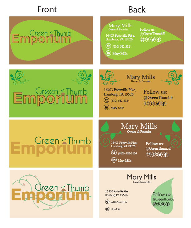
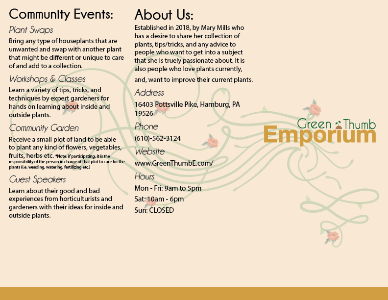
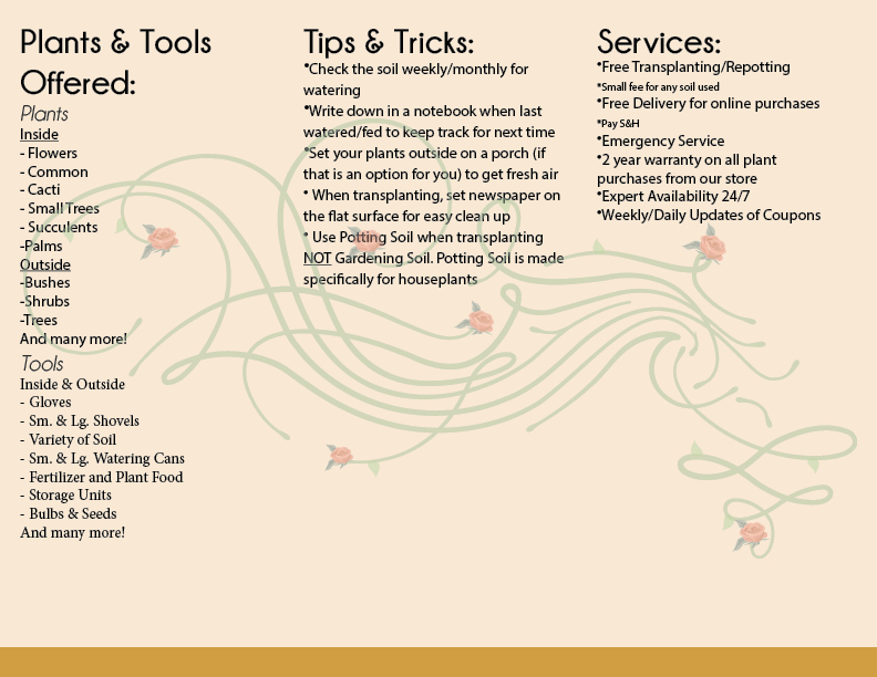
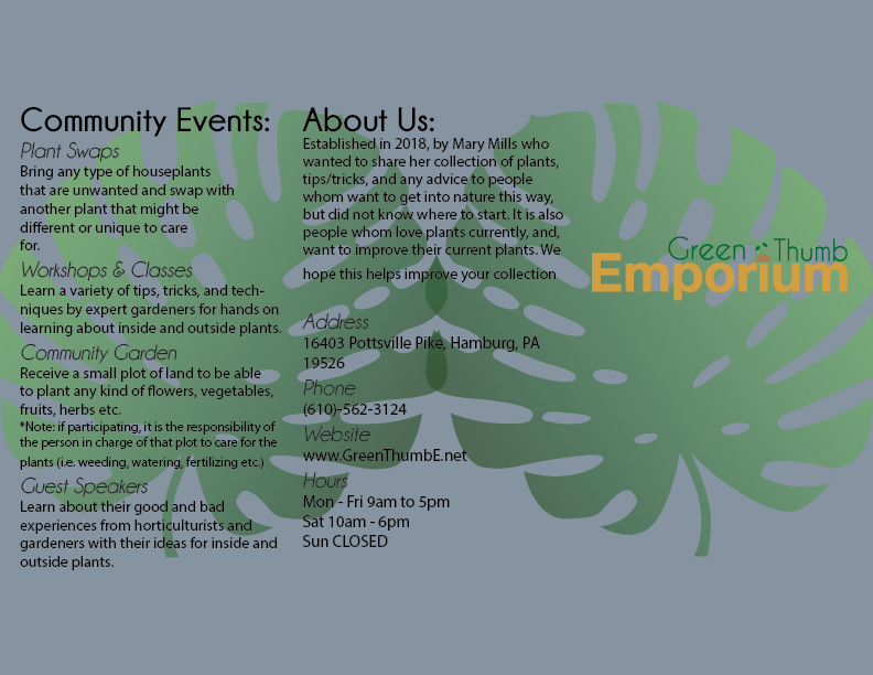
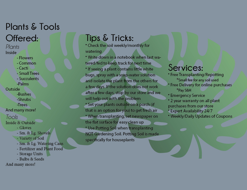
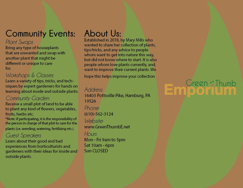
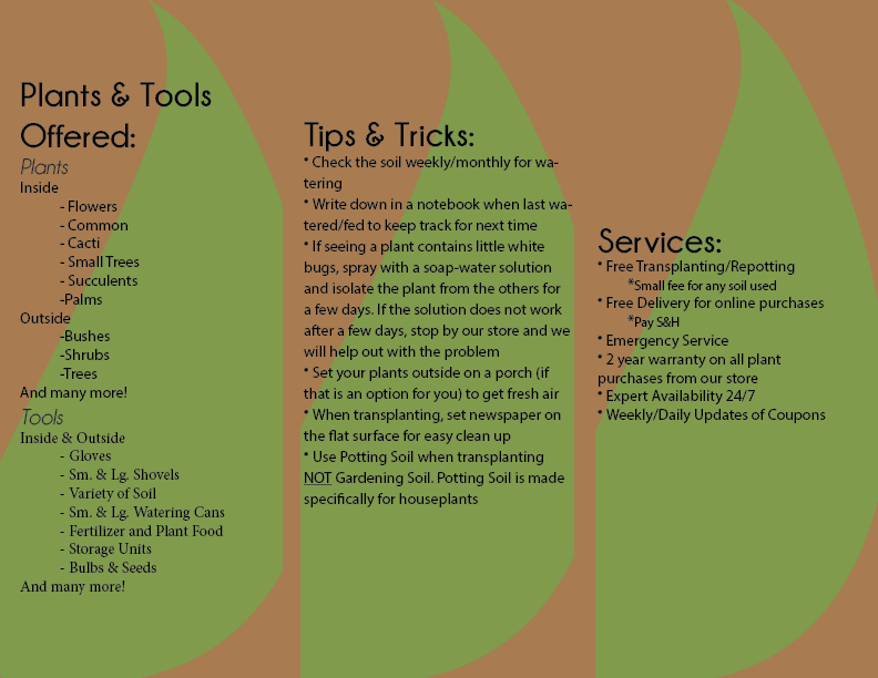
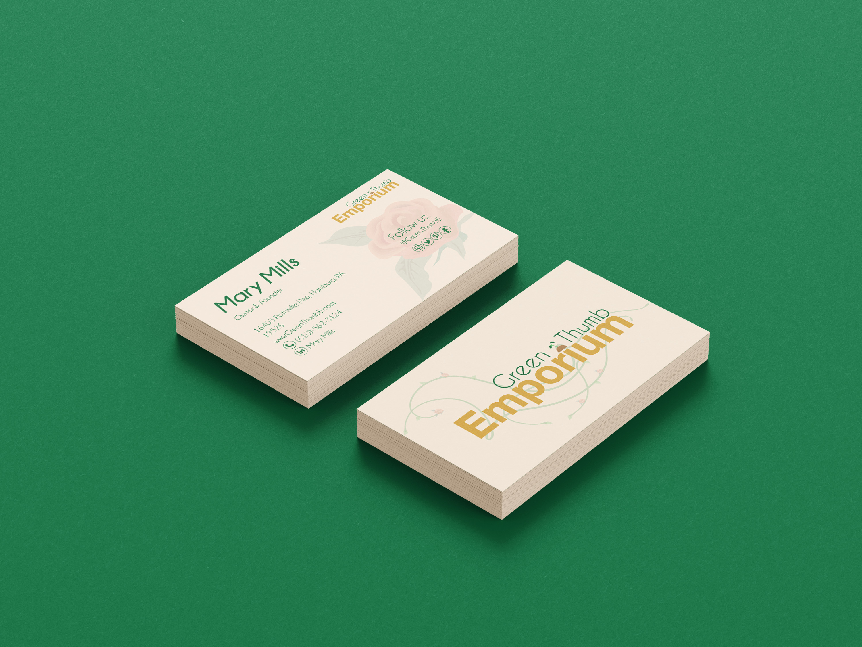
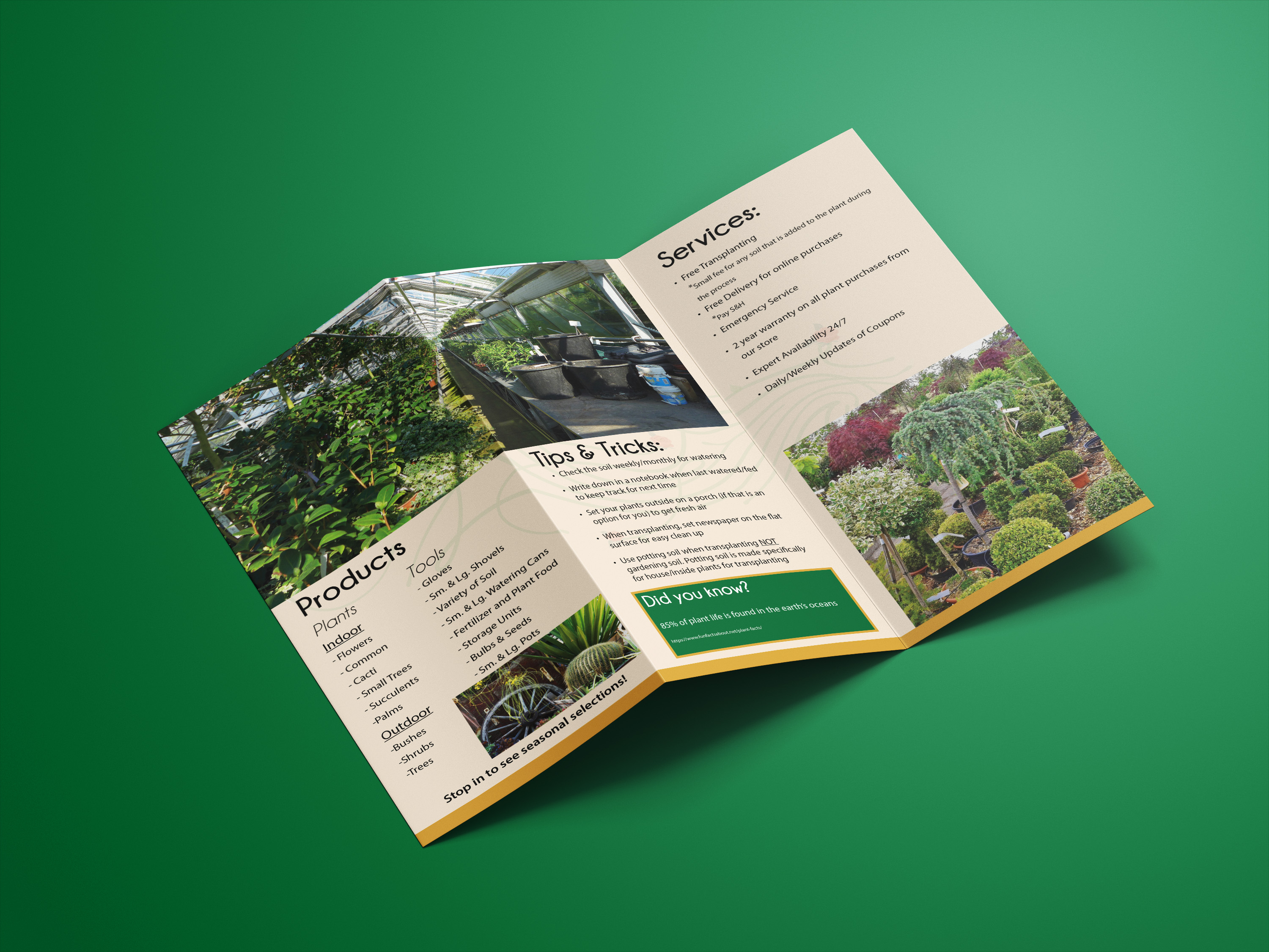
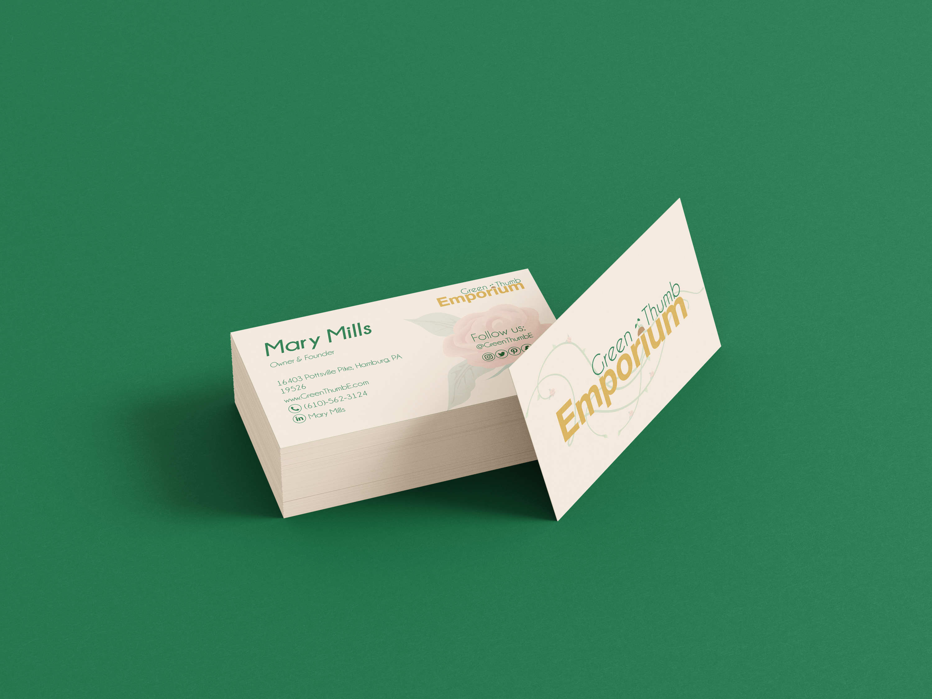
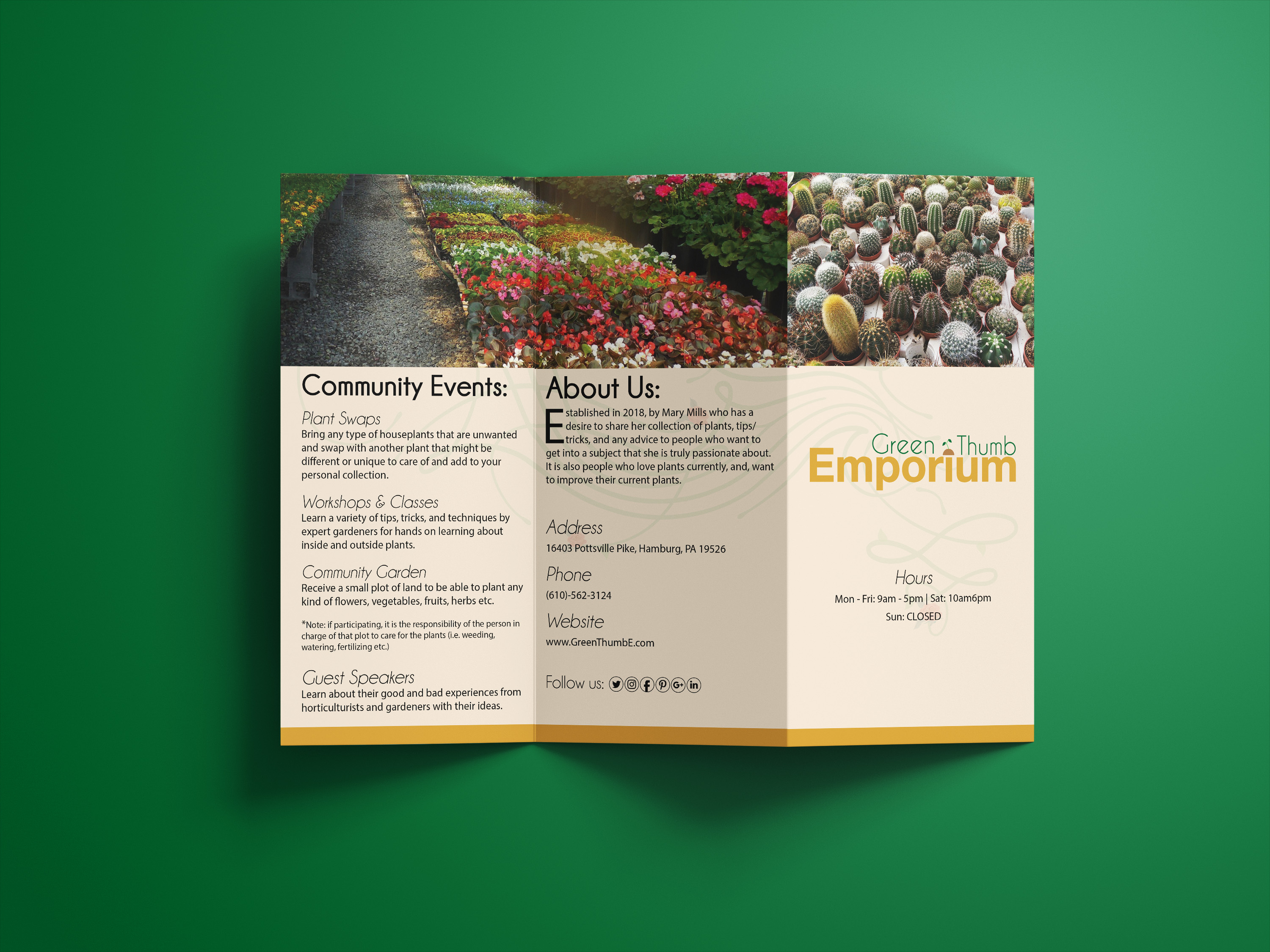
The first image is preliminary layouts for the front and back of the business card. Next are the early layout designs for the brochure. I already had picked out the final logo design, so for each of these designs, I centered them around the logo design to follow what kind of colors and typefaces I wanted to use for each. I tried to use similar graphics that I brainstormed for these pieces in the sketches. The final option I picked for the business card design was the one on the bottom because I liked the background color and how it looked against the Green Thumb Emporium logo. The only change from that design is adding the vine shown on the front to the back of the business card in low opacity for cohesiveness. The other choices were great, but they used too much of dark colors, where it needed that balance of a lighter color for the background. After the business card selection, I modeled that design to create and pick the brochure design that has the same background color as the business card. The same goes for the other choices, they were too dark in color in the background, and the use of high-opacity plant leaves was distracting, making it not a suitable pick for the brochure design.
Mockups
