Laura Mills Graphic Design

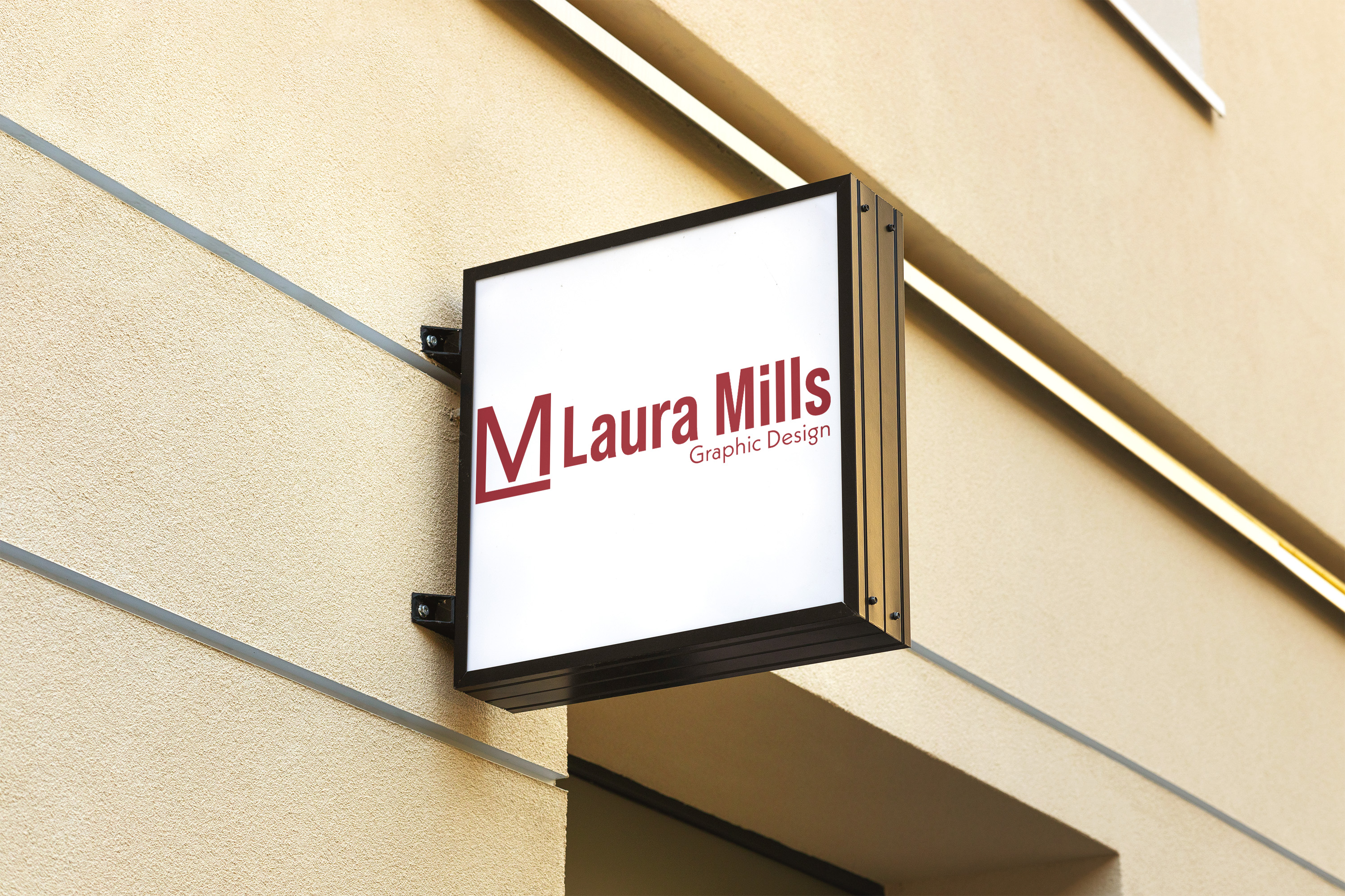
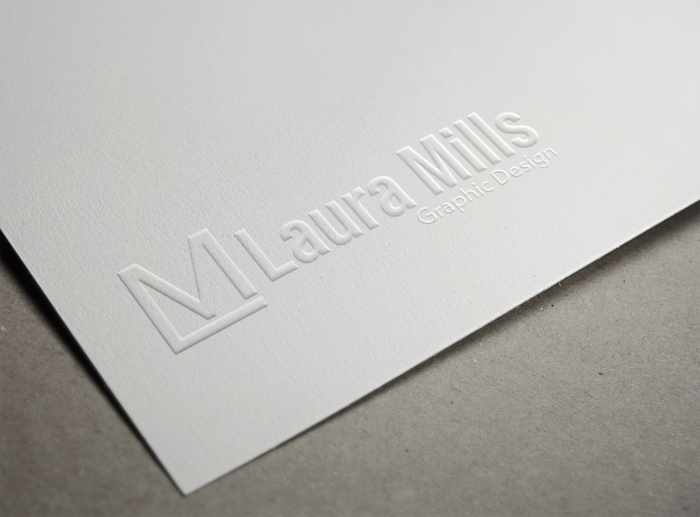
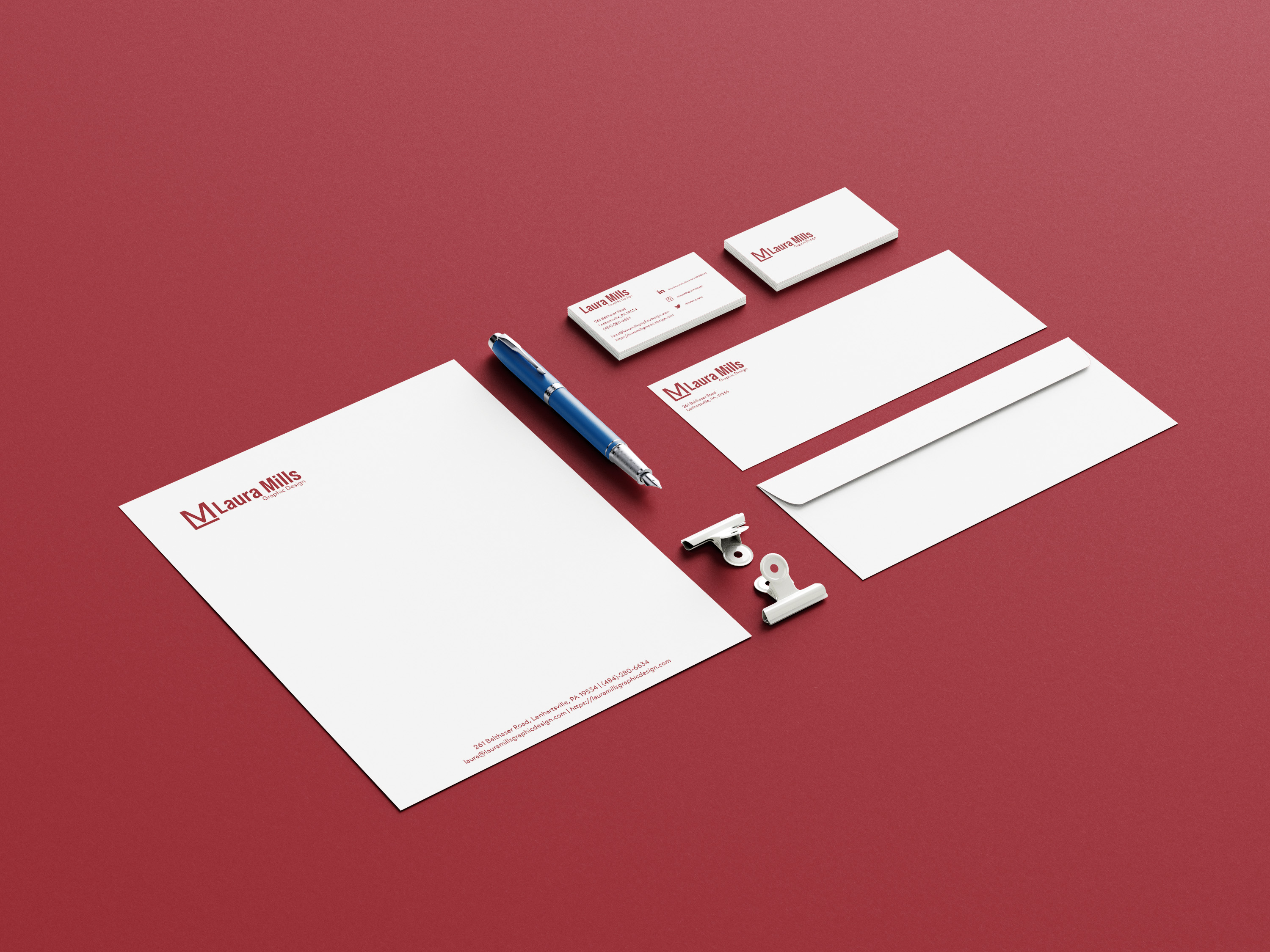
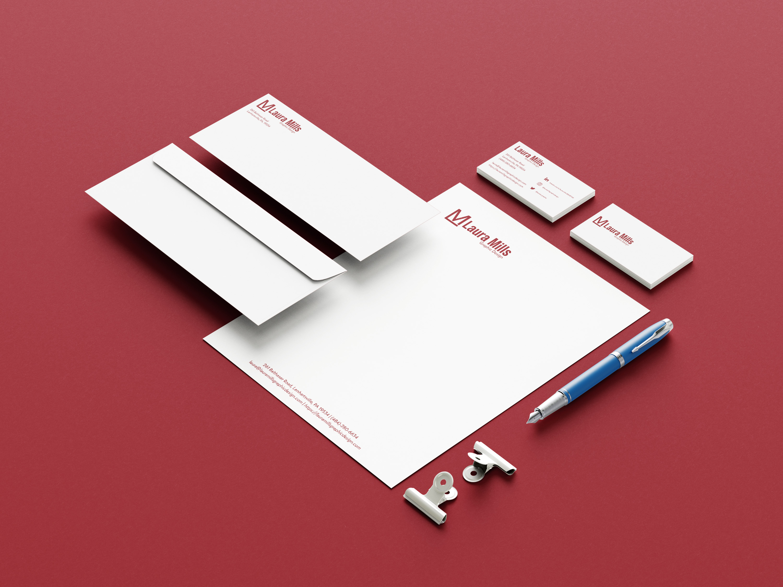
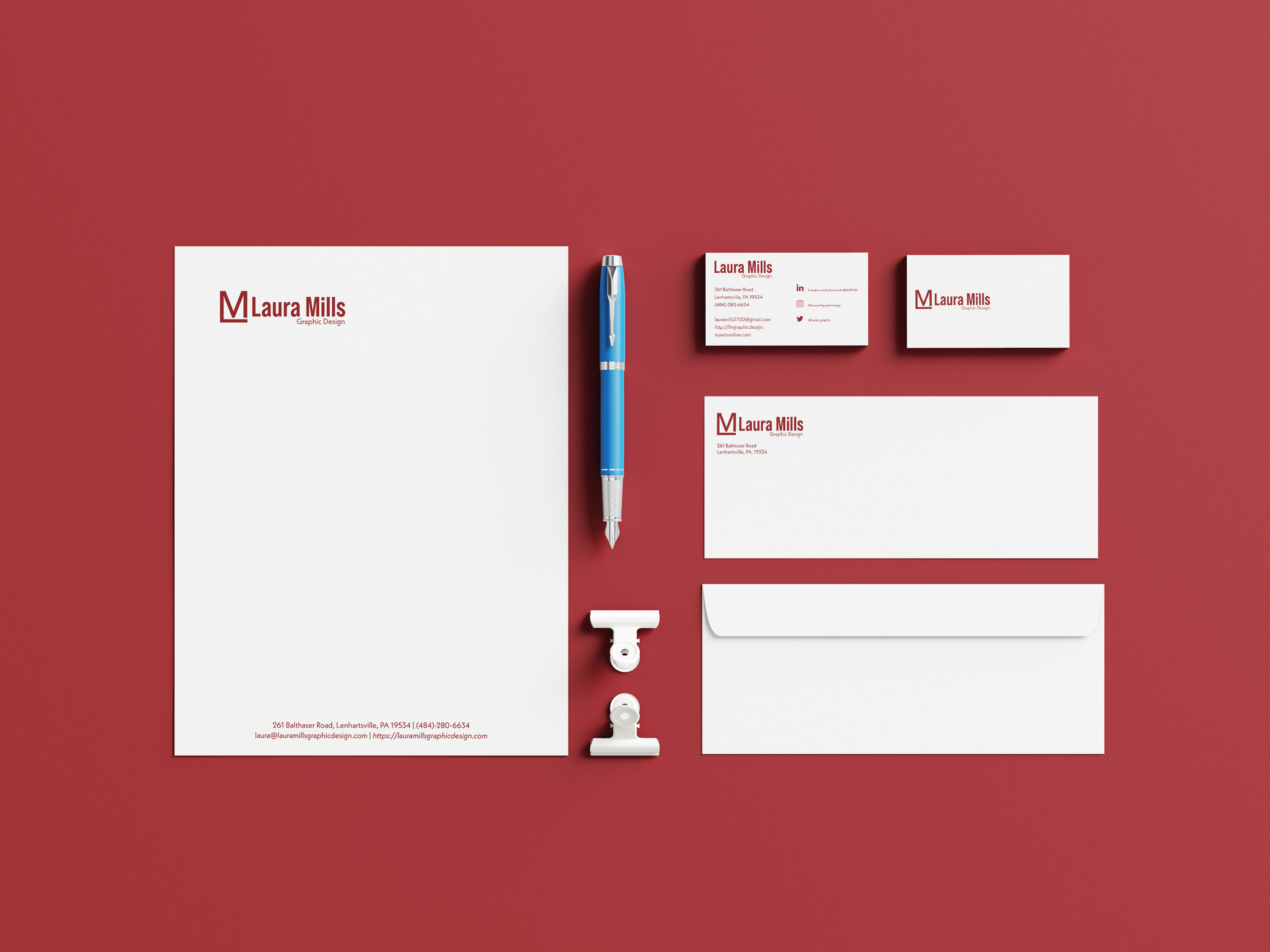
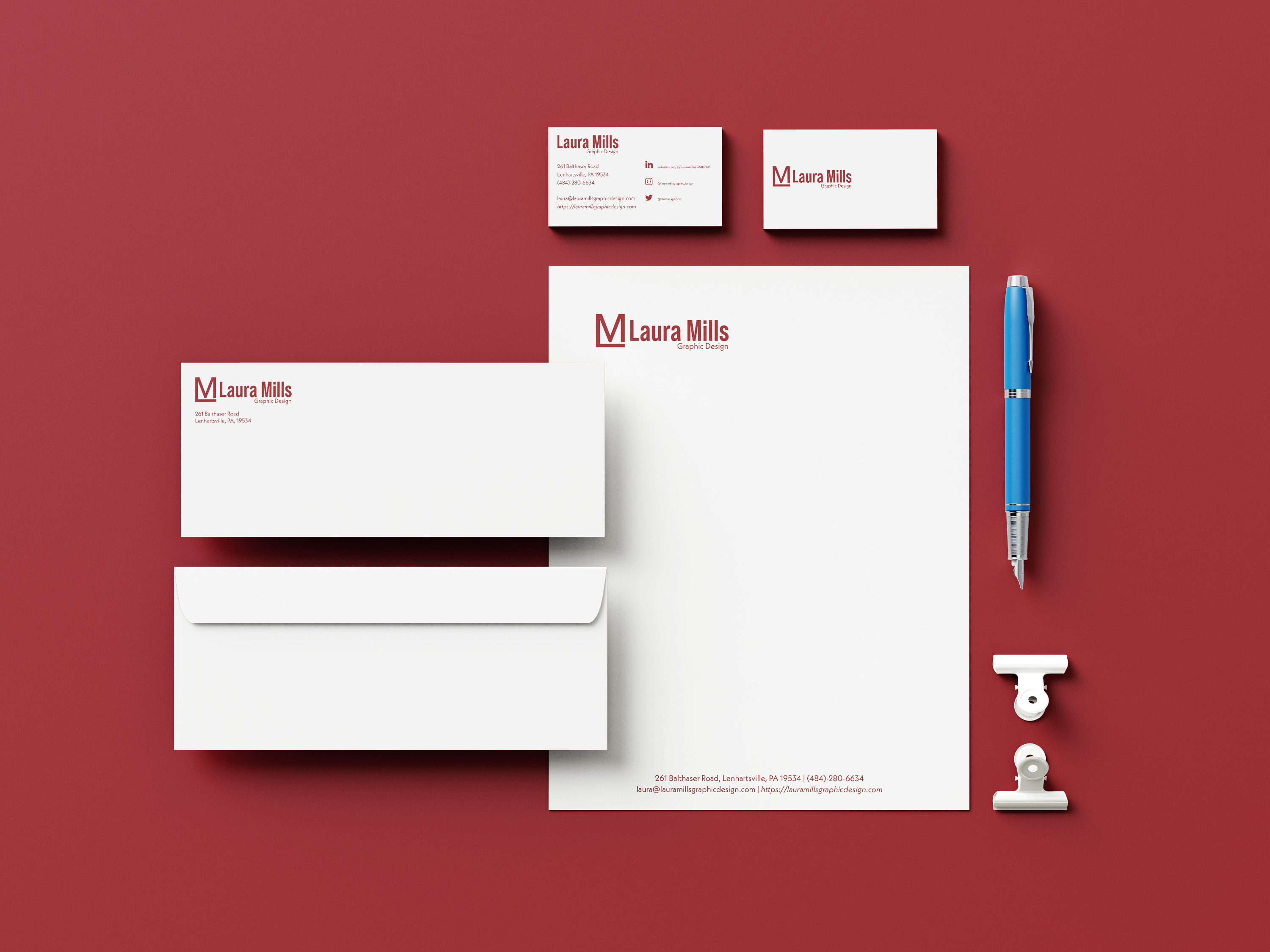
Laura Mills Graphic Design is my branding package made up of a logo, business card, letterhead, and a number 10 envelope. The minimalist approach with one color embodies my personality and enjoyment of graphic design. The target audience is mainly adults as potential clients who need a graphic designer to create something for their business, like advertisements, branding, or other marketing materials. It could also serve as inspiration for other graphic designers who are looking to upgrade their branding. The software used to create these pieces was Adobe Illustrator and InDesign. Adobe Illustrator helped create the logo, and InDesign served as the page layout of the business card, letterhead, and number 10 envelope. The design intent is to market and communicate my services to potential clients as a graphic designer.
Digital Thumbnails
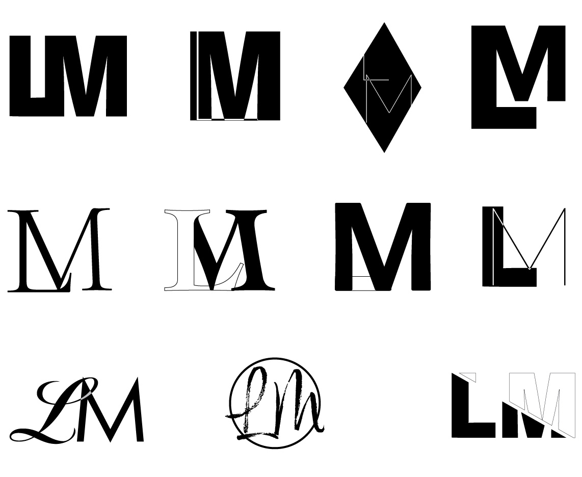
These were some of the initial ideas created digitally with Adobe Illustrator of what I wanted my logomark to look like. I experimented with an assortment of typefaces together in different positions and sizes, with shapes and effects on the logomark. Overall, the concept was having the letters 'L' and 'M' connected to different parts of the character.
Type Study
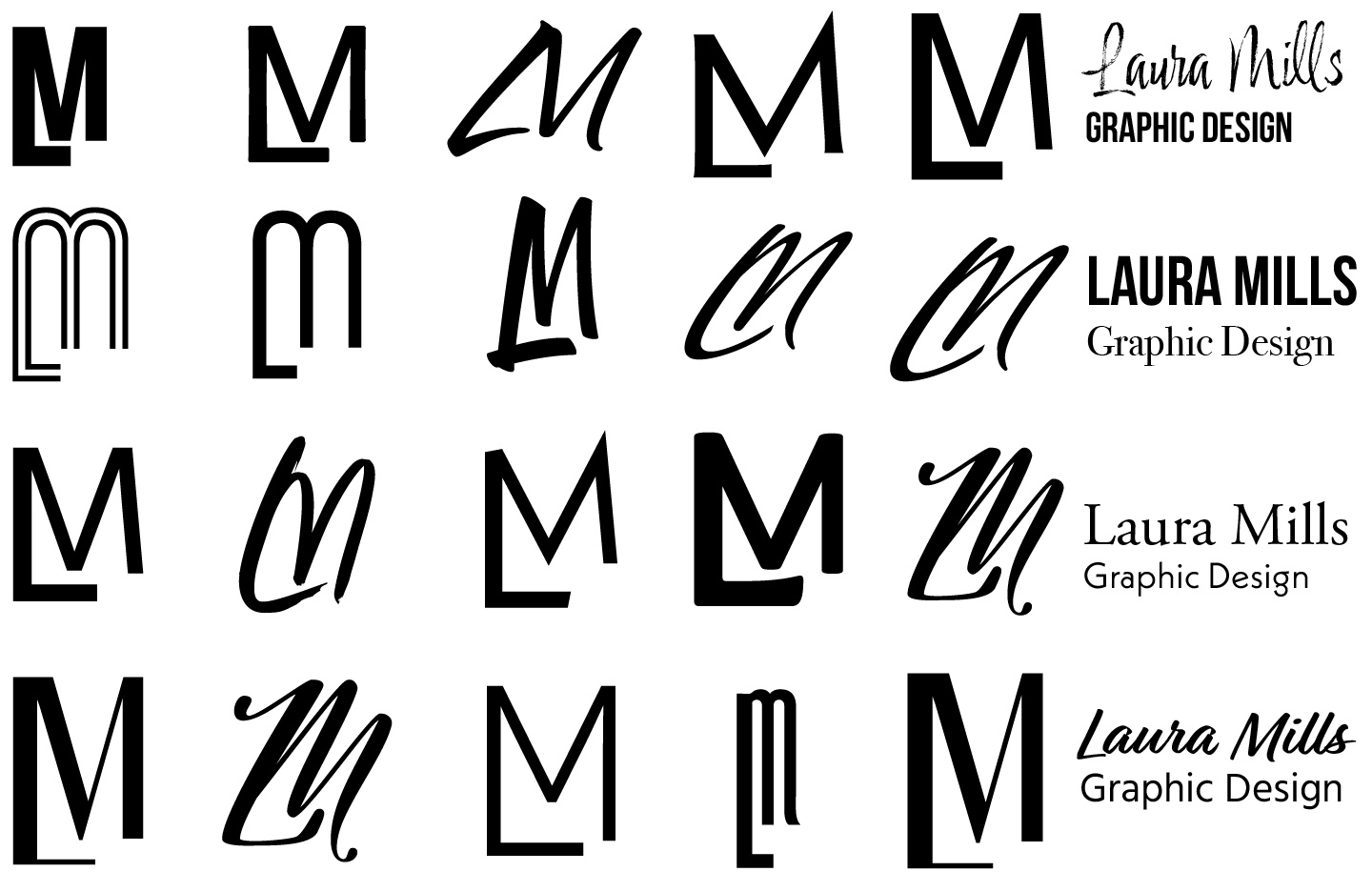
The options listed here are rough logomark designs with some ideas for the wordmark portion of the logo design. After I knew how I wanted the logomark to appear, I went through many typefaces to see which would look the best together and in conjunction with the wordmark.
Color Study
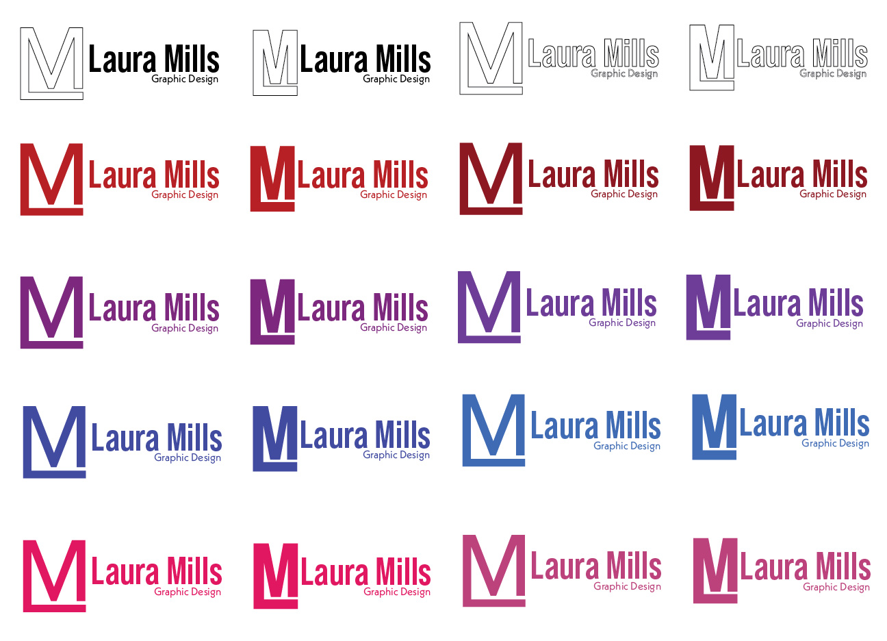
I created this to show different color variations I was considering after I had narrowed down my complete logo to two versions. All these color choices passed the color accessibility checker, so there is optimum contrast between the white background and the color selected. The final pick is the variation in the second row and the third in that column. I picked this color because it represents my love and enthusiasm for graphic design, and it's a hue that is not super dark or bright that could be distracting.
Final Designs

The final choice for the logo was the option on the left because I liked how the characters formed when put together, and it wasn't super bold for the type style of the entire logo. The other option was a great choice, but I felt the logomark was too strong for type style, and with the wordmark section; it made it complicated what the viewer's eye should focus on first.
Mockups
