Tomas Lara

Tomas Lara contacted me via Fiverr for a brand identity refresh to better align with his professional endeavors, such as Spanish audiobook narration and digital marketing. I created a new logo and social media banners for Twitter/X, LinkedIn, and YouTube. Tomas requested a simple, minimalist logo, which I achieved using two fonts and two colors. This approach gives his brand a clean, professional appearance suitable for his target audience, which includes potential clients like authors seeking audiobook narrators, listeners of Tomas's work, and Spanish-speaking audiences. This branding could also inspire other audiobook narrators to develop or update their branding. I used Adobe Illustrator to design the logo and social media banners, effectively marketing Tomas's services. The design intent is to market and advertise Tomas's services for his audiobook narration and other professional endeavors he wants to pursue.
Digital Thumbnails
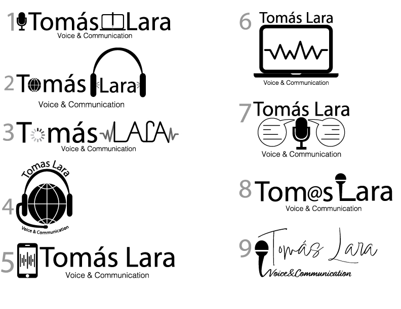
This was the first set of thumbnails I created in Adobe Illustrator for Tomas's logo. However, I misunderstood what he wanted his new logo to look like because he sent an image of his old logo, which I took as an indication that he wanted the new logo to appear similar to the old one. After I sent him these iterations of the thumbnails, he clarified his preferences. I assured him that I would go back and redo the designs to better align with his vision. These initial logos were intended to capture both his audiobook narration and digital marketing pursuits.
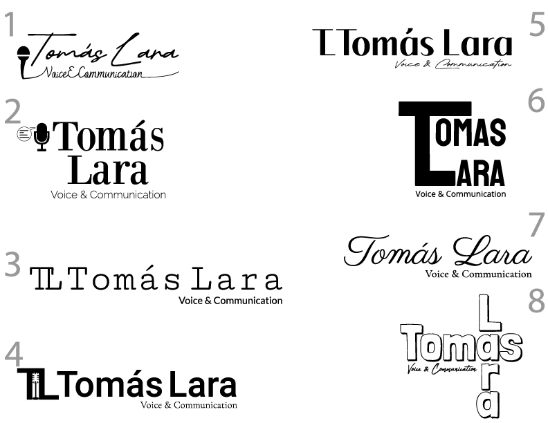
These are the revised thumbnails based on Tomas's envisioned logo. After clarifying the confusion from the first attempt, I understood that he wanted a monogram-style logo. This makes sense as it allows him to market himself across all professional endeavors, including audiobook narration and digital marketing. I created these in Illustrator, focusing on connecting the 'T' from his first name with the 'L' from his last name to form the logomark, and using his first and last names for the wordmark. Together, the logomark and wordmark constitute the full logo. The goal was to create thumbnails that exude elegance, professionalism, and clear communication.
Type Study
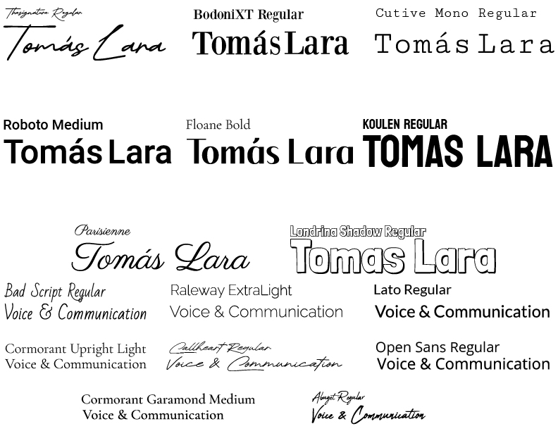
These are the fonts I used in the redesigned logo thumbnails. I included fonts in the thumbnail designs to give Tomas a better idea of what the final concept would look like, even without color. This allowed me to showcase font options that I felt best conveyed the goals Tomas had for his logo. Since he wanted the logo to exude elegance, professionalism, and clear communication, I experimented with handwritten styles, bold and contrasting sans-serif styles, and unique serif fonts. Additionally, I included a slab serif style to subtly reference Tomas's work as an audiobook narrator.
Roughs and Color Study
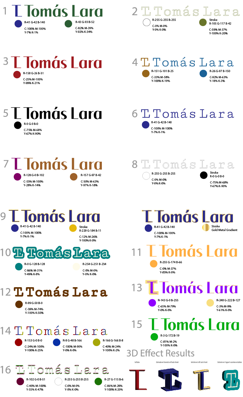
This phase is what I consider the rough stage of the creative process for Tomas's logo. I incorporated feedback from the redesigned thumbnails, had Tomas select the ones he liked, and then experimented with a variety of colors to align with his goals. Tomas suggested incorporating a navy blue from his previous logo, which I did, but I also tried other solid colors and combinations, ensuring they passed a color accessibility checker for contrast. I explored color combinations that were contrasting and those based on their color theory meanings and emotional connotations. Tomas also expressed interest in potentially having the logomark in a 3D effect, so I demonstrated the different options available in Illustrator. Ultimately, we decided that the 3D effect did not look right, so we discarded that idea. Lastly, Tomas chose to remove the "Voice and Communication" tagline from below the logo.
Final Design Adjustments
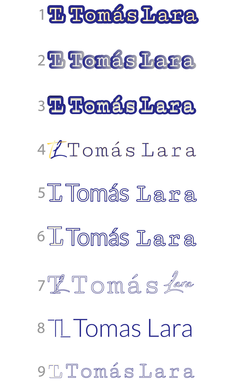
These are the final tweaks to Tomas Lara's new logo design. Before finalizing the logo, Tomas wanted it to be a bit more unique yet still simple, especially since the 3D effect did not work out as he had hoped. My plan was to revisit the design and find ways to make it more interesting while meeting Tomas's request. For example, I considered adding a gold metal gradient, retrying the 3D effect, or mixing different fonts. One idea was to revisit the fonts used in the redesigned thumbnails. I realized that a unique and interesting aspect could be to use the arm of the slab serif 'L' in Lara to the bottom of the sans serif 'T' in Tomas, creating the logomark. Finally, I used the same font for the 'T' in both the logomark and the name Tomas, and the same font for the 'L' in both the logomark and the name Lara.
Social Media Profile Banners


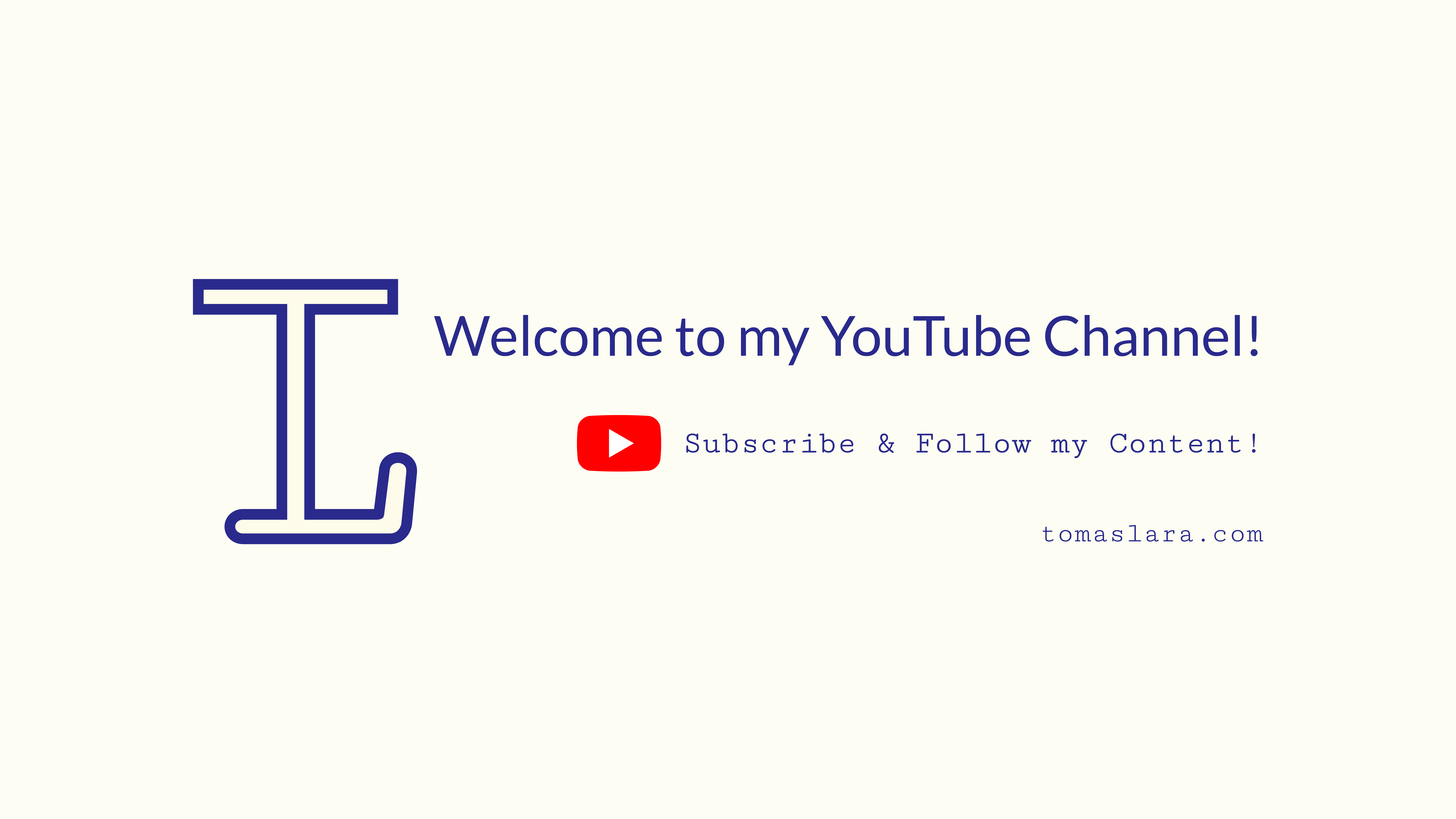
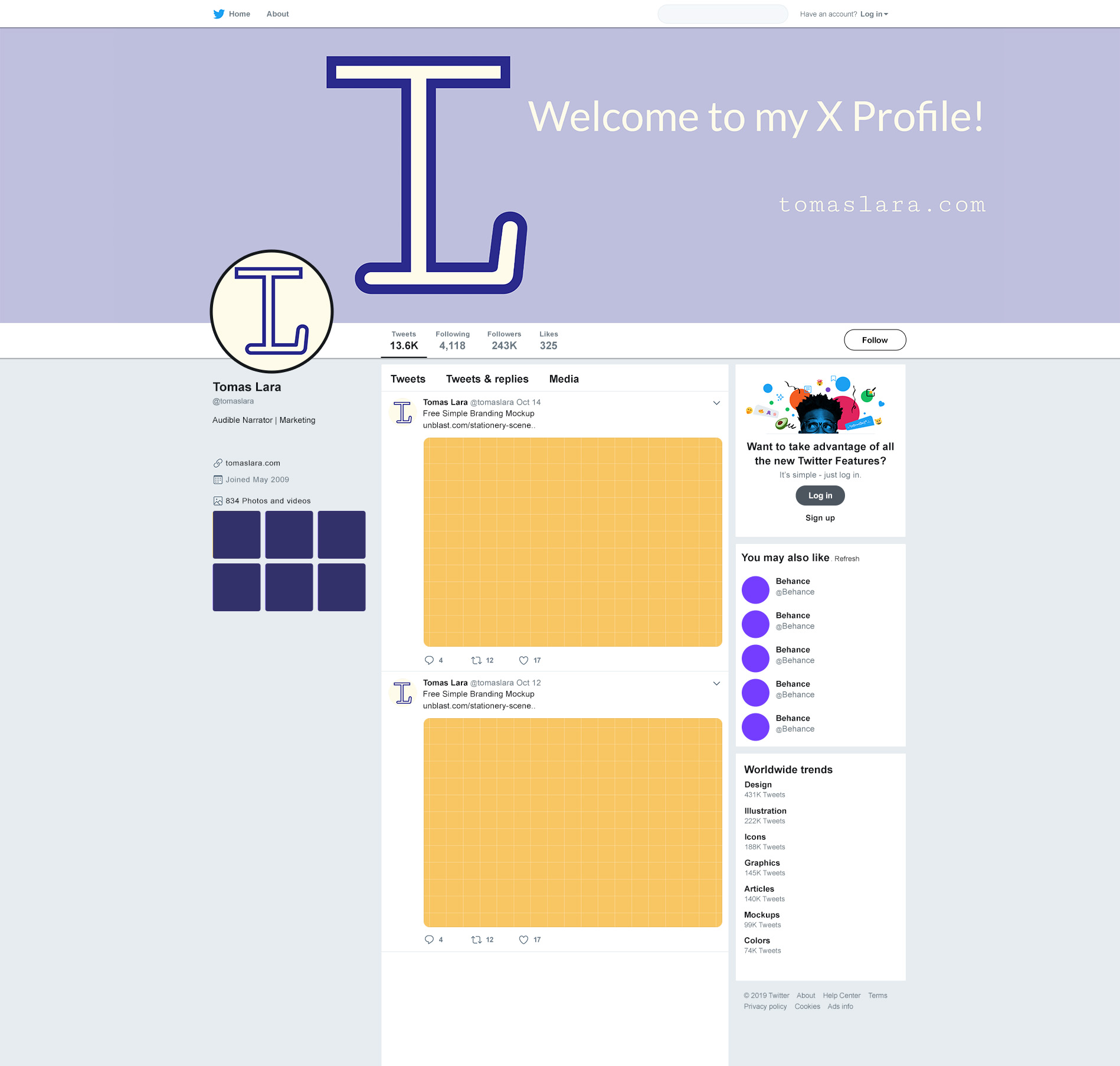
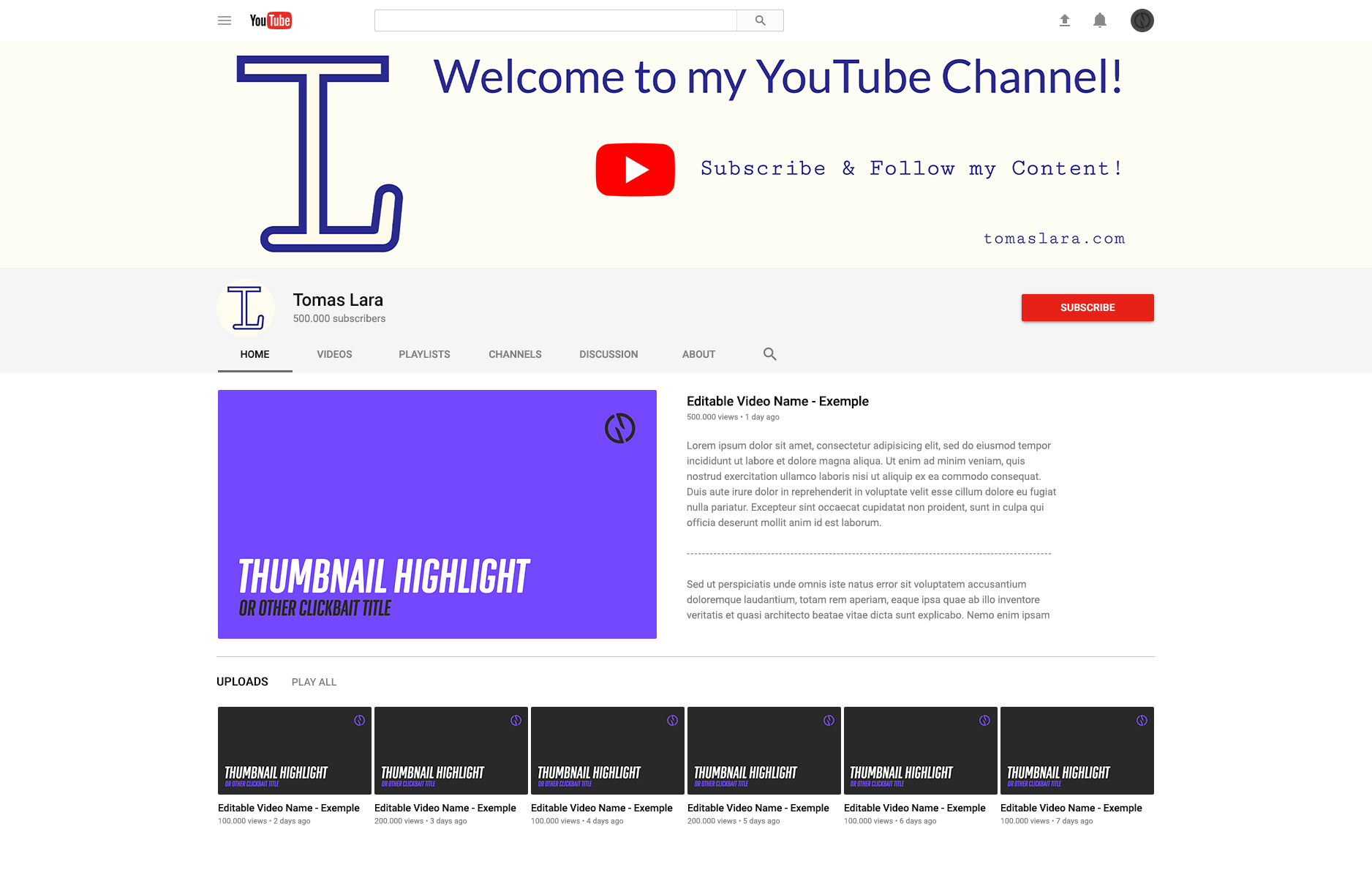
These are the social media profile banners I designed last for Tomas's branding package. He requested banners for his Twitter/X, LinkedIn, and YouTube profile pages. Although I would have liked to go through the creative process for these designs, Tomas had a tight schedule for updating his branding on his website and social media platforms. Fortunately, he provided clear instructions for each banner, simplifying the layout process. Once I completed one banner, it made sense to replicate the layout for the others. The only adjustment I had to make was shifting the content to the right in the Twitter/X and LinkedIn banners to accommodate the space taken up by the profile picture box on those social media pages.
Mockups
