Food Pattern Illustration
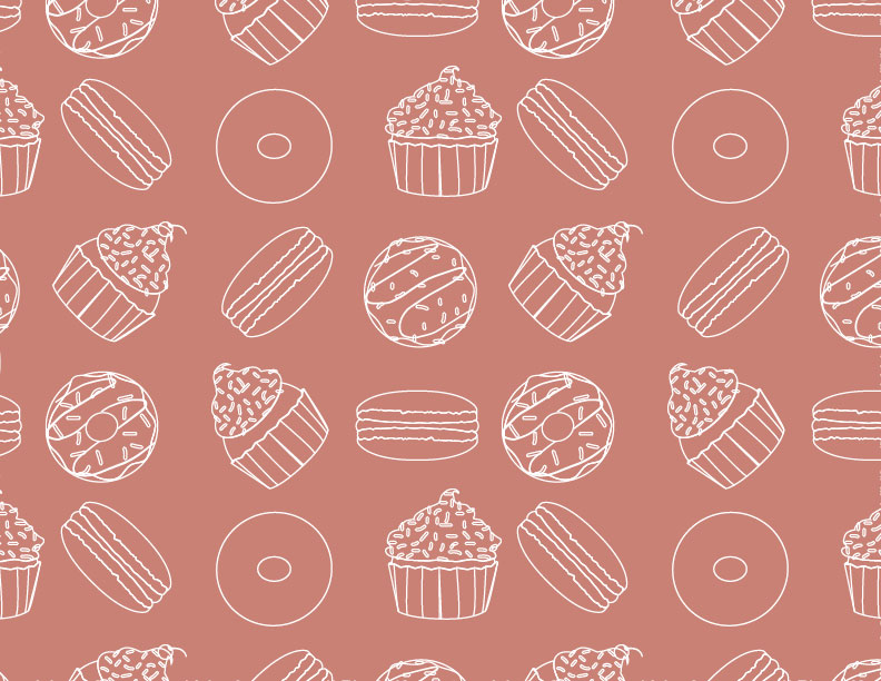
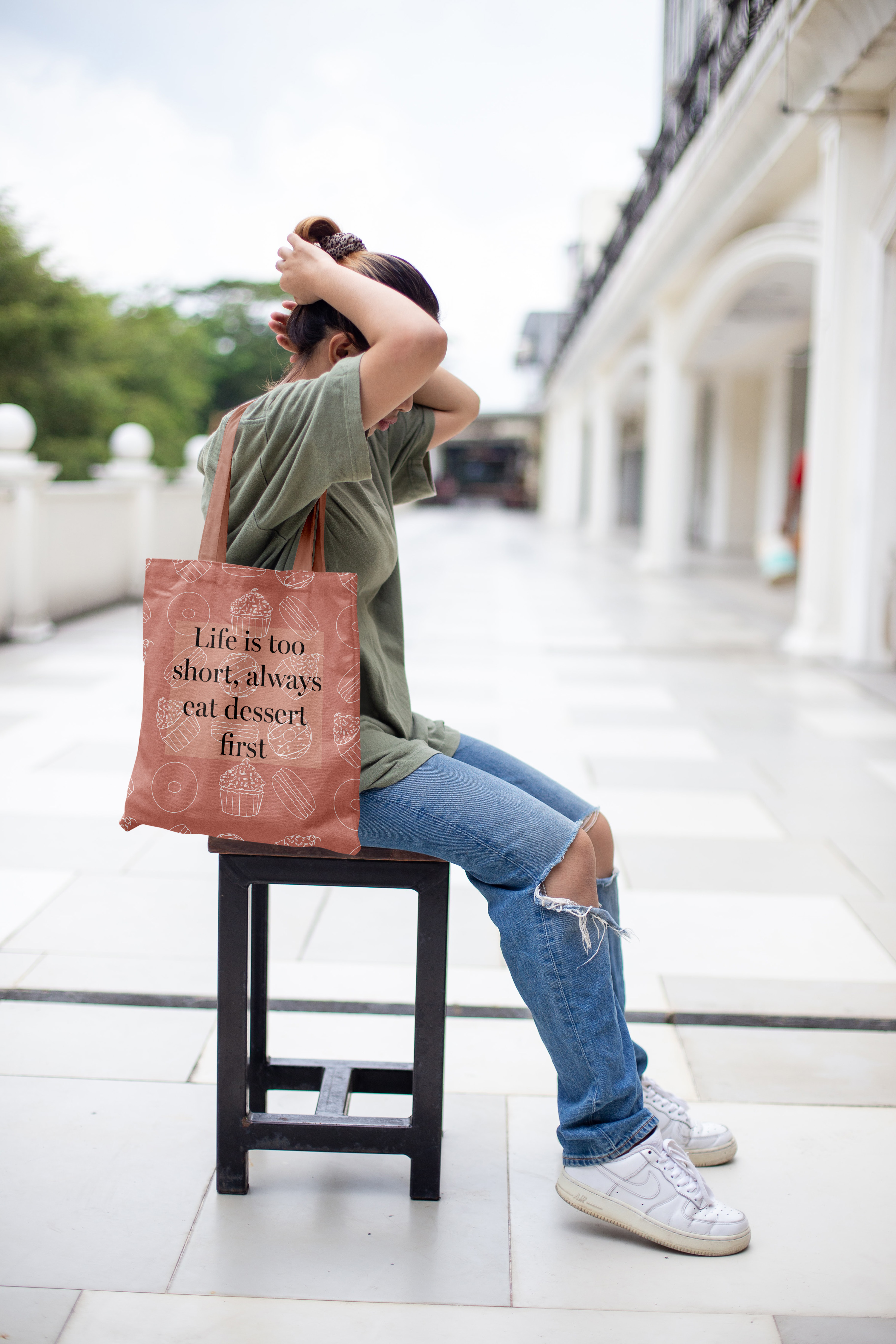
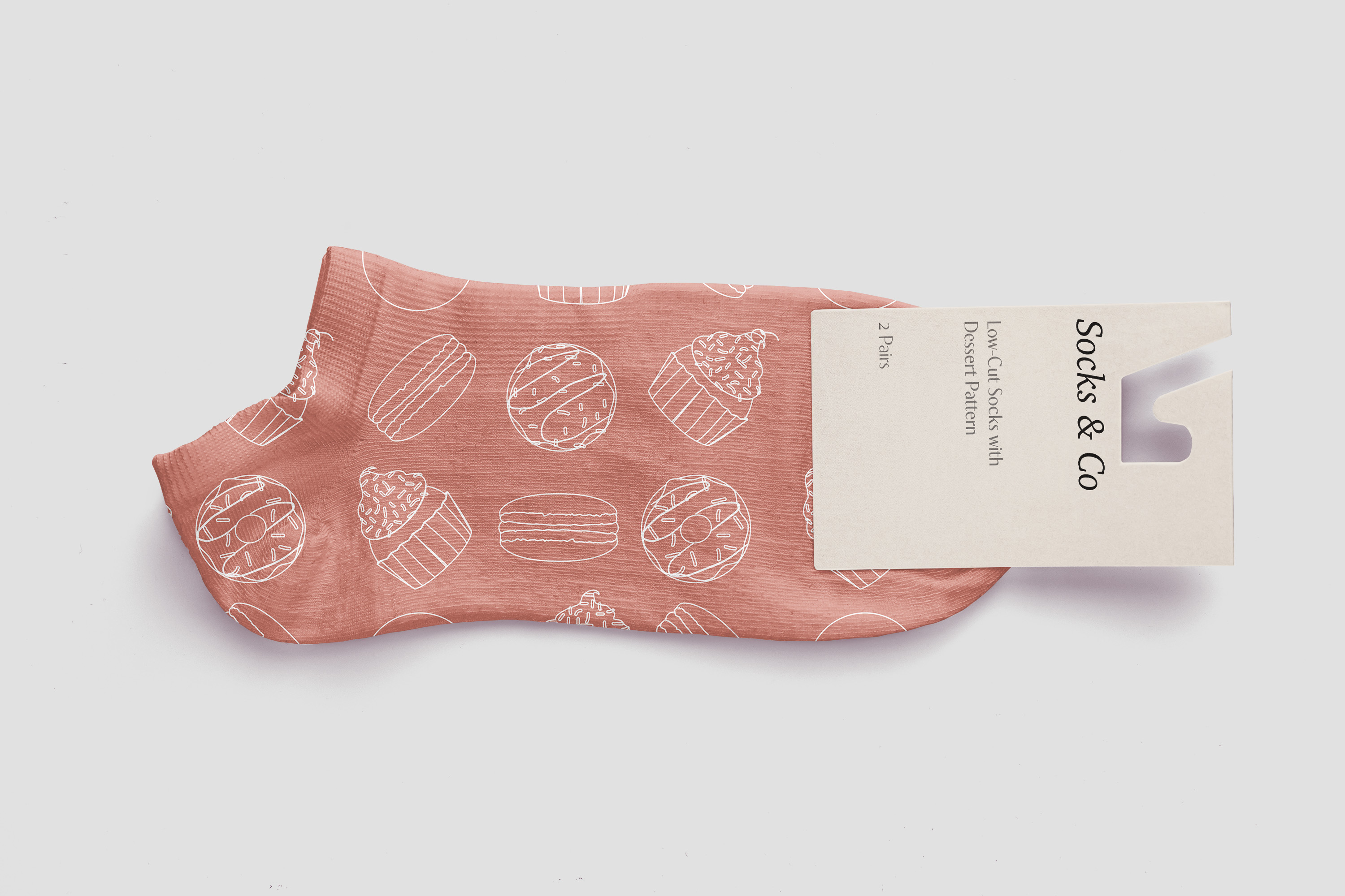
The Food Pattern Illustration is a variety of desserts, with different kinds of doughnuts, cupcakes, and macaron cookies. The pattern also includes having the three desserts repeated by facing alternate directions to make it more of a repeating pattern so that they are not all the same. The target audience is anyone who loves creating or seeing designs that use food or desserts. It can also be for artists or creative individuals that like artistic patterns using line artwork in a pattern or non-pattern-related artwork that uses line art. The software used was Adobe Illustrator since I drew out the desserts using either the shape or pen tool, depending on how detailed or intricate the dessert drawn is. The design intent was to create an interesting repeating pattern with desserts making it stand out.
Process Work - Sketches
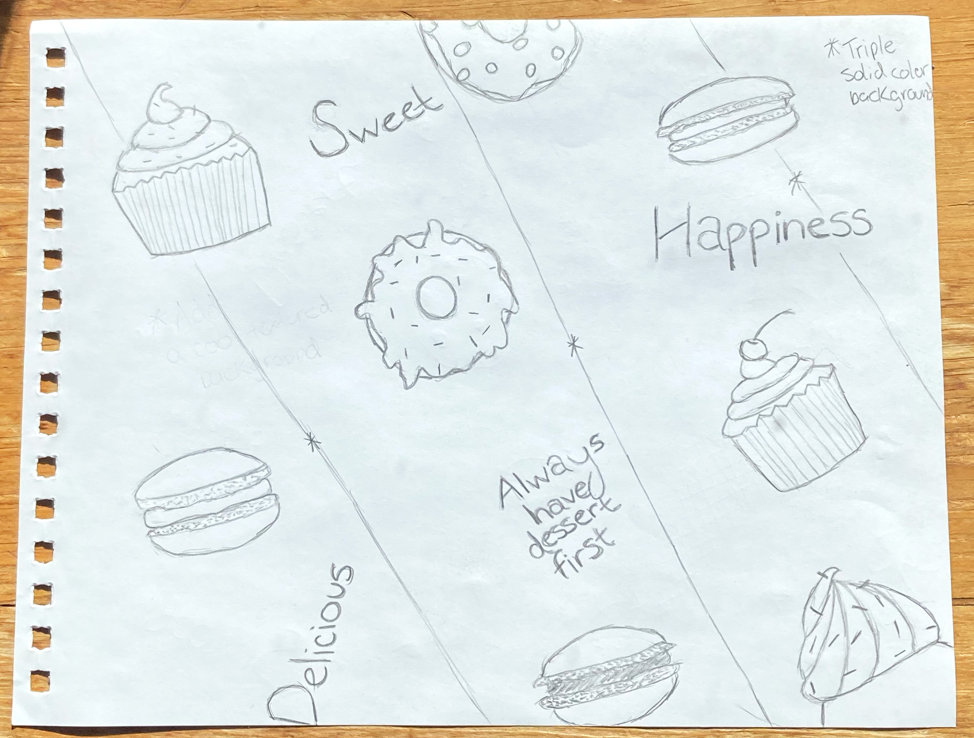
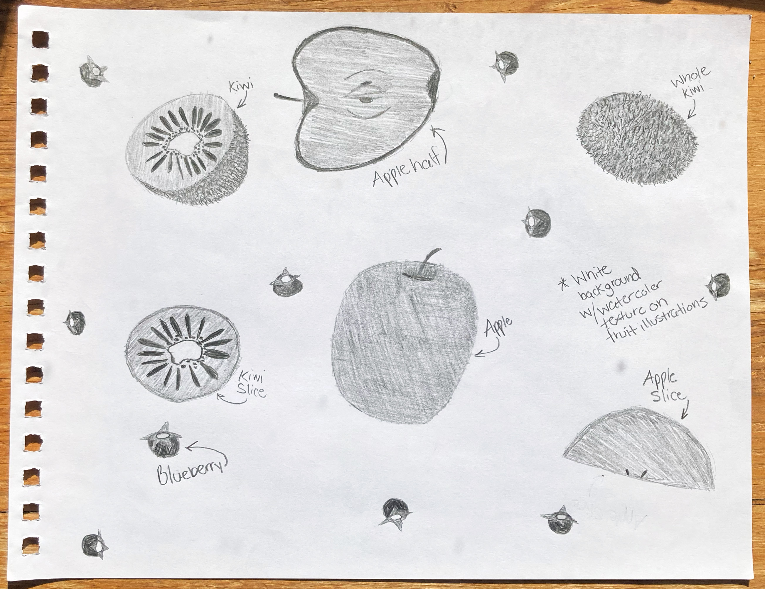
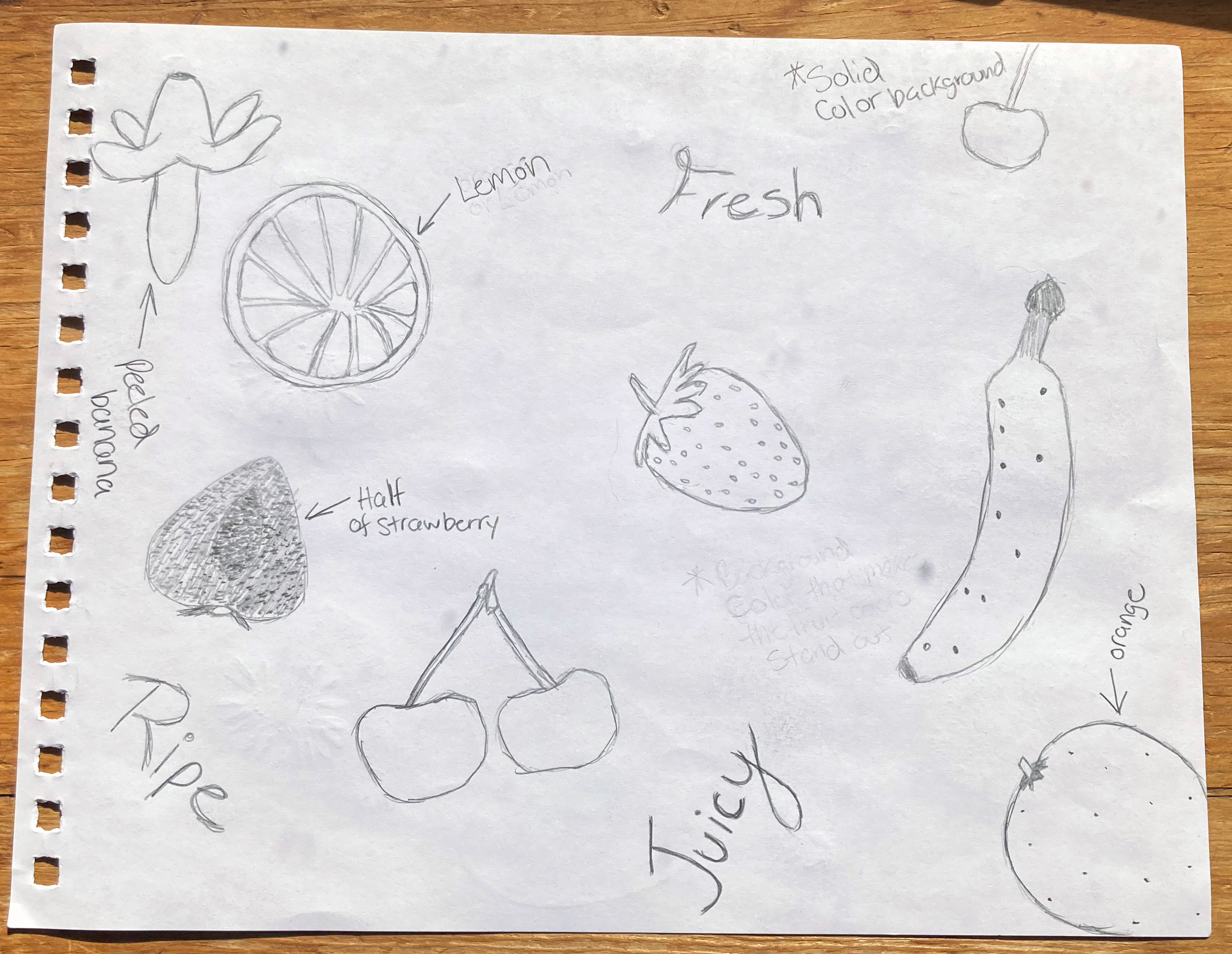
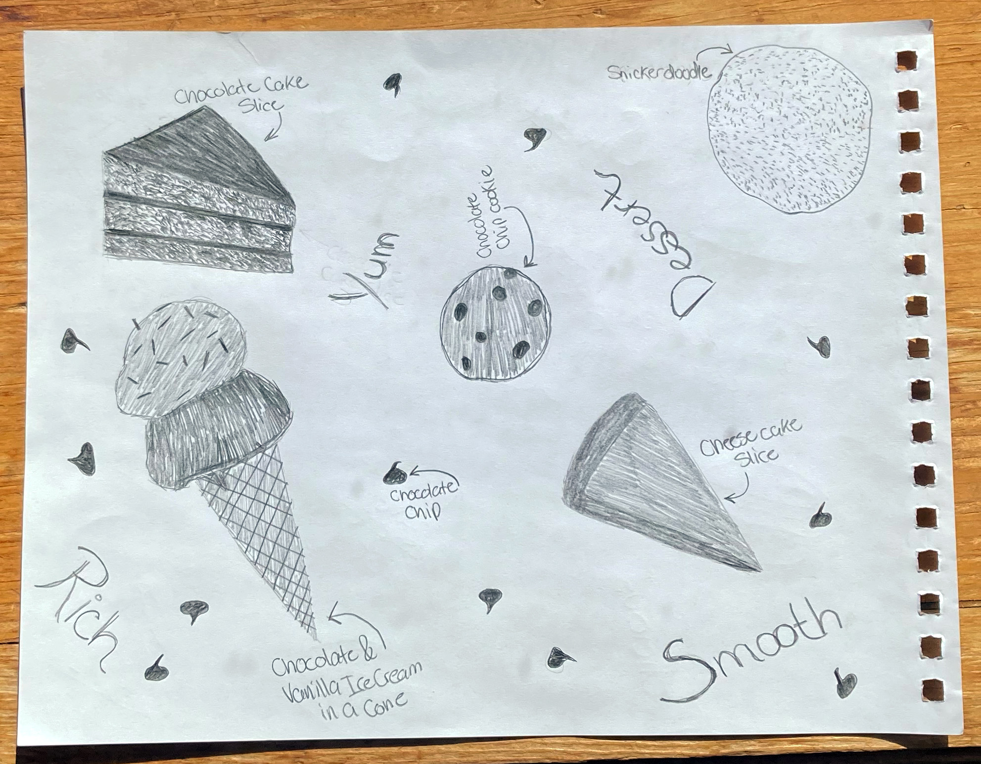
The idea behind this artwork started with making a pattern, and then I decided to use food-focused desserts and fruits. I always liked looking at the royalty-free images of high-quality, professional-looking pastry items and pieces of fruit displayed, which is where this creation came to fruition. I selected no more than four for each dessert and fruit-themed pattern because I didn't want the design to be overdone. It also gave a chance to show distinct flavors of desserts or assorted pieces of fruit. I also liked including some typography that is adjectives for that specific food.
Type Study
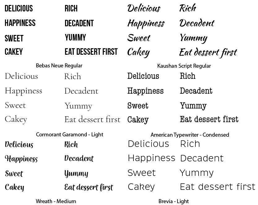
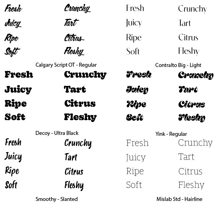
The type study for the dessert and fruit patterns involves traditional serif, sans serif, and script typeface styles. For the dessert-themed text, I chose typefaces that could be in a logo for a bakery. The fruit adjectives include a funky or bubble letter style because I felt it suited the fruit theme. Ultimately, for one of each rough designs—dessert and fruit pattern—I selected two typefaces; for the dessert, I chose Kaushan Script regular and Brevia light since they are script and sans serif styles that complement each other. The fruit design used Contralto Big Light and Decoy Ultra Black because they are serif and sans serif, which are classic pairs to use together.
Color Study
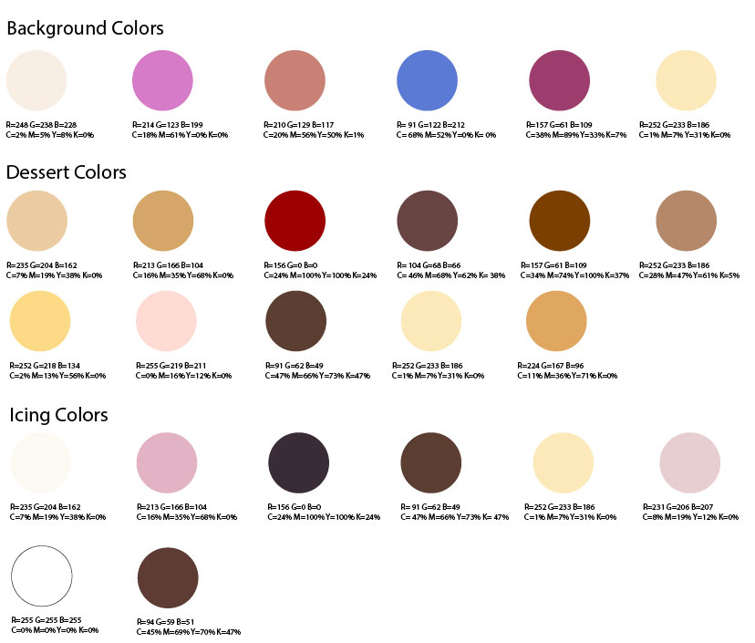
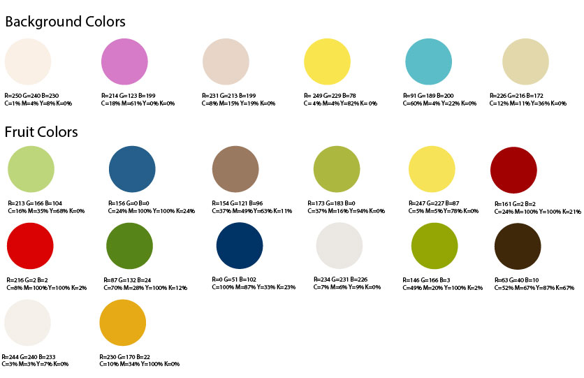
Like the type study, there is a color study for the dessert and fruit design patterns. The background colors for the dessert and fruit are a mixture of a couple of the same colors. I wanted to try some of the colors with the dessert pattern, but I felt I also might want to try it with the fruit pattern. I chose the custom color options for the dessert, icing, and fruits because I didn't want to use ones that don't exist for flavor choice. In the final pattern design, I decided on a brownish-red background because I thought using a pop of color when having the dessert illustrations with no fill and a white stroke would add contrast while adding an eye-catching pop of color at the same time.
Process Work - Digital Roughs
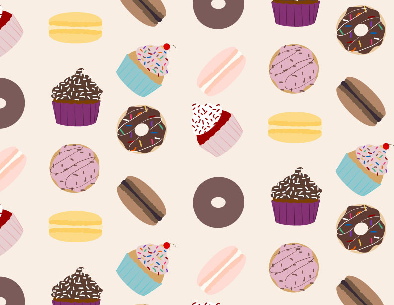
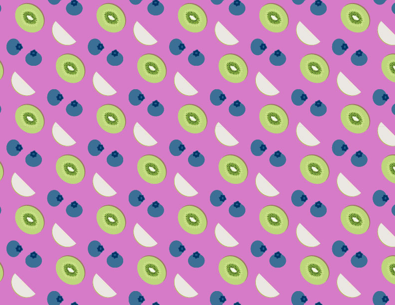
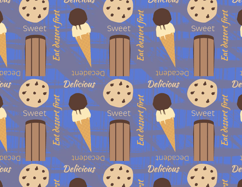
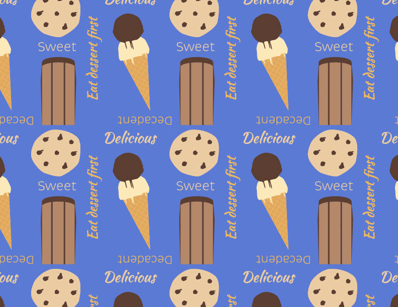
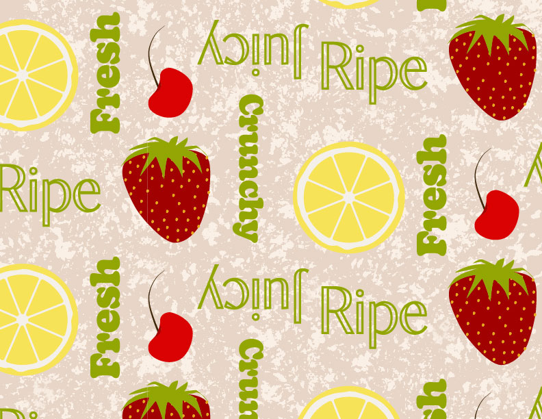
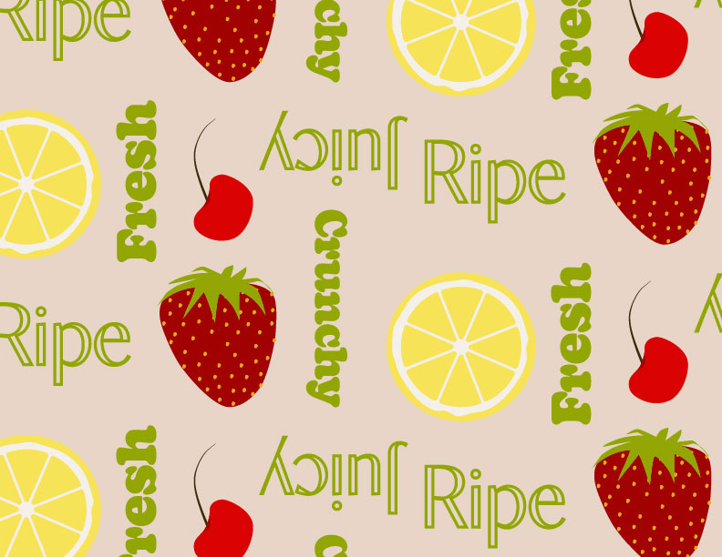
These are the rough digital designs created in Adobe Illustrator. Two patterns display twice because the background of one version has a texture from Adobe Photoshop and a solid color for the other. I wanted to do two versions of each fruit and dessert pattern because I wanted to use different fruits and desserts while also allowing for other ways to make it different, like adding text to one and not the other. It allowed me to experiment with typefaces and layouts as well. I did not pick a version of the pattern with the desserts filled in with color because I wanted to make it pop off the page and be simple. To do that, I concluded that a solid color background with the dessert graphics in a white stroke would be better.
Mockups
