Typography Illustration
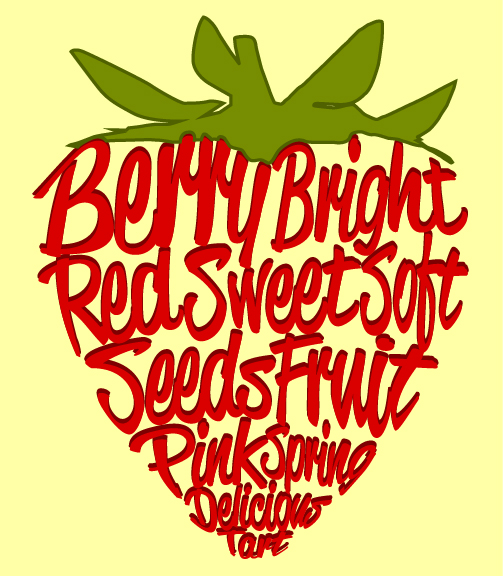
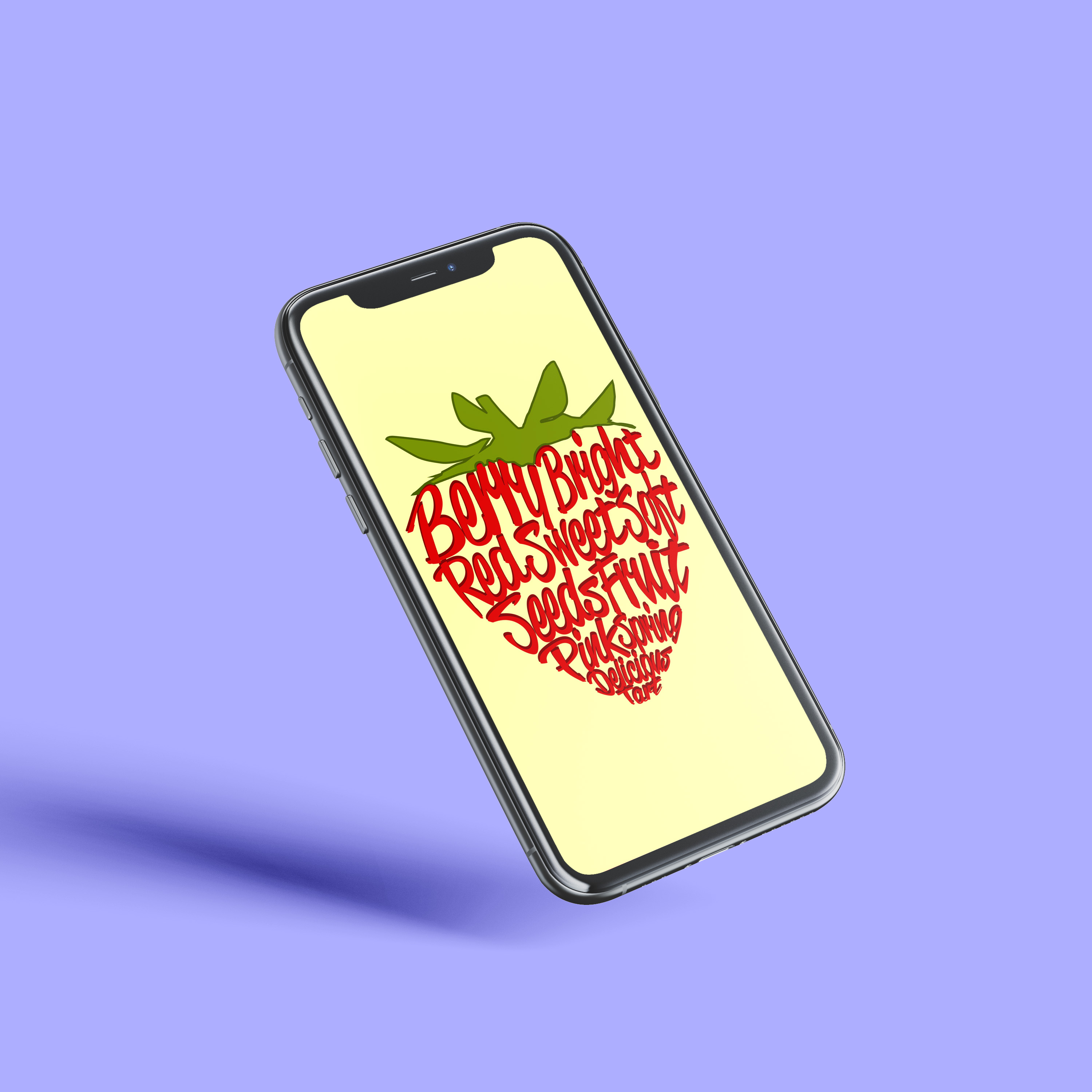
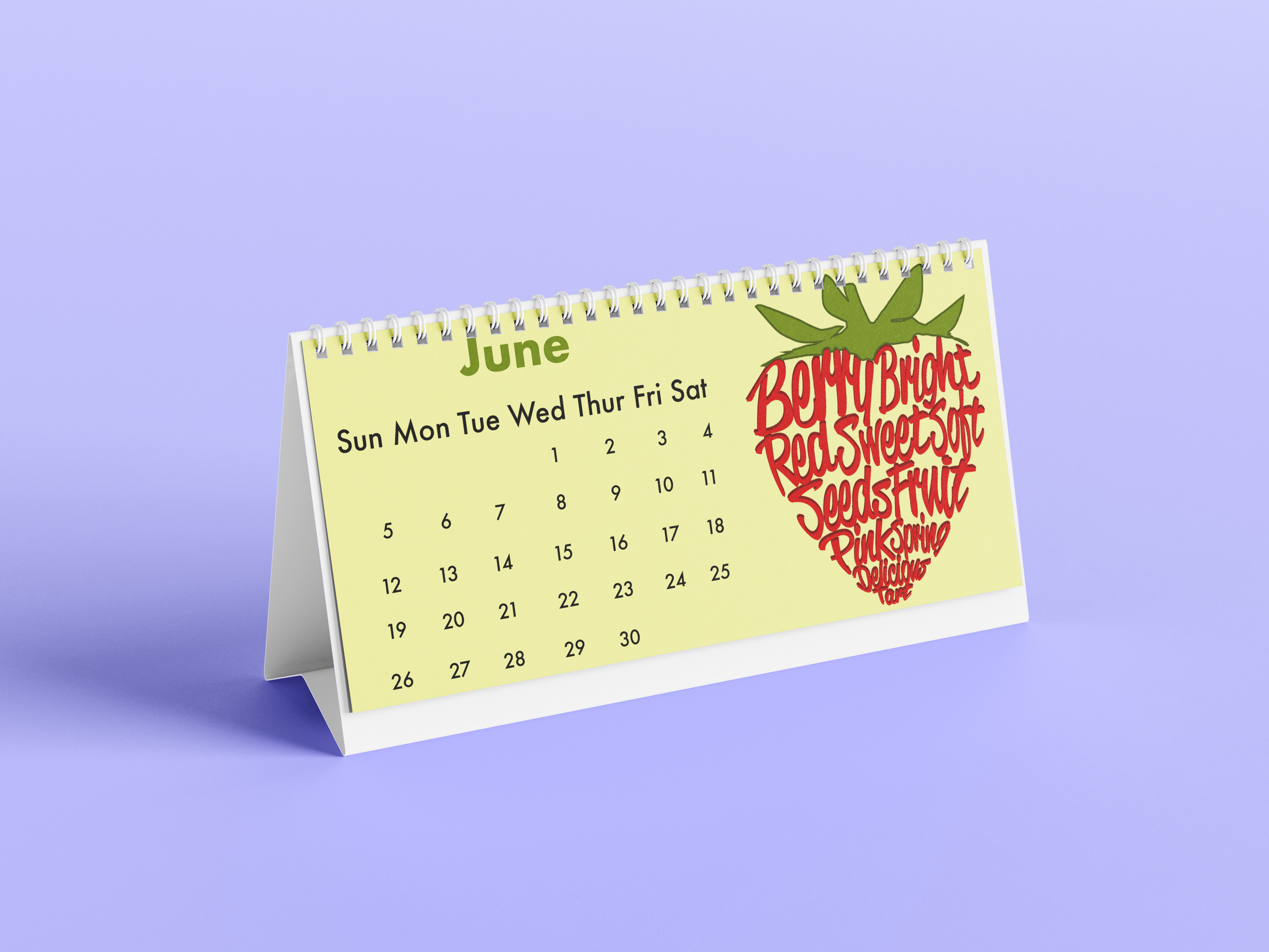
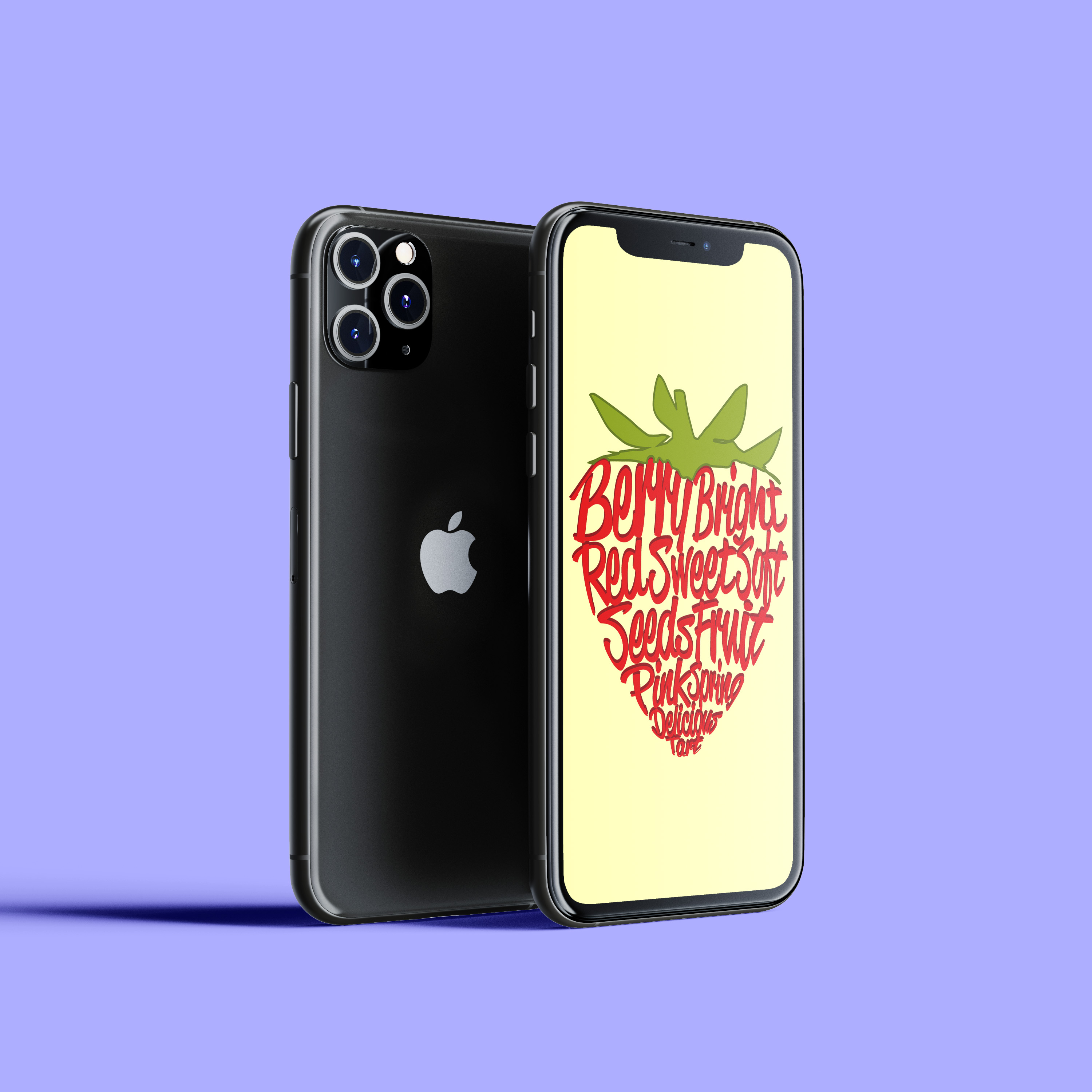
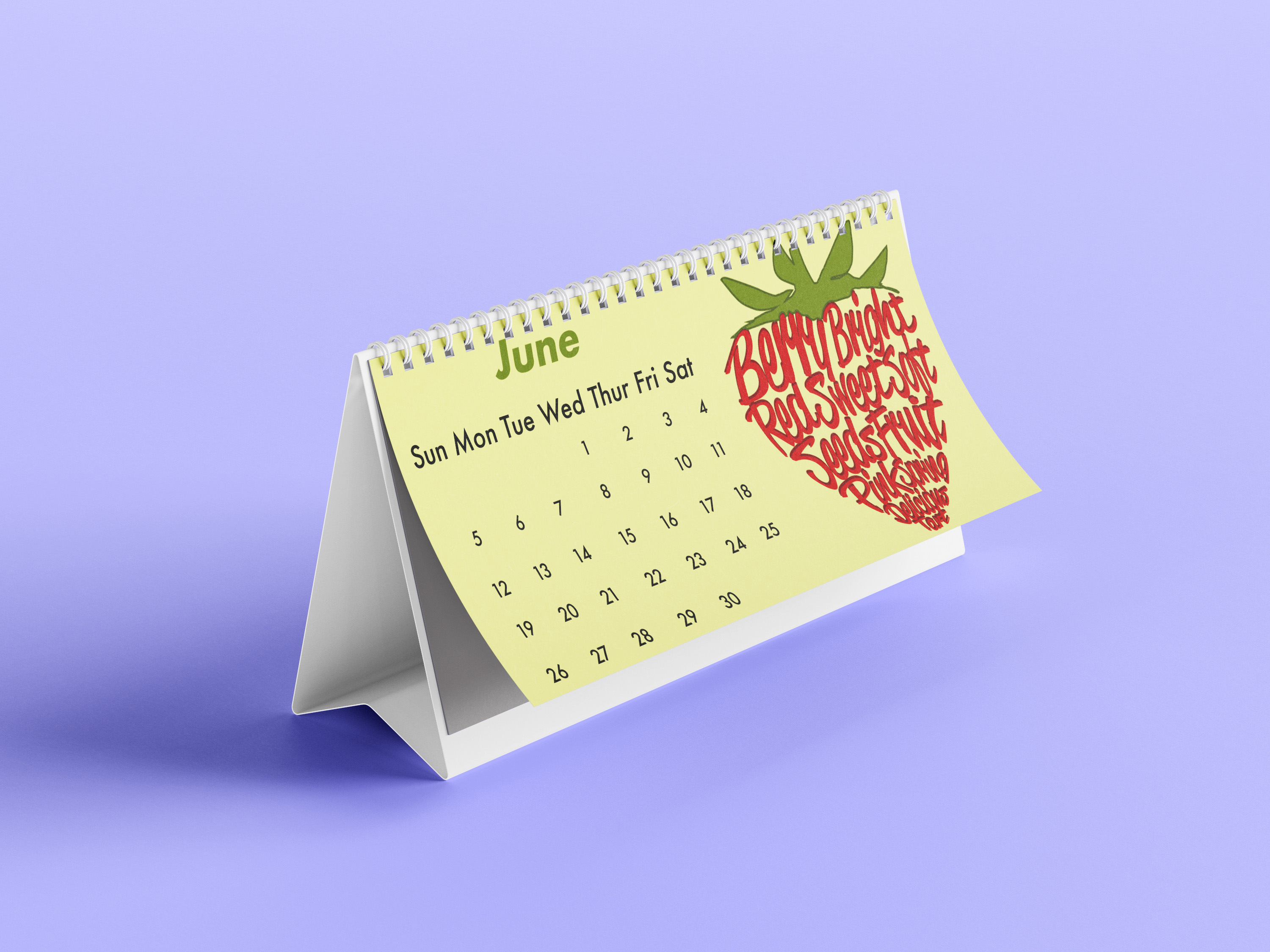
The strawberry typographic illustration involved using a typeface to type out descriptive adjectives related to a strawberry, then warping each word to have it conform to the shape of the strawberry. The target audience could be anyone who likes strawberries or enjoys artwork focused on typography. The software used was Adobe Illustrator because it allowed me to turn the type into objects and edit the words and characters to mold the strawberry shape. The design intent was to create a typographic portrait, but instead of a person, it was of an object to make it more of a unique illustration.
Process Work - Digital Sketches
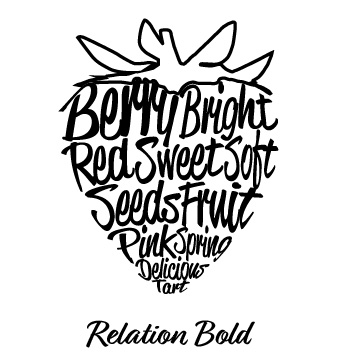
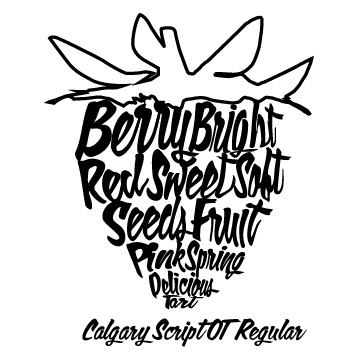
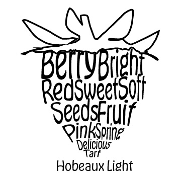
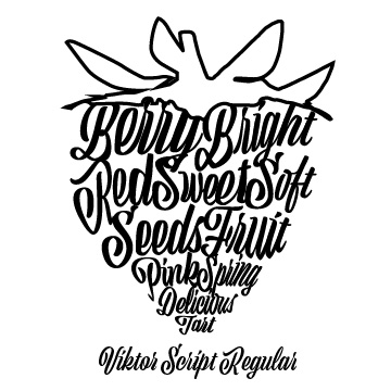
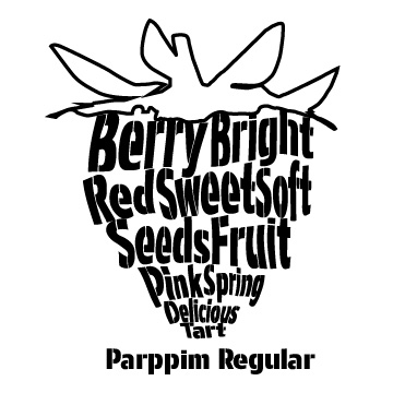
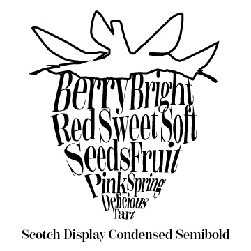
These thumbnails are made with Adobe Illustrator because I felt it was best to show the effect of making the type look like the finished product. I chose to use a strawberry for this because I found a photo on a website called Unsplash, and I loved the simplicity of it and the background color against the color of the strawberry. I wanted to do a variance on a traditional typographic portrait that uses an image of a person. I also wanted to try out a variety of typeface classifications to decide which would be best for this design.
Type Study
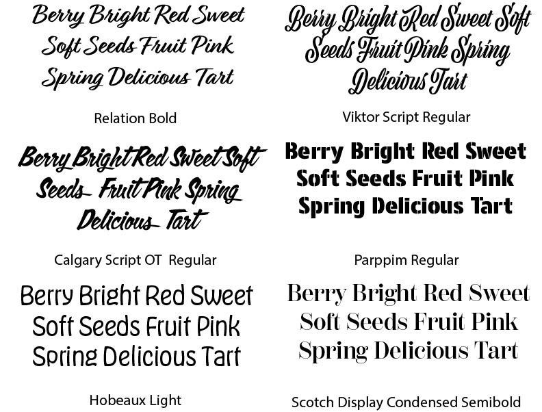
The typography choices I tried to pick a range of typefaces, such as serif, sans-serif, and script styles. Ultimately, I selected the script style of Relation Bold because I liked the contrast between the thick and thin of the characters. I felt for warping the characters in the typeface was the easiest to do without distorting them so much that it made them appear illegible.
Color Study
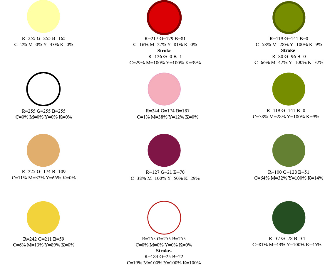
I had an assortment of color options selected for this, but I ultimately chose a mellow yellow background with a bright red berry and a stem with a lighter green than the darker green stroke around the stem. I chose this color combination because of how well they looked together and the differentiation between the background color and the colors of the strawberry. It was the same color palette in the reference photo I used for this project.
Mockups
