Science Magazine Spreads
*The body text was provided for the project*
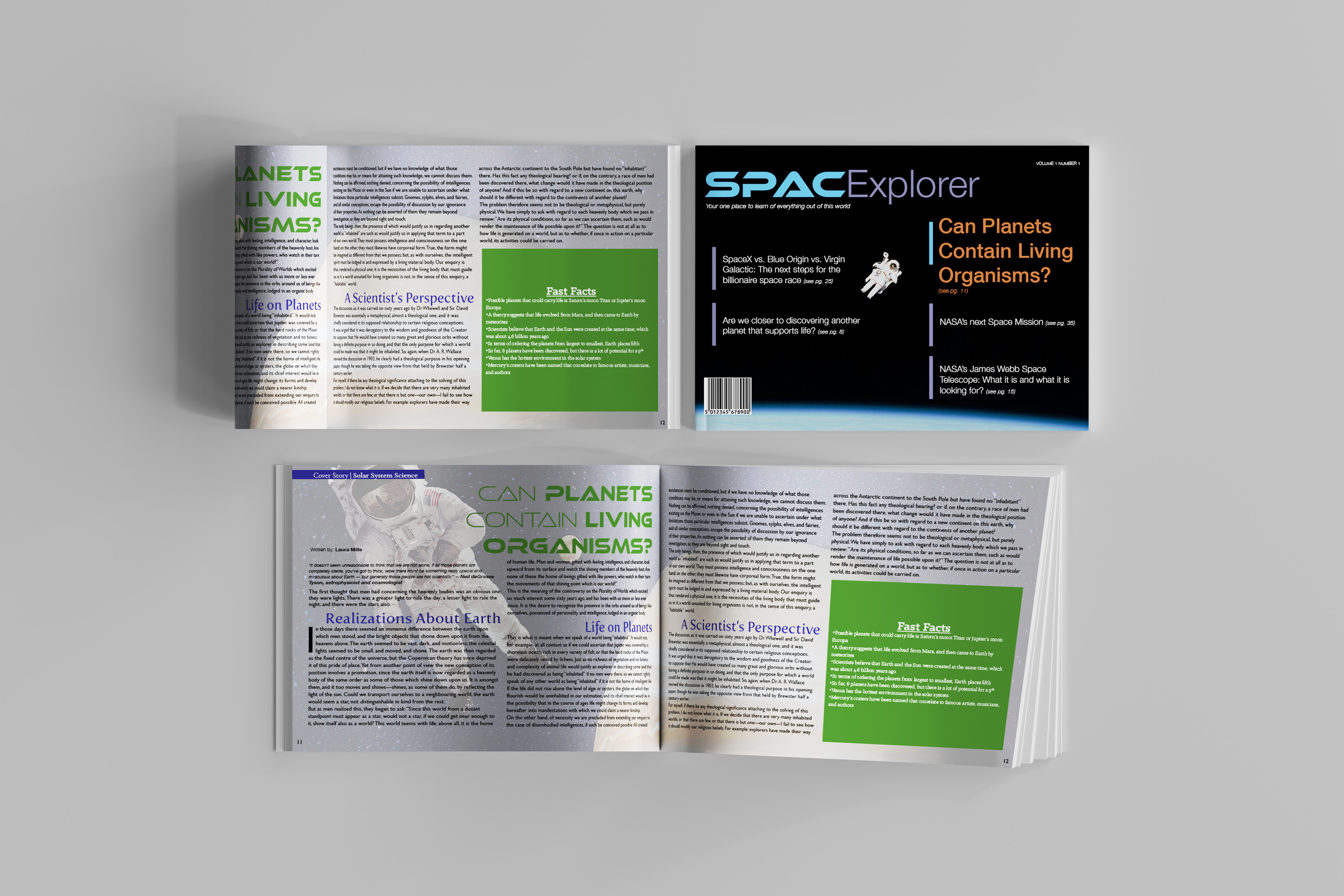
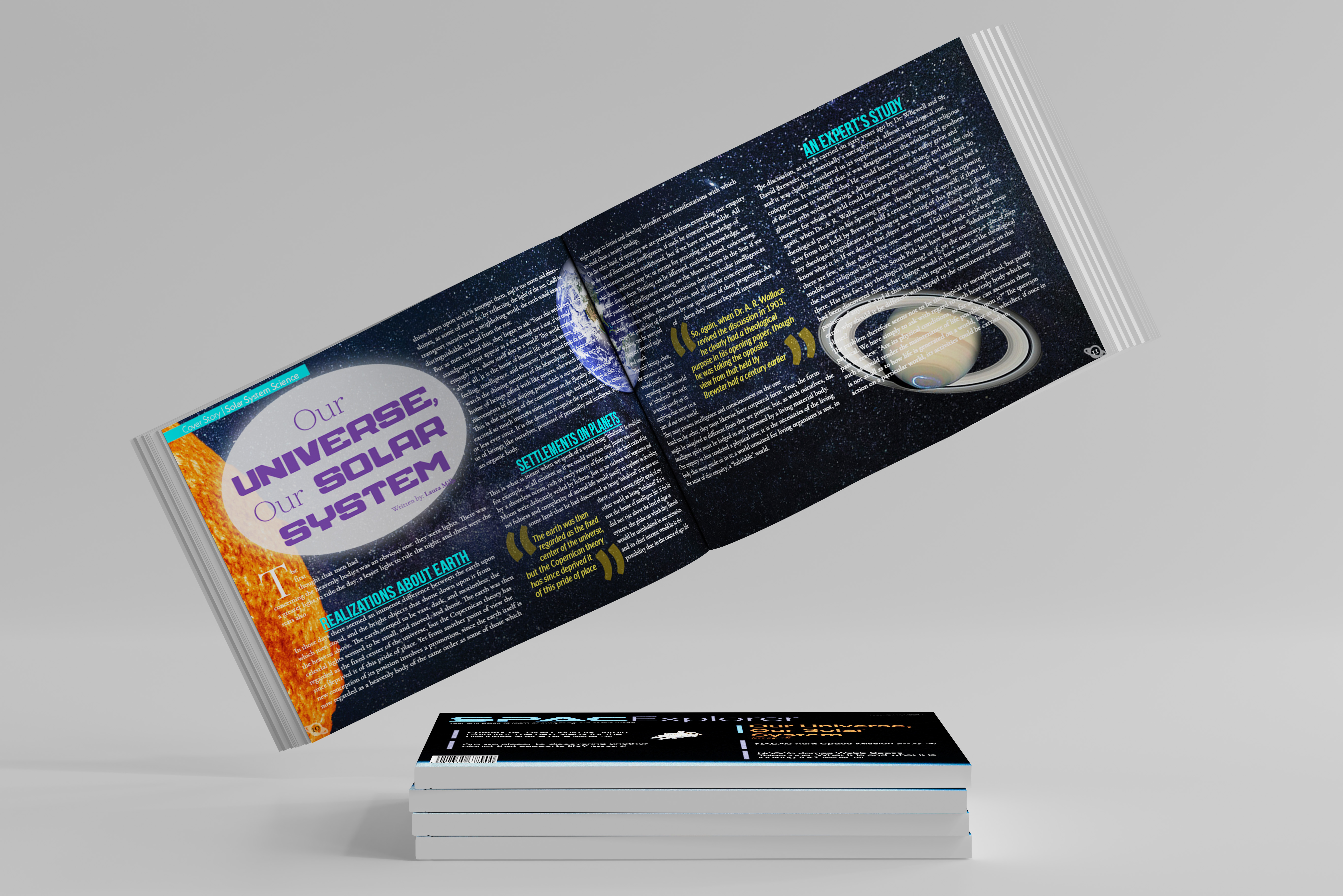
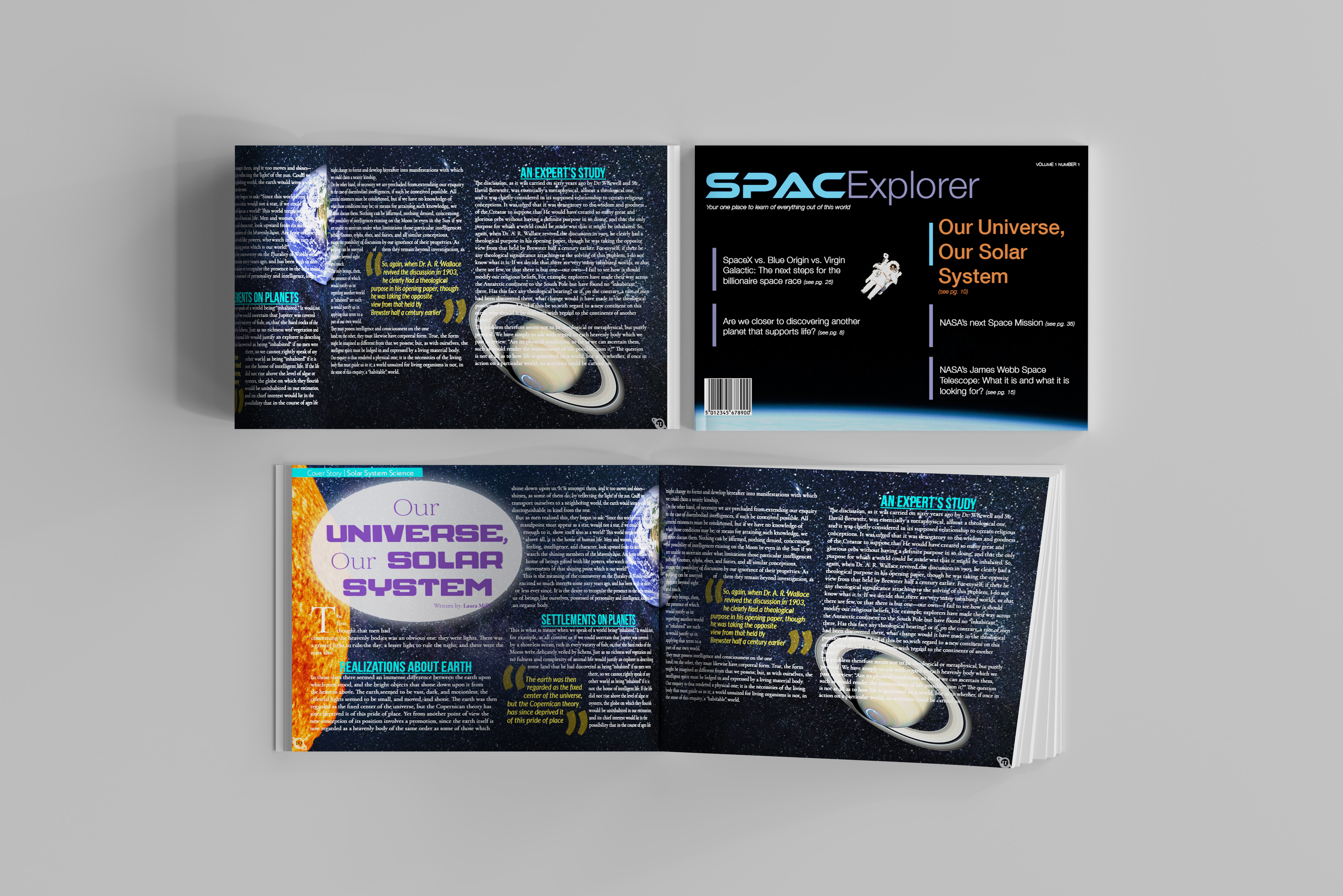
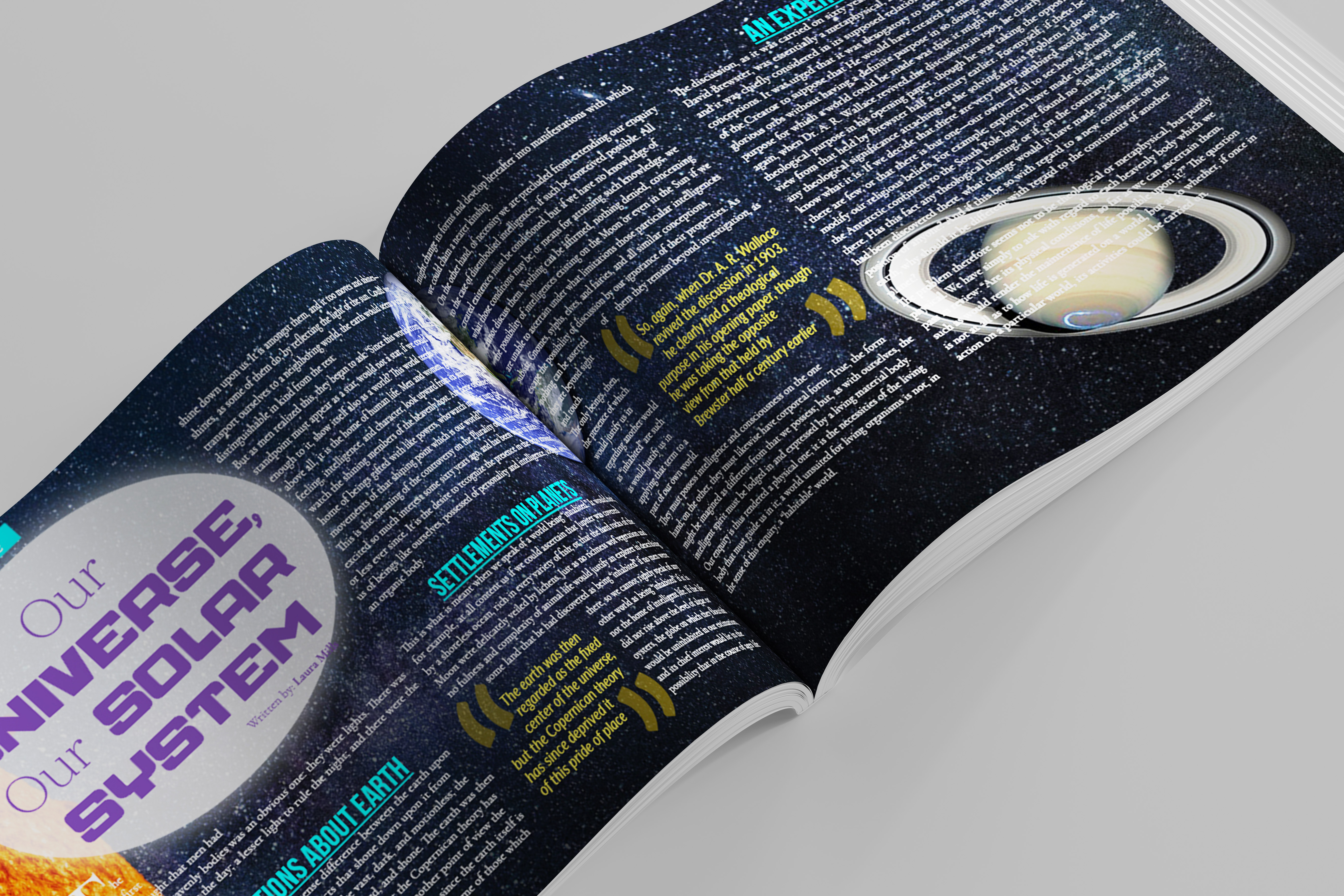
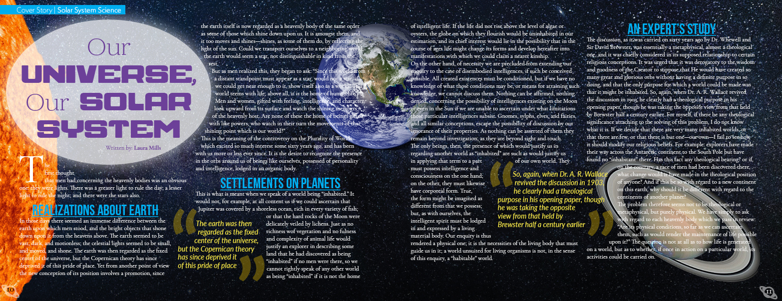
The two-science magazine spread designs are centered on outer space because that is what the body text is about. Each design focuses on something with the theme through visuals, color palettes, and typography choices. The target audience is adults who like to learn about outer space, students learning about the topic in the science field, and science professionals that need to keep up-to-date latest changes. I used Adobe Photoshop for the starry night sky image and put together the different planets to show them orbiting the sun; InDesign for the page layout portion of the spread. The design intent was to connect the design theme to the magazine article while making it eye-catching.
*The body text was provided for the project*
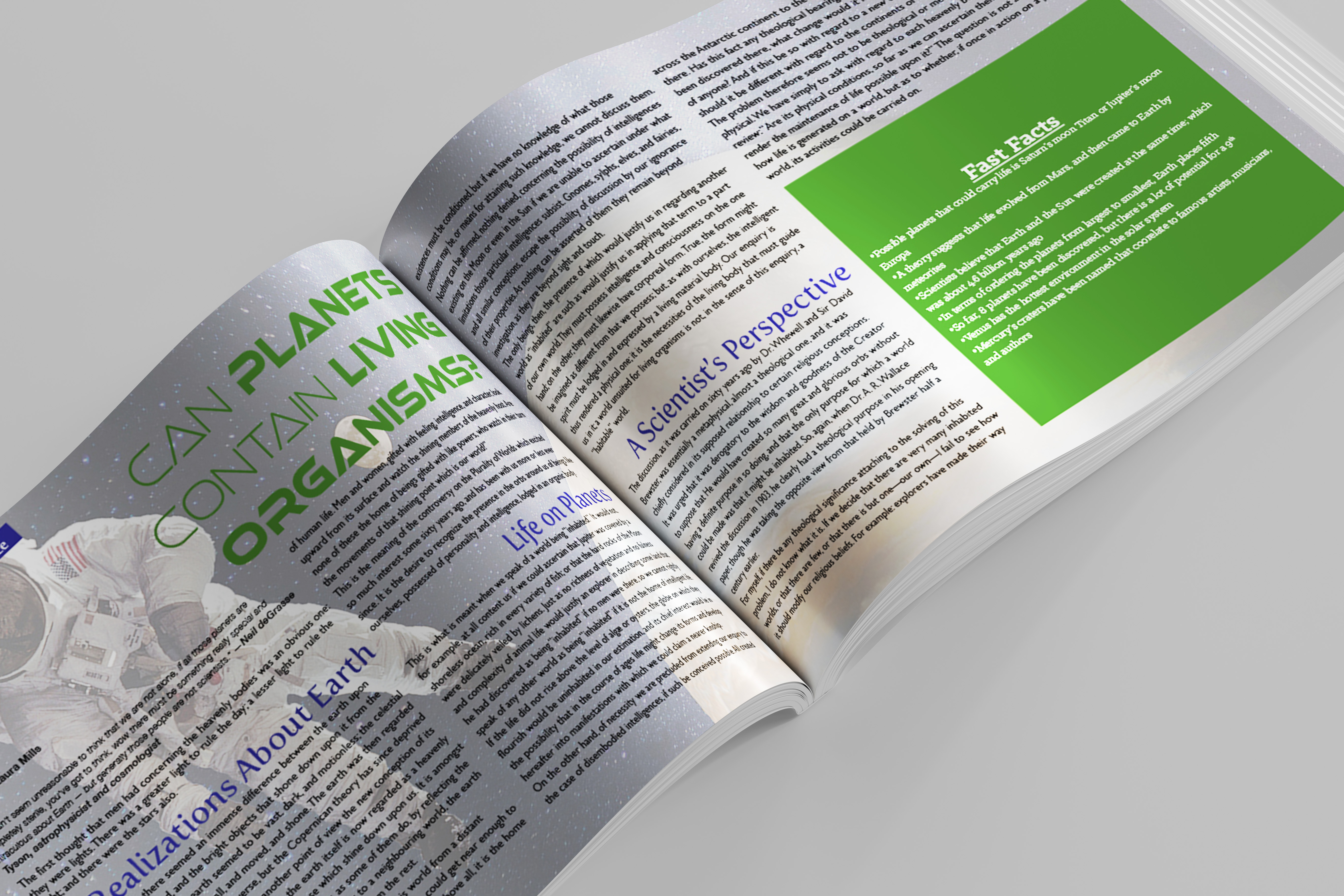
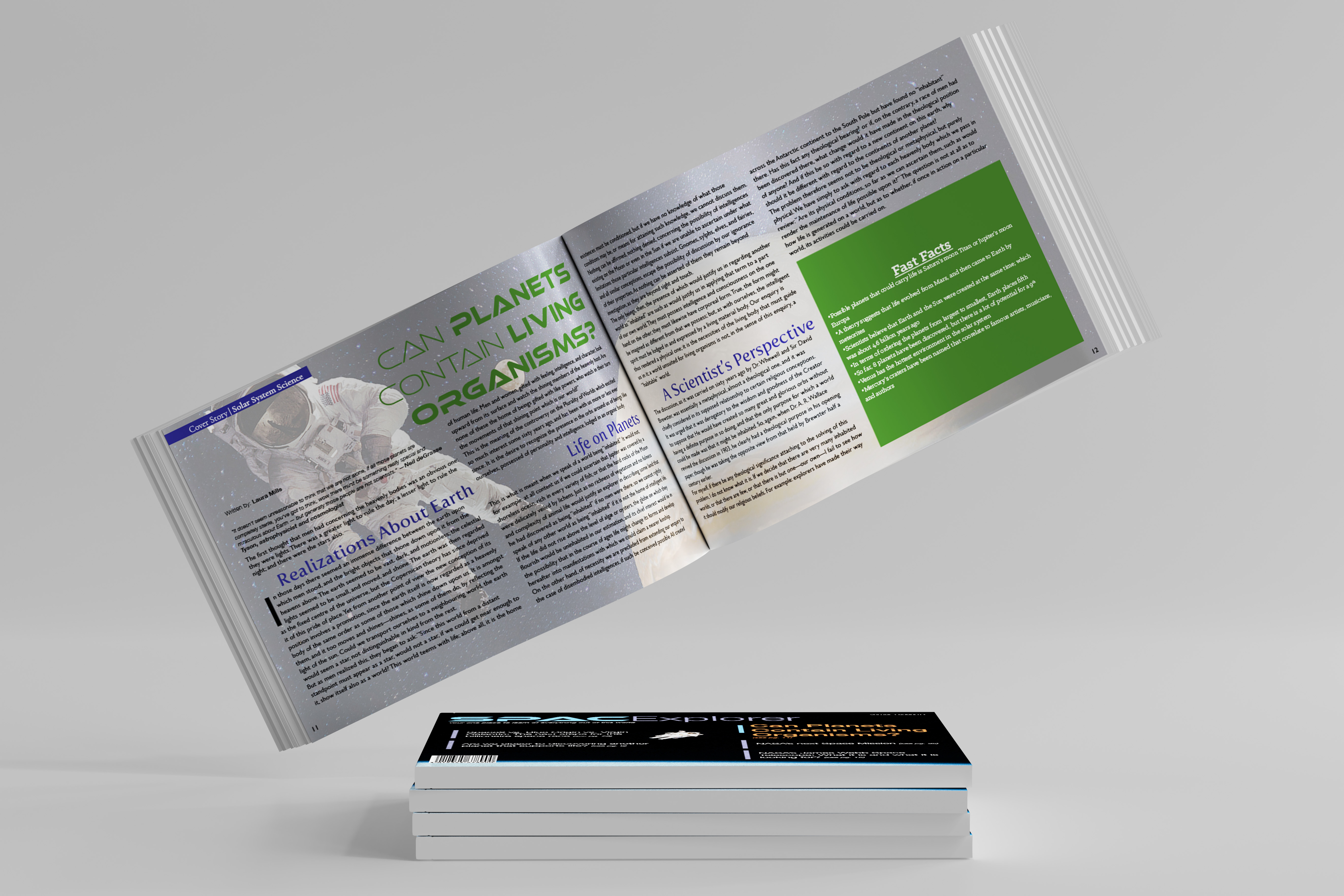
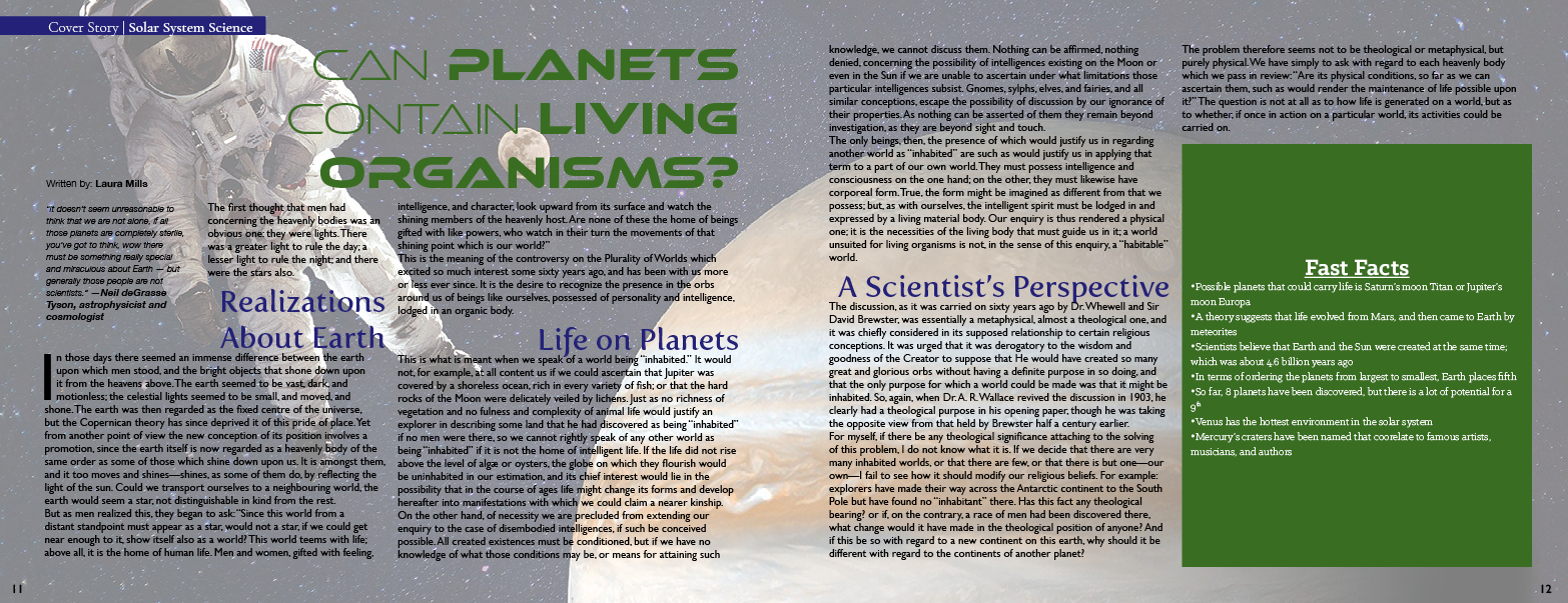
The second design concentrates on an astronaut floating through space with the planet Jupiter on the right. Also, like the first design, I kept the space theme going through color and typography choices. The target audience is adults who may find learning about space interesting, students for a space-related course, and science professionals that want to know the latest about the universe. The software was again Adobe Photoshop and InDesign to create this design piece. The design intent was to connect the design theme to the text of the article to show unity between the information and design.
Mockups
