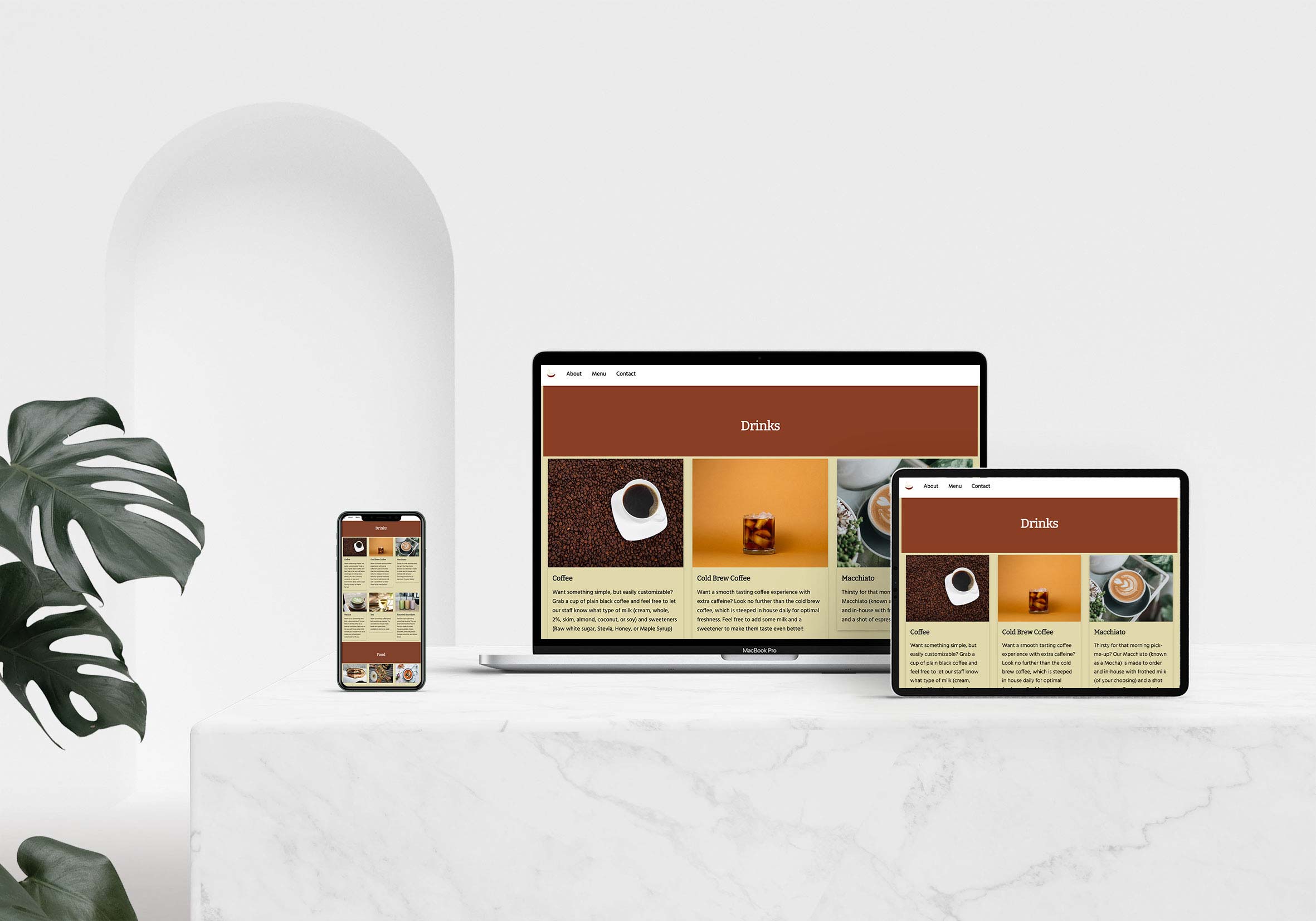
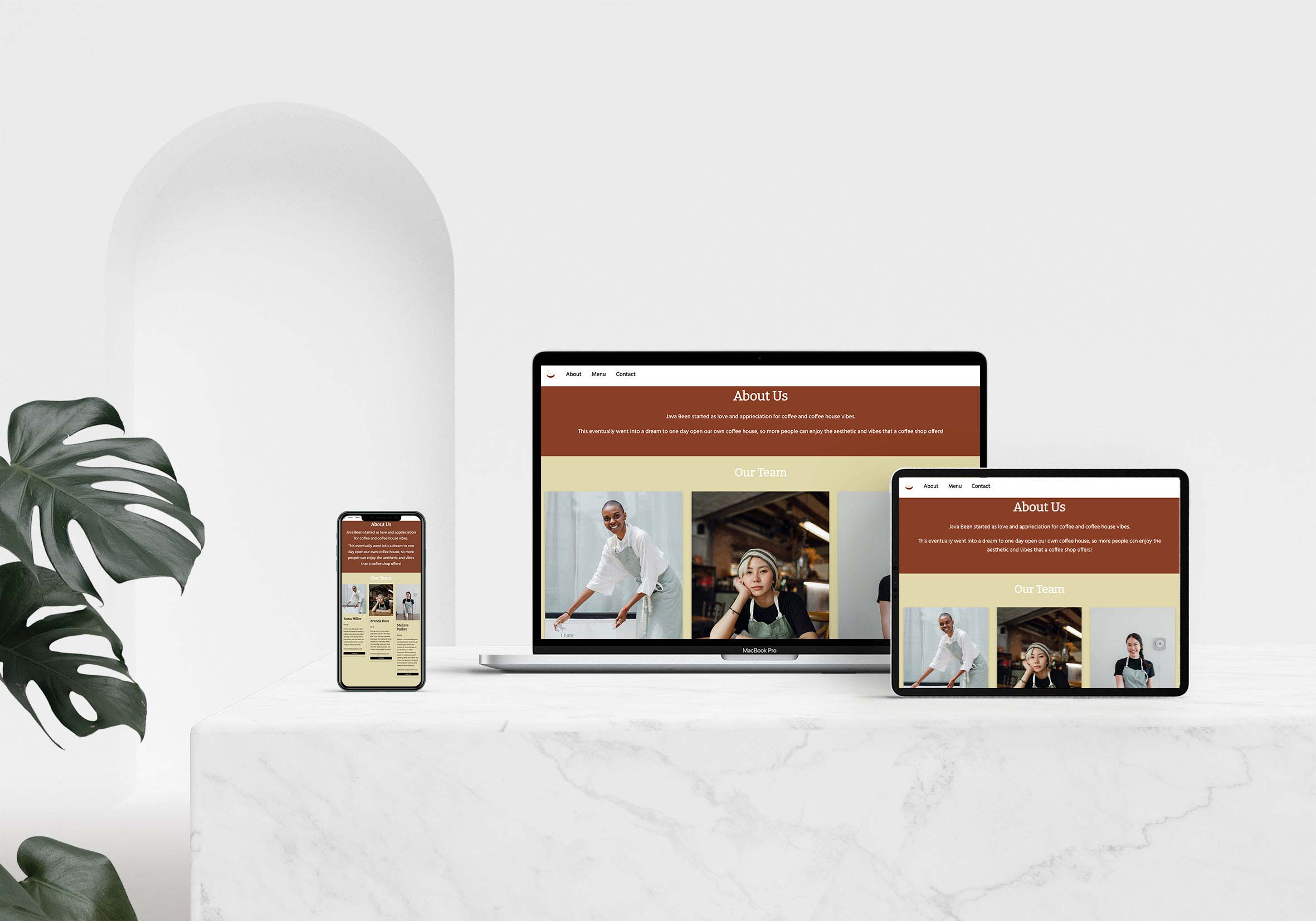
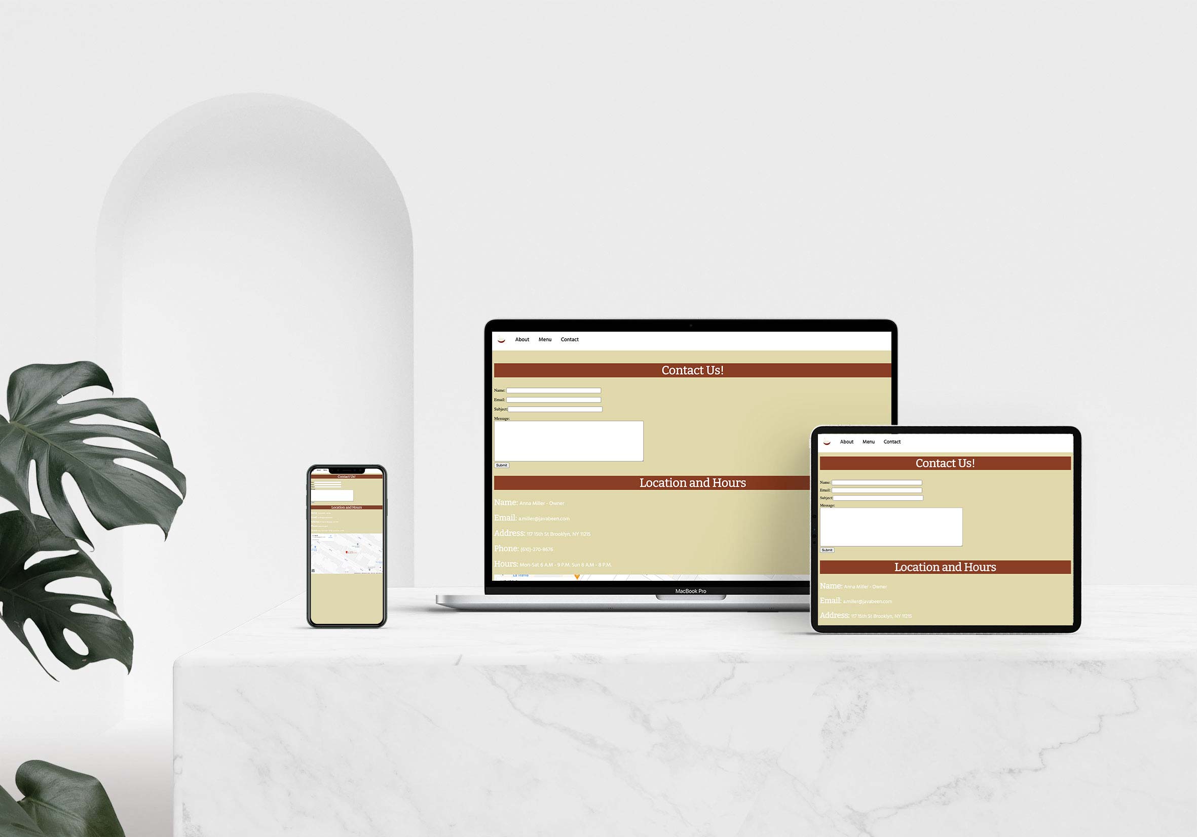
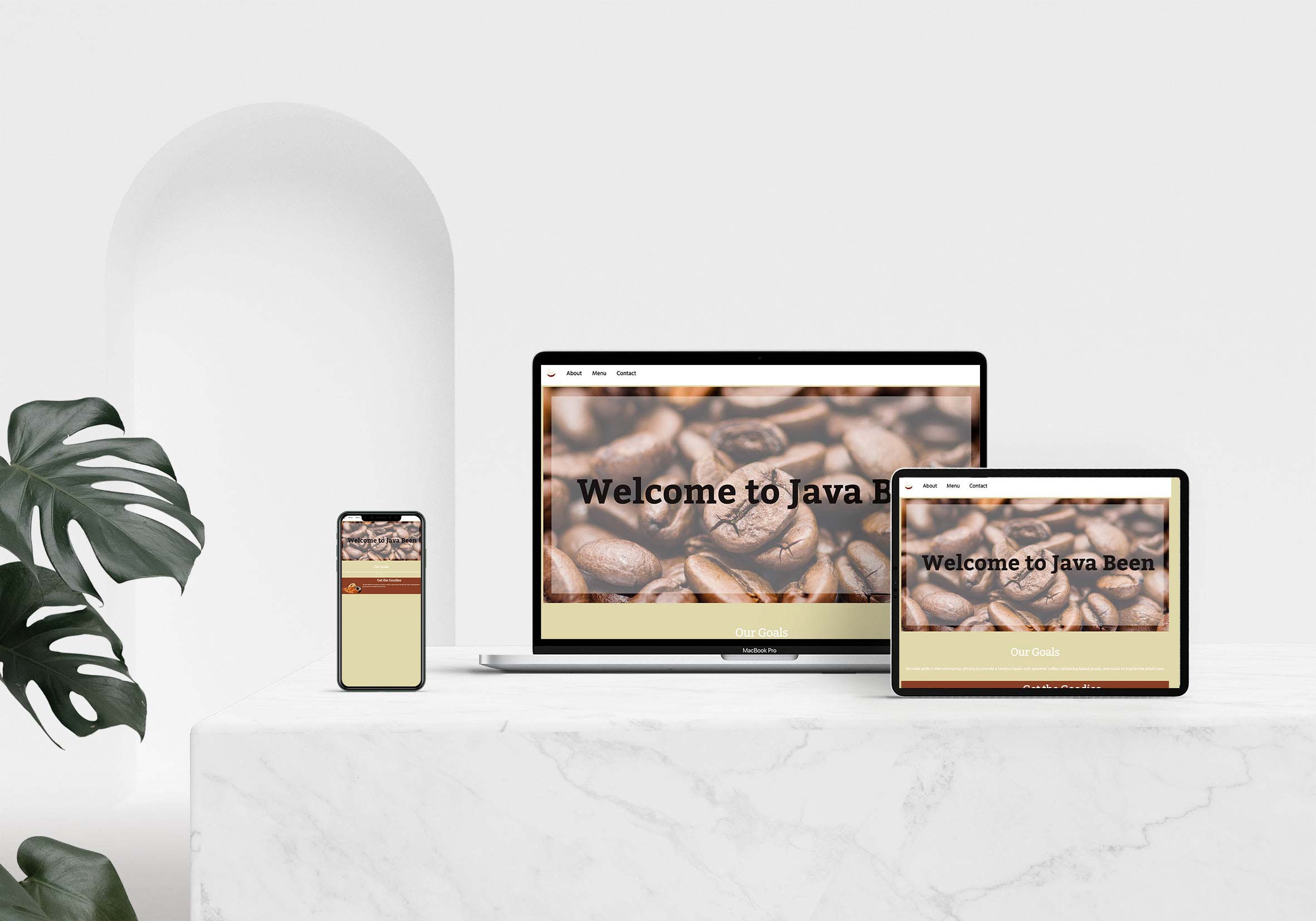
Java Been Website
*The logo was provided for this project*
Java Been is a cafe and brand that creates a cozy home atmosphere with a minimalist feel through a curated selection of typography, color palettes, and photos. Java Been’s website has an about page consisting of a summary of its owner and employees, menu selection, and contact information to report feedback on how customers like their visit and what can be improved. The target audience is adults wanting a quiet space to work away from home, students having a meetup spot to work or hang out, and people wanting to have a place to relax. The software used to create the site was Adobe Dreamweaver. The design intent is Java Been to reach their customers and target audience to connect with and deliver information about the coffee house and brand, so patrons are in the know.
Process Work - Wireframes
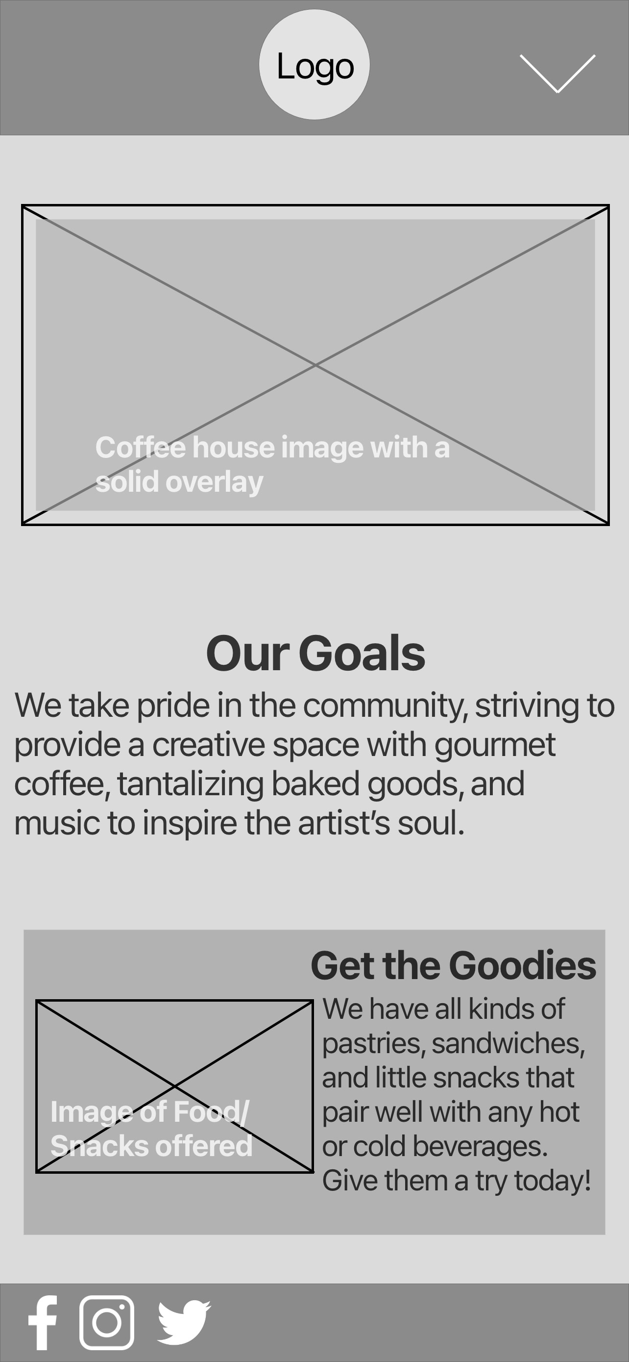
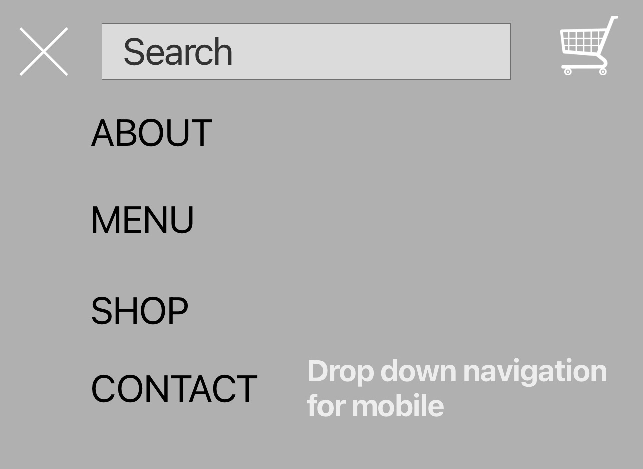
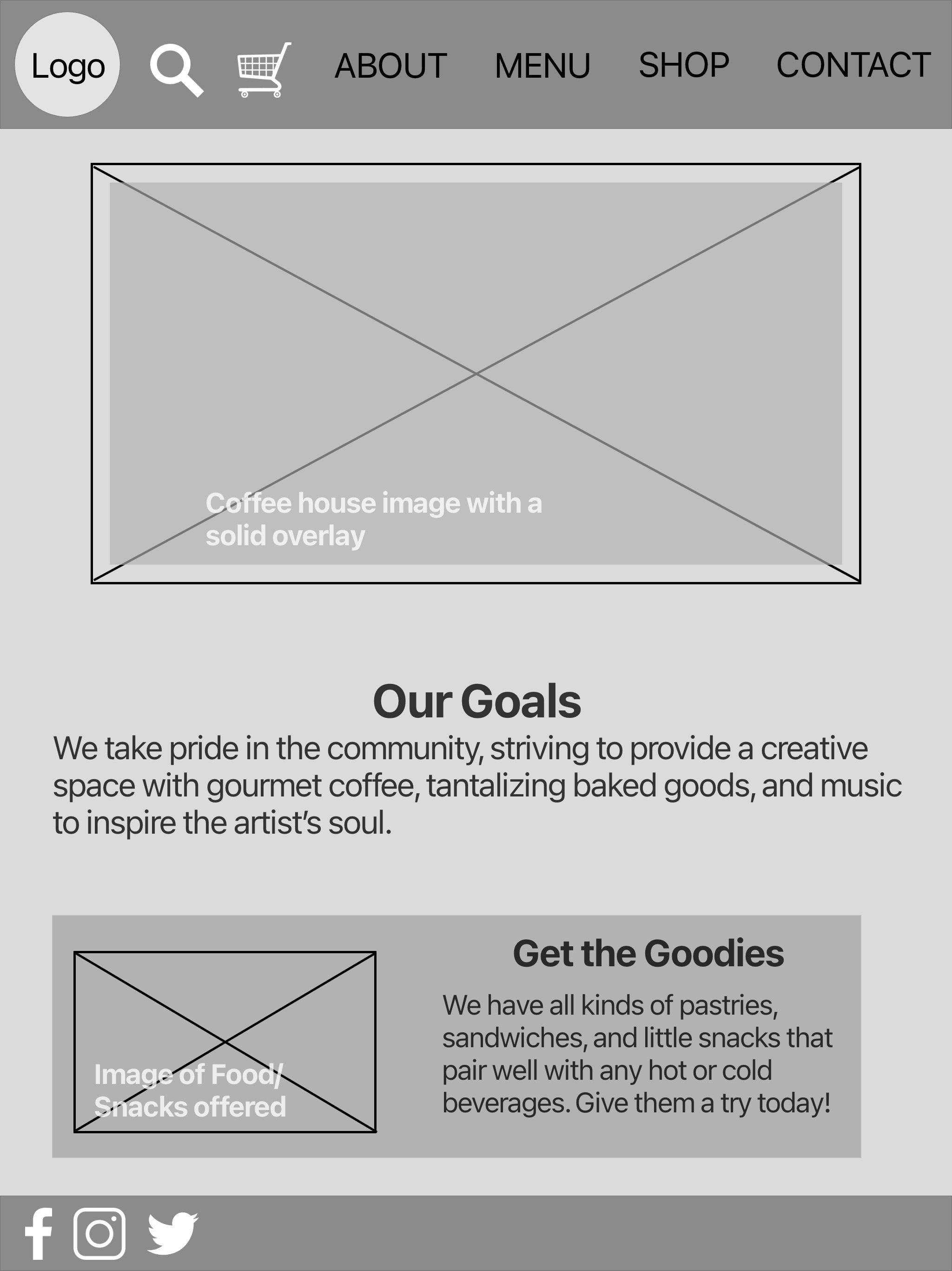
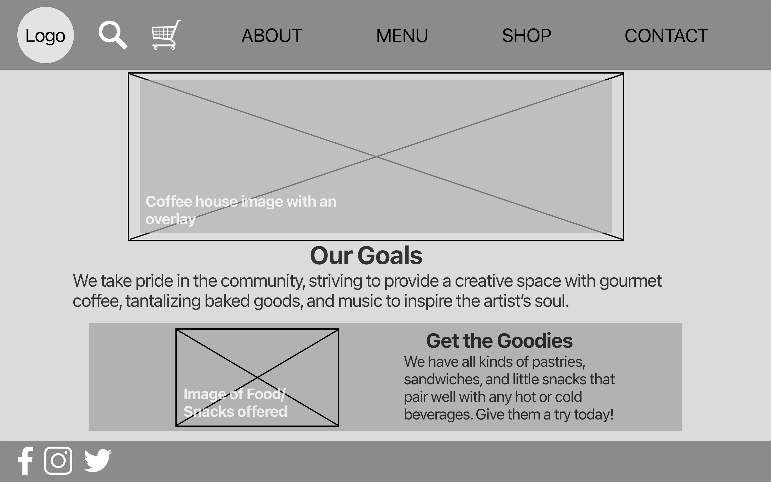
The wireframes for the Java Been website show the mobile, tablet, and desktop breakpoints to show the website's responsiveness. Also, for the mobile design, included is what the hamburger dropdown menu would look like. I wanted the wireframes to have a central image that would embody what the Java Been brand and cafe are to people that visit the site because it creates consistency and the customers know what to expect when visiting either the website or the cafè. I also liked the idea of advertising on the bottom of the home page that Java Been offers different snacks and other food items. Customers need to know it's not just a place to grab their coffee or tea but a place to sit, relax and enjoy a variety of food items as well.
Process Work - Rough Designs
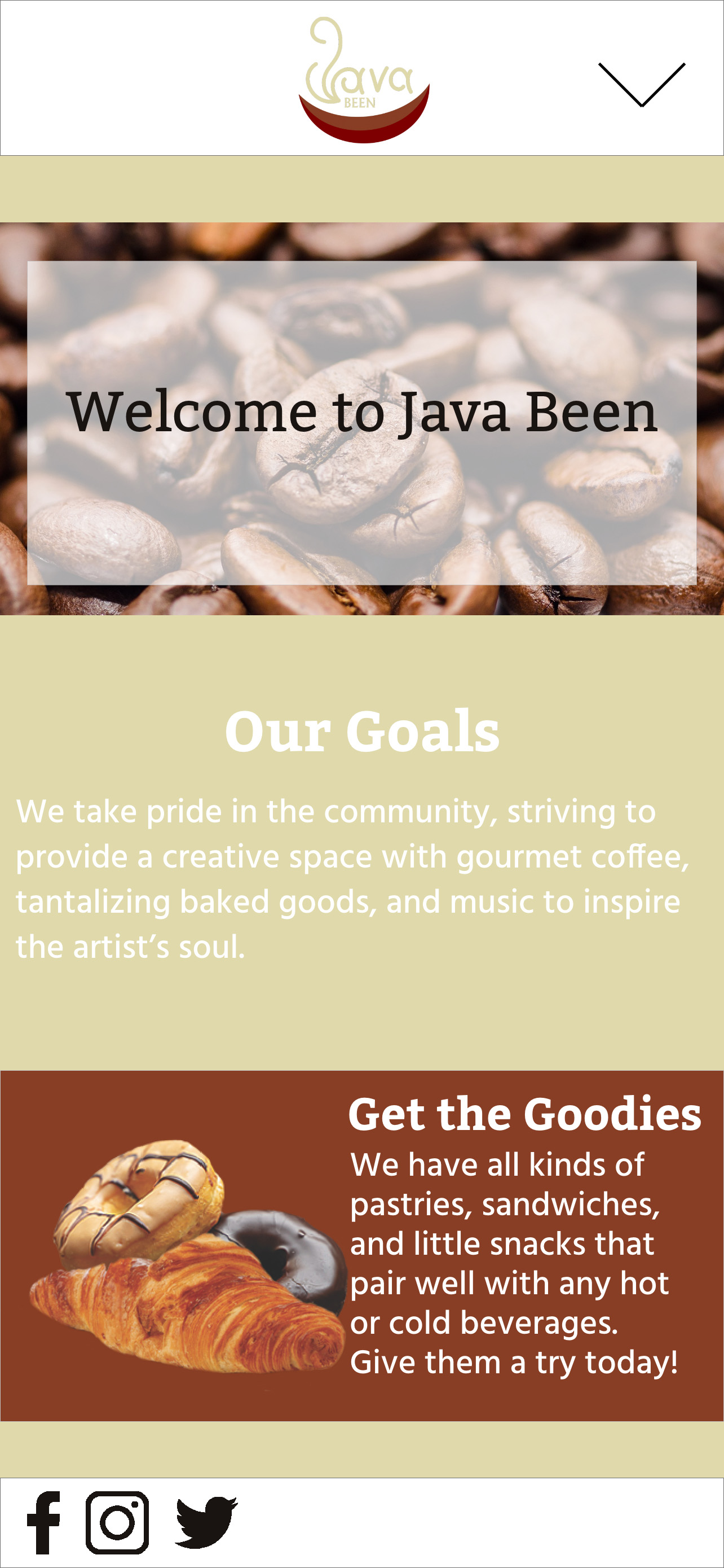
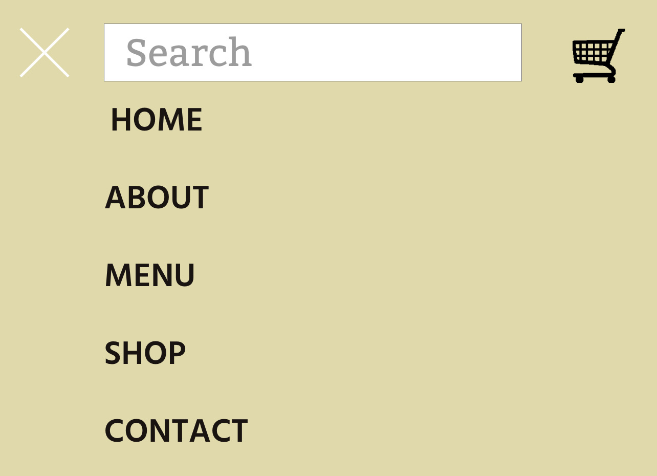
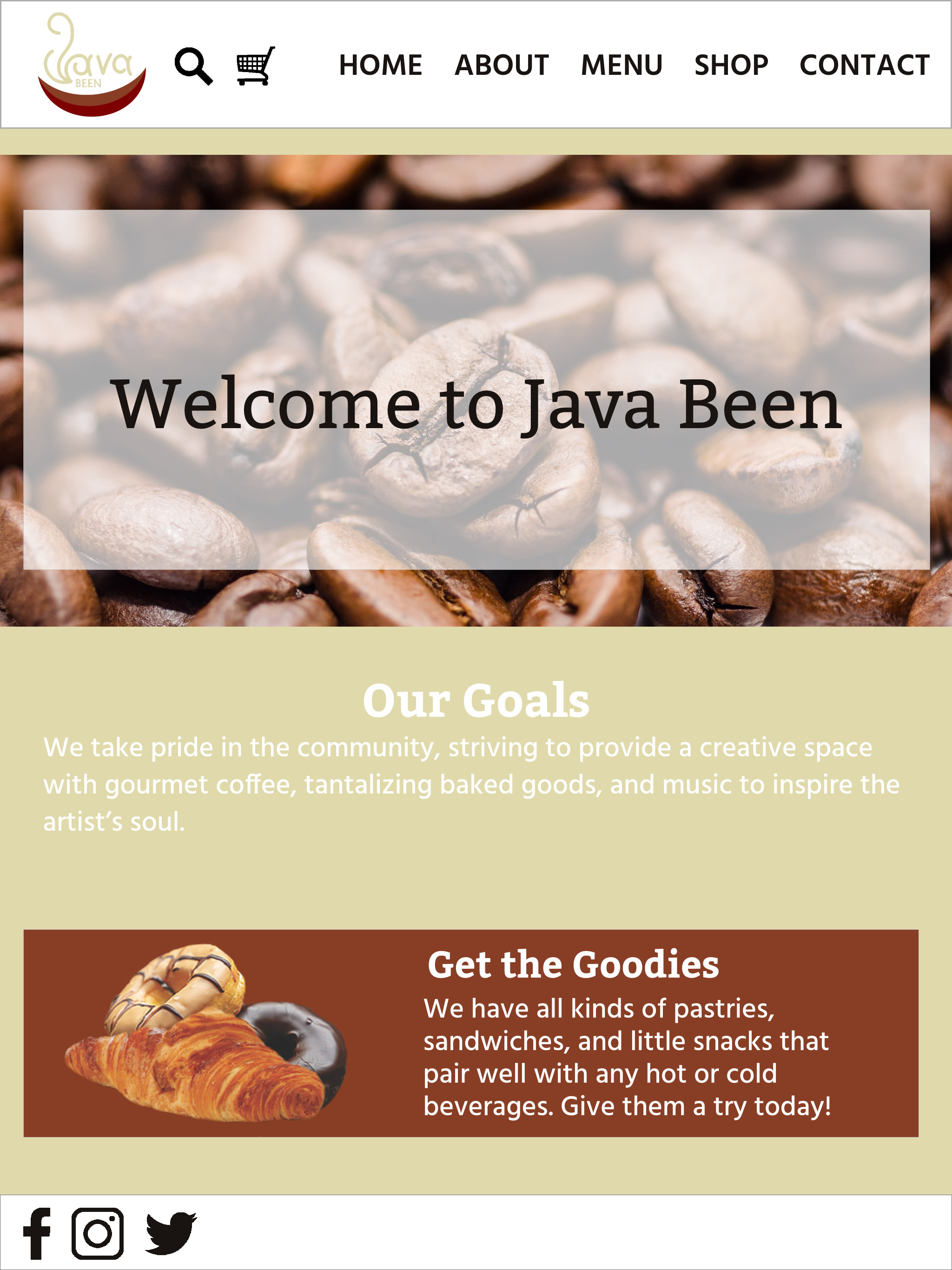
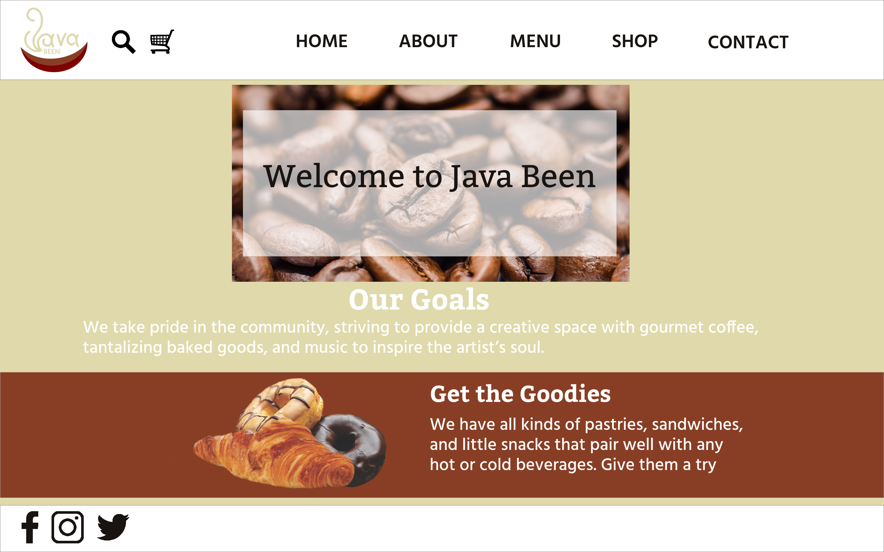
These designs follow the same design as the wireframes above. These are the rough designs for the mobile with hamburger dropdown menu, tablet, and desktop breakpoints to show the responsiveness of the Java Been website. The difference between the wireframes above and these versions is that they have more detail, like color palette, image use, official logo, and typography choice/text details. It gives a better visual of what the final design will look like with the chance to make adjustments as needed. I liked using an image of coffee beans for the main picture since it is a coffee house, and adding a transparent box on the front created a unique effect for the text could be visible. I liked to make known the goals of Java Been as well, so customers would know how they serve the community and want to give to people that come in to visit. Another part in the wireframe is a small advertisement that Java Been offers more than just coffee and tea; there are snacks, sandwiches, and pastries with other hot or cold beverages. This layout works well in that it has a simple user interface, and the design fits very well with the Java Been brand.
Mockups
